This is an IELTS writing task 1 sample answer essay from the real academic exam on the subject of higher education (a bar chart).
There are a couple of key areas to note before you start writing.
First, this graph shows change over time so you will have to describe the full trend for full marks on your overview.
Secondly, there is a lot of data but you must include all of it.
Finally, it is important to structure and compare the data.
Read how I did that below!
Find out more about my exlusive Patreon essays here.
Dave
IELTS Writing Task 1 Sample Answer Essay: Higher Education Bar Chart (Real Past IELTS Exam/Test)
The bar chart shows the percentage of young people in higher education in 2000, 2005 and 2010.
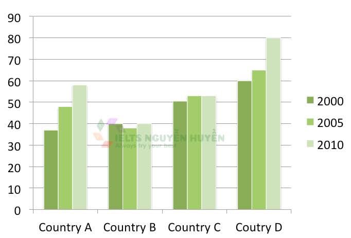
The bar chart details changes in the proportions of young people studying in higher education across 4 countries and at 3 intervals of 5 years from 2000 to 2010. Looking from an overall perspective, it is readily apparent that, with the exception of country B where growth was flat, all countries experienced rises. Country D had the highest overall numbers throughout, while country A overtook country C and country B was generally lowest.
Looking first of all at the overall leader, country D, 60% of young people studied higher education in 2000 followed by a slight uptick to 65% in 2005 and a final upswing to 80%. In contrast, country B had far lower levels at 40% in both 2000 and 2010, with a small dip in between to just under 40%.
Country A had 37% of youngsters studying in university at the beginning of the period, trailing country C by approximately 13%. Both countries underwent increases in 2005 (by 11 and 2%, respectively) before country A surged ahead to nearly 60% and country C’s growth stagnated at 53%.
Analysis
1. The bar chart details changes in the proportions of young people studying in higher education across 4 countries and at 3 intervals of 5 years from 2000 to 2010. 2. Looking from an overall perspective, it is readily apparent that, with the exception of country B where growth was flat, all countries experienced rises. 3. Country D had the highest overall numbers throughout, while country A overtook country C and country B was generally lowest.
- Paraphrase what the graph is showing.
- Begin your overview. You must include all areas and say whether they increase/decrease.
- Also include the ranking and any other notable areas.
1. Looking first of all at the overall leader, country D, 60% of young people studied higher education in 2000 followed by a slight uptick to 65% in 2005 and a final upswing to 80%. 2. In contrast, country B had far lower levels at 40% in both 2000 and 2010, with a small dip in between to just under 40%.
- Begin to write about some of the data. I chose to compare the low and high in this paragraph.
- Compare and be sure to include all data.
1. Country A had 37% of youngsters studying in university at the beginning of the period, trailing country C by approximately 13%. 2. Both countries underwent increases in 2005 (by 11 and 2%, respectively) before country A surged ahead to nearly 60% and country C’s growth stagnated at 53%.
- Describe the data for the other countries.
- Be sure that you are always comparing and you don’t miss out on any data.
Vocabulary
What do the words in bold below mean?
The bar chart details changes in the proportions of young people studying in higher education across 4 countries and at 3 intervals of 5 years from 2000 to 2010. Looking from an overall perspective, it is readily apparent that, with the exception of country B where growth was flat, all countries experienced rises. Country D had the highest overall numbers throughout, while country A overtook country C and country B was generally lowest.
Looking first of all at the overall leader, country D, 60% of young people studied higher education in 2000 followed by a slight uptick to 65% in 2005 and a final upswing to 80%. In contrast, country B had far lower levels at 40% in both 2000 and 2010, with a small dip in between to just under 40%.
Country A had 37% of youngsters studying in university at the beginning of the period, trailing country C by approximately 13%. Both countries underwent increases in 2005 (by 11 and 2%, respectively) before country A surged ahead to nearly 60% and country C’s growth stagnated at 53%.
Answers
details describes
proportions percentages
higher education university
intervals periods
looking from an overall perspective, it is readily apparent that overall
exception what is different
growth was flat stayed the same
throughout all during the period
while at the same time
overtook surpassed
generally lowest overall at the bottom
overall leader highest in general
slight uptick small increase
final upswing large increase
far lower levels not nearly as high
small dip tiny decrease
just under a little less than
beginning of the period at the start of the time surveyed
trailing behind
approximately around
underwent experienced
respectively in turn
surged ahead increasing past
nearly almost
growth stagnated stopped increasing
Pronunciation
ˈdiːteɪlz
prəˈpɔːʃənz
ˈhaɪər ˌɛdju(ː)ˈkeɪʃən
ˈɪntəvəlz
ˈlʊkɪŋ frɒm ən ˈəʊvərɔːl pəˈspɛktɪv, ɪt ɪz ˈrɛdɪli əˈpærənt ðæt
ɪkˈsɛpʃən
grəʊθ wɒz flæt
θru(ː)ˈaʊt
waɪl
ˌəʊvəˈtʊk
ˈʤɛnərəli ˈləʊɪst
ˈəʊvərɔːl ˈliːdə
slaɪt ʌptɪk
ˈfaɪnl ˈʌpswɪŋ
fɑː ˈləʊə ˈlɛvlz
smɔːl dɪp
ʤʌst ˈʌndə
bɪˈgɪnɪŋ ɒv ðə ˈpɪərɪəd
ˈtreɪlɪŋ
əˈprɒksɪmɪtli
ˌʌndəˈwɛnt
rɪsˈpɛktɪvli
sɜːʤd əˈhɛd
ˈnɪəli
grəʊθ stægˈneɪtɪd
Listen and repeat:
Vocabulary Practice
Remember and fill in the blanks:
The bar chart d___________s changes in the p_______________s of young people studying in h___________________n across 4 countries and at 3 i__________s of 5 years from 2000 to 2010. L_____________________________________________________________________t, with the e___________n of country B where g______________t, all countries experienced rises. Country D had the highest overall numbers t____________t, w_________e country A o__________k country C and country B was g________________t.
Looking first of all at the o____________r, country D, 60% of young people studied higher education in 2000 followed by a s______________k to 65% in 2005 and a f______________g to 80%. In contrast, country B had f___________________s at 40% in both 2000 and 2010, with a s_____________p in between to j_____________r 40%.
Country A had 37% of youngsters studying in university at the b_____________________________d, t______________g country C by a___________________y 13%. Both countries u_______________t increases in 2005 (by 11 and 2%, r_______________y) before country A s______________________y 60% and country C’s g______________________d at 53%.
Listen and check:
Writing Practice
Write about the bar chart below then check with my sample answer:


Hi Dave. I always visit your website to look for your essay samples which are impressive and well-written (wondering if I can write as good as you). Perhaps, if you don’t mind, you can give a comment on my essay here. I also have a problem in writing task 1 timely, mostly I spend 25 mins for task 1 and it makes me panic while continuing to task 2 because I’m afraid of running out of time. Can you give me tips to tackle this? Thank you in advance!
The bar chart gives information about the proportions of youngsters who were studying in further education in four different countries in three separate years. In general, all countries but country B had increased in the percentages of young people at the end of the year with the largest proportion of young adults in higher education belonged to country D throughout the years.
In 2000, 60% of young people in country D studied in a higher level of education, while 50% of young adults in country C were students in further education, and each country A and B had students’ percentages no more than 40%.
After five years, country A, C and had experienced an increase in the portions of students in further education by around 10%, 2% and 5% respectively, except country B had decreased to about 38%. At the end of period, the percentage of higher-level students in country C remained at approximately 52%, while the remaining countries had more young people studied in higher education with a significant increase by 20% to 80% belonged to country D.
Thanks for saying that, Thyar! (Interesting name – where are you from?)
I would recommend doing task 2 first since it is worth more for your score overall then task 1 second.
Some corrections: had increased BY the… belonging to… throughout the period… of no more than… young people studying… belonging to
And be careful with your overview – did all countries increase really?
I’m from Indonesia. Thanks for the corrections and I just realized that there is a stagnant growth.
Cool! Hope to travel there sometime soon – I’m living in Vietnam at the moment.
The bar chart illustrates the proportion of young population of four different countries who were receiving higher education in the year of 2000, 2005 and 2010.
Overall, country D had the highest number throughout the years. Although country A started off the lowest, its growth was the most significant. Country B and country D’s figures remained relatively stable over the given period.
In 2000, exactly three fifths of the young people in country D were in higher education, and this number increased substantially to a record high of nearly four fifths by the end of the period. Likewise, there was a dramatic growth in the number of country A from approximately 37% to about 58%, overtaking the previous second highest percentage by 2010.
Despite a dip of about 2% in the middle of the period, the number of country B remained relatively unchanged throughout the decade at about 40%. The figures for country C, on the other hand, rose slightly from exactly a half before reaching a plateau of around 52% for the rest of the period.
Good!
in the years, great overview!, overtaking the perviously second-ranked percentage, numbers for
lots of improvement in your writing!
No,I want to join now
Ok, what would you like to join?
Yes
Can you write a bit more what you are looking for?