These are the most recent/latest IELTS Writing Task 1 Task topics and questions starting in 2019, 2020, 2021, 2022, 2023, 2024, 2025, and continuing into 2026.
If you have already passed IELTS and are working on your college or university application essay, check out my post here.
You can find all the most recent IELTS writing task 2s here and the general training questions here.
If you are able, please consider supporting my efforts (and receiving exclusive IELTS Ebooks!) by signing up for my Patreon here.
Enjoy and comment any questions/writing that you have!
-Dave
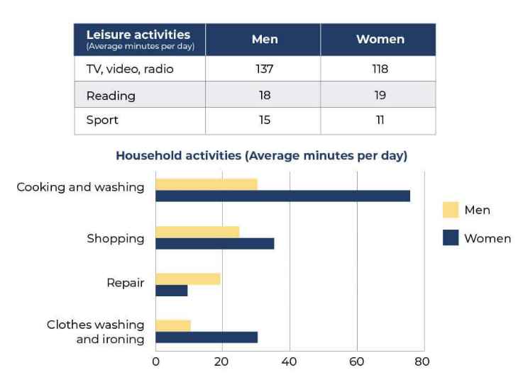
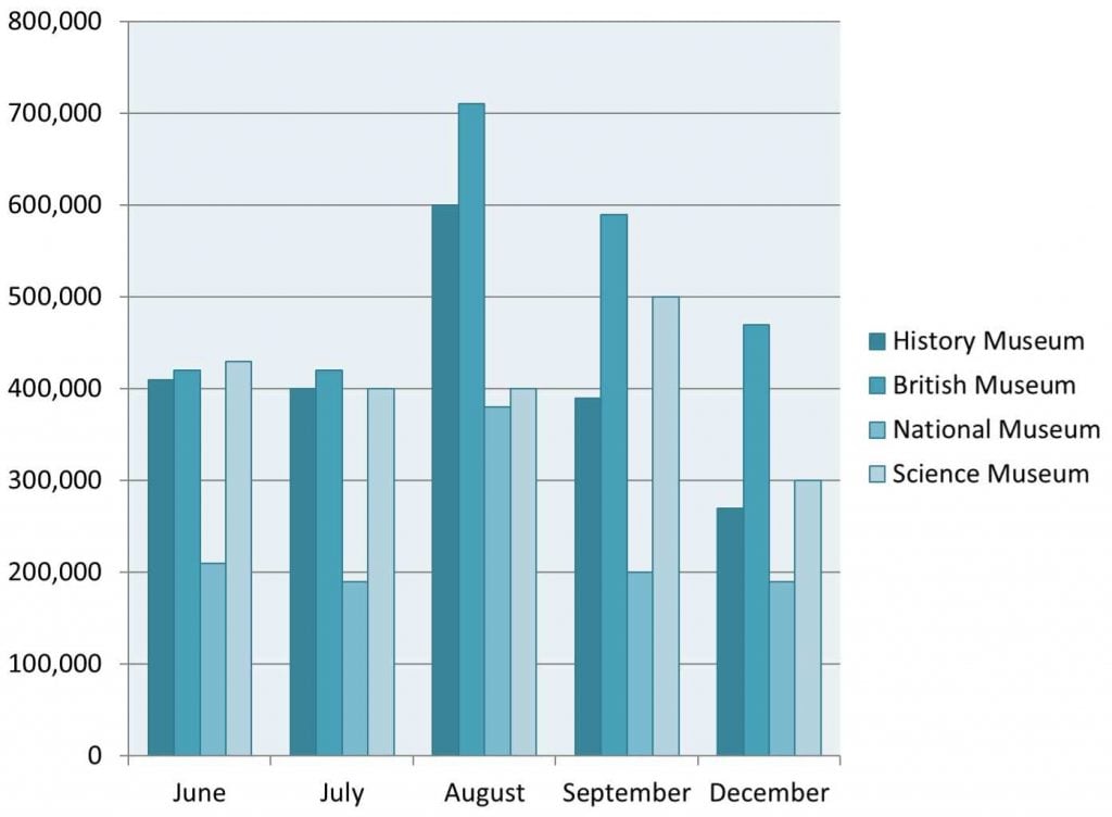
Read my sample for the table and bar chart below here.
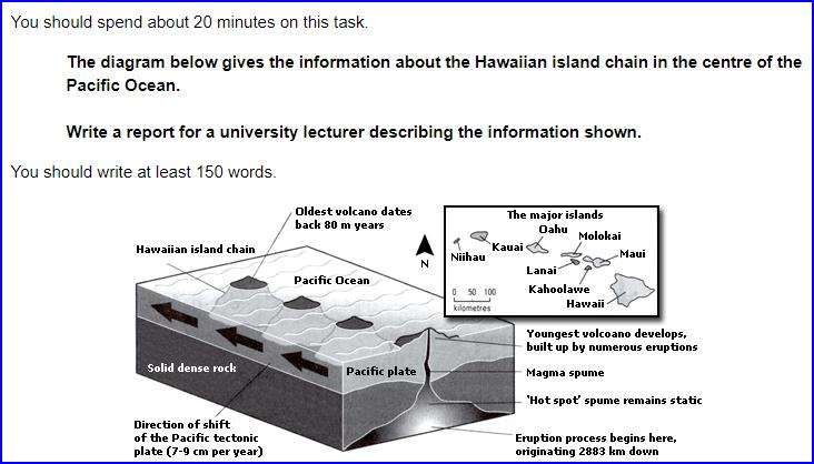
Read my essay here for this IELTS 20 chart.
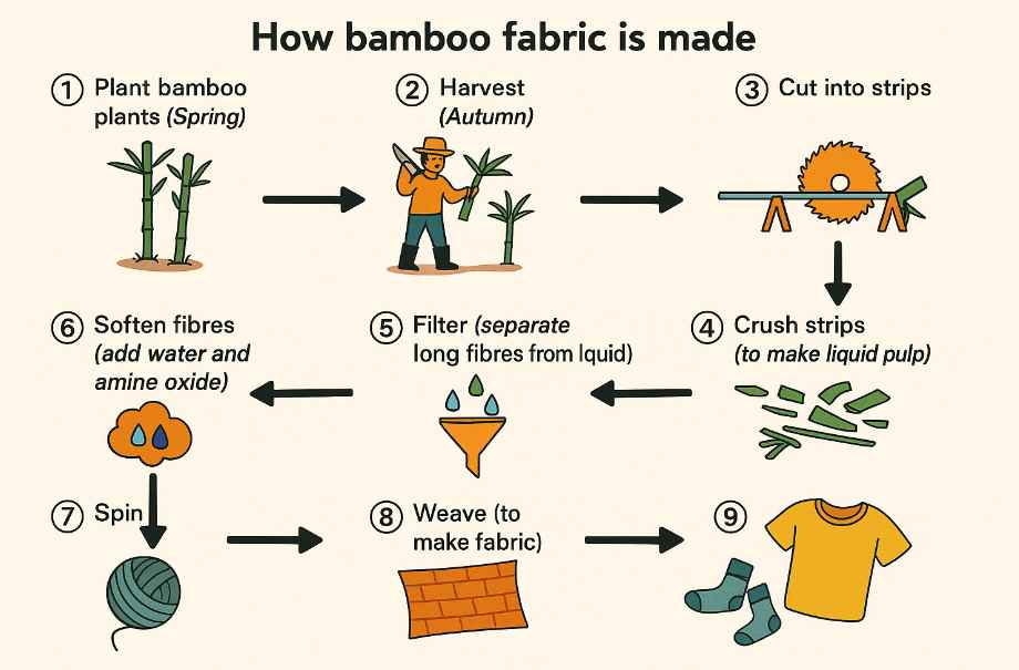
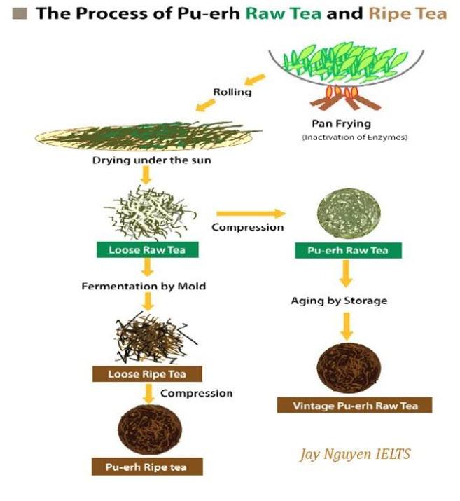
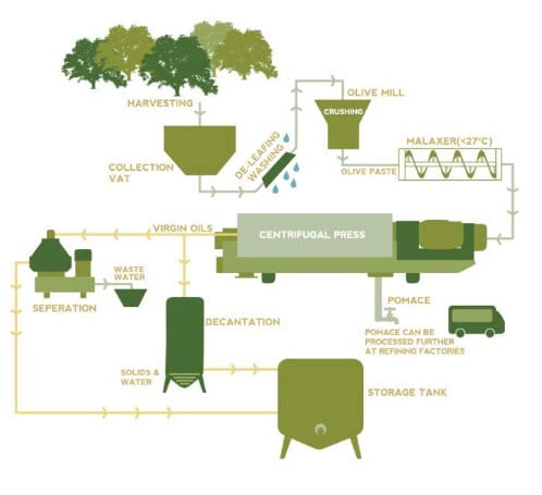
Read my essay for the process below here.
Read my sample here for the Cambridge 20 map below.
My full EBook for the chart below is available only on Patreon.
Sample answer on the way!
Read my essay for the bar chart below here.
Read my sample for the table below here.
Read my sample for the process below here.
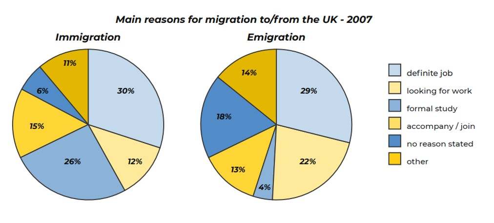
Read my sample for the pie chart below here.
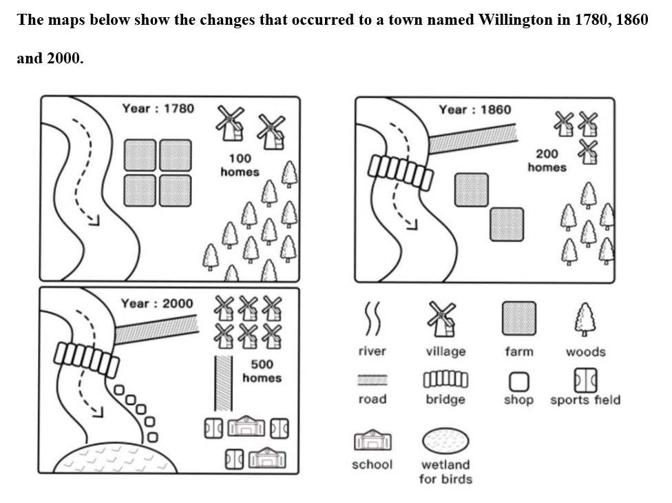
Read my sample answer for the map below here.
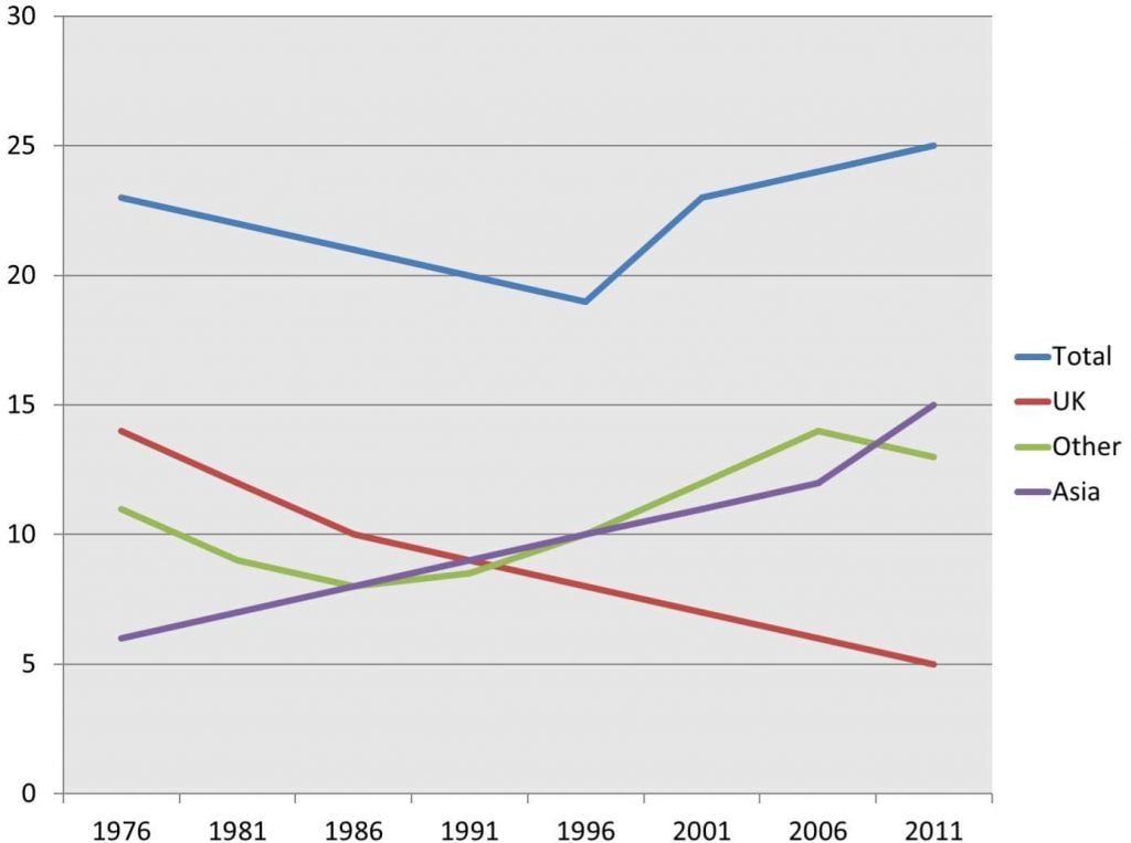
Read my sample answer for the Cambridge 19 line chart below here.
Read my sample for the line chart below here.
Read my sample for the process below here.
Read my sample answer for the chart below here.
Read my sample for the table below here.
Reported on IELTS November 27th
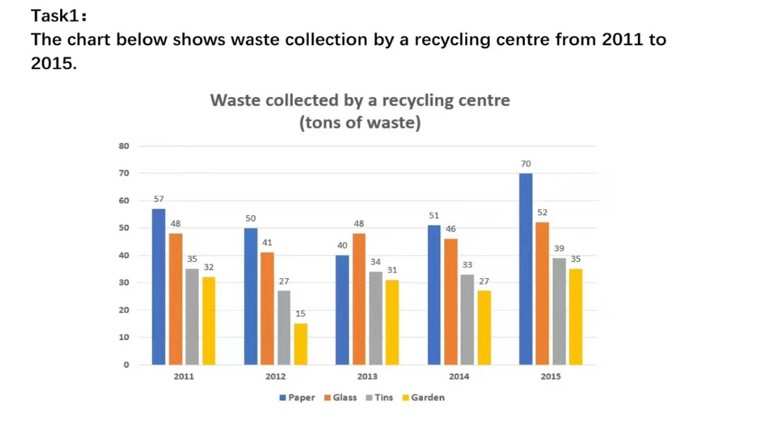
Read my sample for the bar chart below here.
Reported on IELTS November 5th
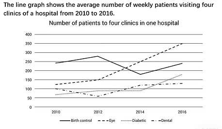
Read my sample for the line chart below here.
Read my sample for the line chart below here.
Read about the line chart below here.
Read about the pie charts below here.
Read about the chart below here.
Read about the line chart below here.
Read about the bar chat below here.
Read about the map below here.
Read my essay for the bar chart below here.
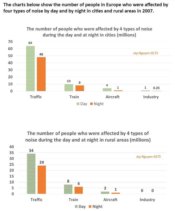
Read my essay for the charts below here.
Read my essay for the line chart below here.
Read my essay for the table below here.
Read my essay for pie charts below here.
Read my essay for the line chart below here.
Read my essay for the process below here.
Read my essay for the map below here.
Read my essay for the bar chart below here.


Read my essay or the process below here.
Read my sample answer for the bar chart below here.
Read my essay for the line chart below here.

Read my essay about this line chart here.
Read my essay for the bar chart and pie chart below here.
Read my essay for the combined pie chart and table below here.

Read my essay for the table below here.
Read my essay for the line chart below here.
Read my sample for the pie charts below here.
Read my sample for the chart below here.
Read my answer for the chart below here.
Read my sample answer for the table below here.
Read my sample for the pie charts below here.
Read my sample answer for this process here.
Read my sample answer for this chart here.
Read my sample answer for the map below here.
Read my sample answer for the process below here.
Read my sample answer for the bar chart below here.
Read my sample answer for the map below here.
Read my sample for this bar chart here.

Read my sample answer for the map below here.
Read my sample answer for this line chart here.
Read my sample answer for this line chart here.
Read my sample answer for the bar chart below here.
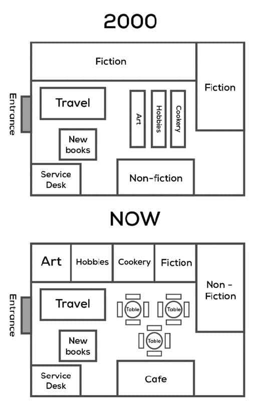
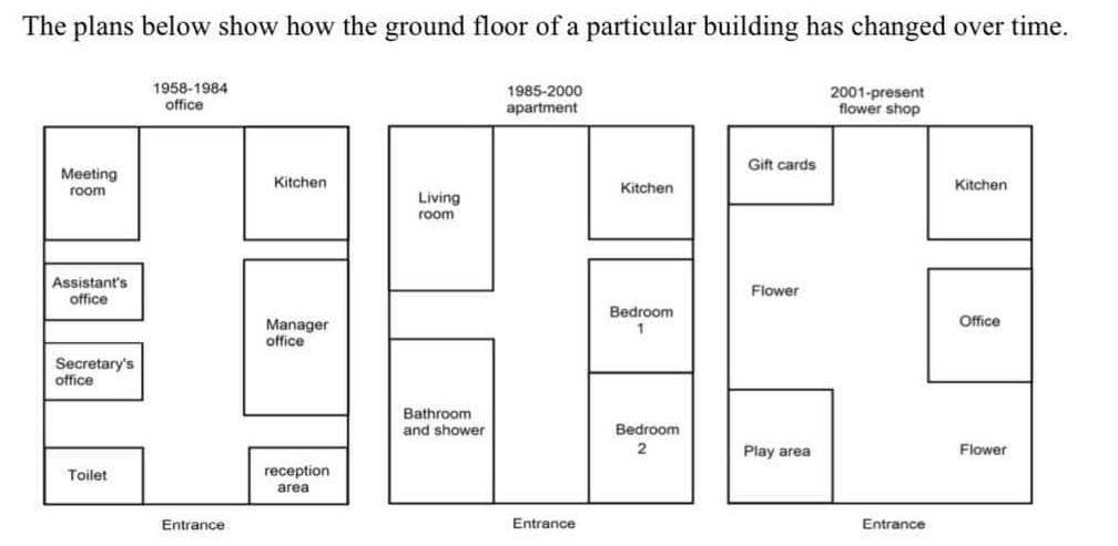
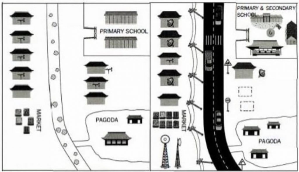
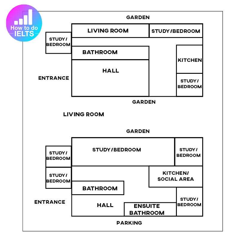
Read my sample answer for the floor plan below:
Read my sample answer for the new bar chart below here.
Read my sample answer for the table below here.
Read my sample answer for this table here.

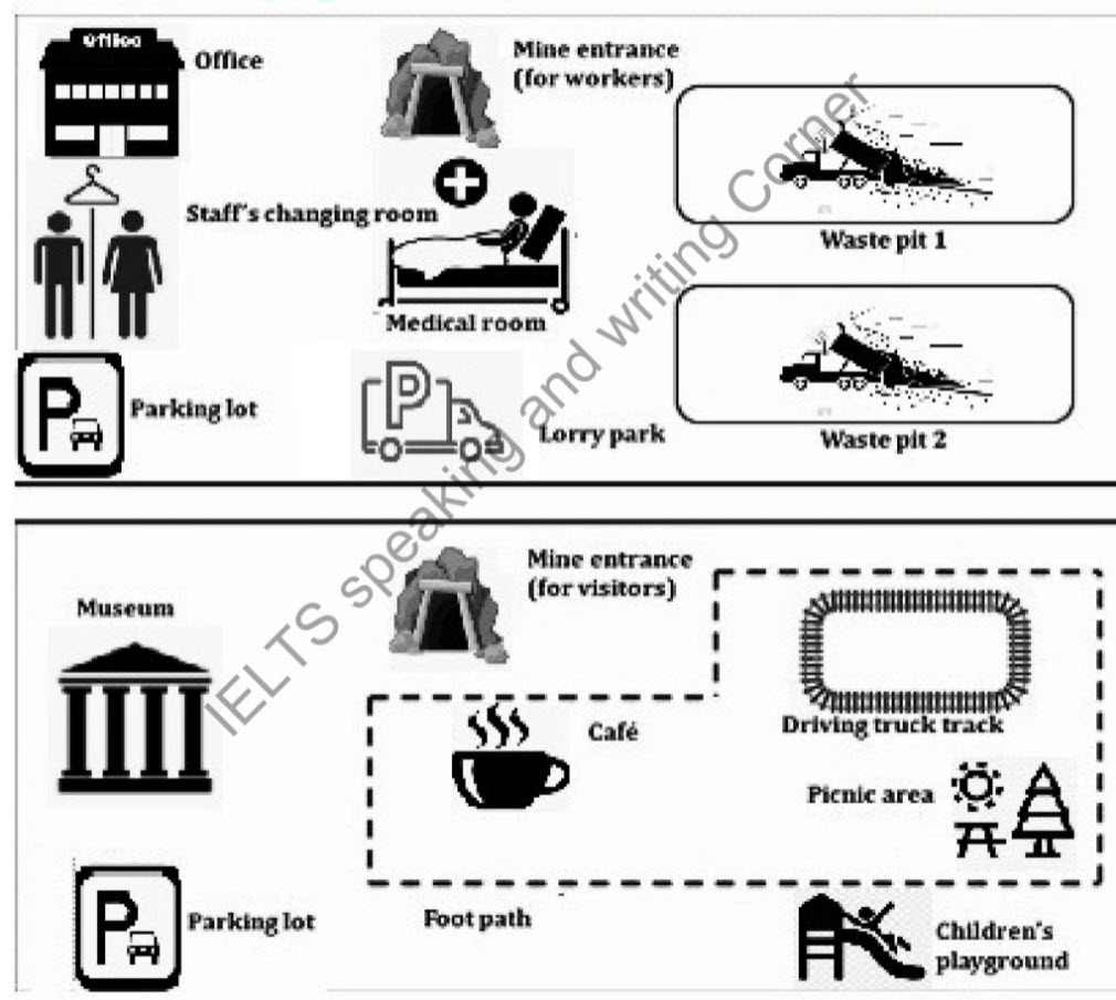
Read my sample answer for this mine map below:
Read my sample answer for this process here.
Read my sample answer for the process below here.
My Ebook for this (really difficult!) chart is only available on Patreon.
Read my sample answer for this question here.
Read my sample answer for this line chart here.
Check with my sample answer here.
Read my sample answer for this chart here.
Read my sample answer for this (unusual) task 1 here.
Read my sample answer for this topic here.
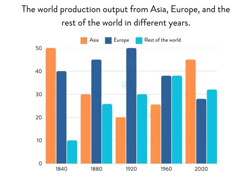
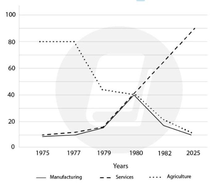
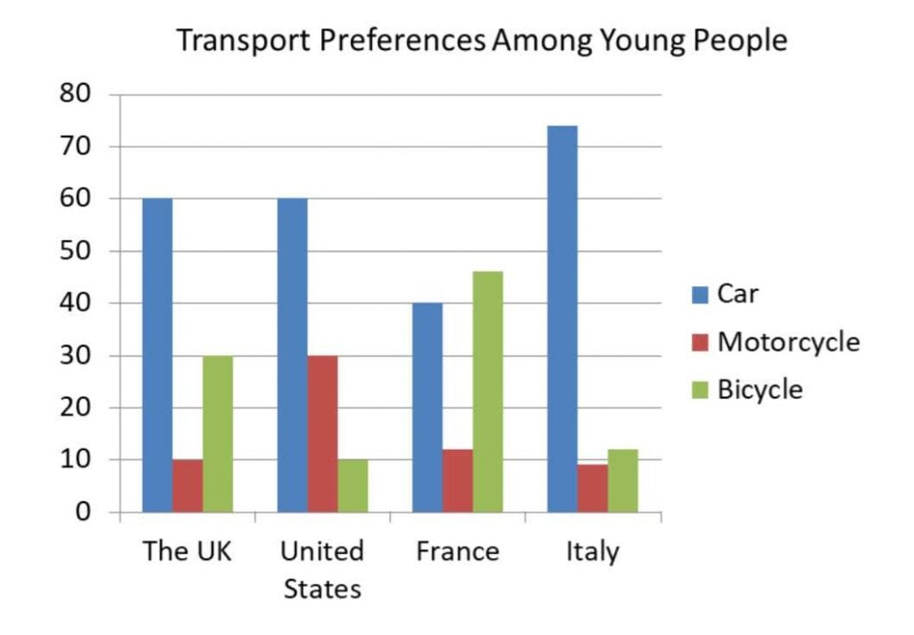
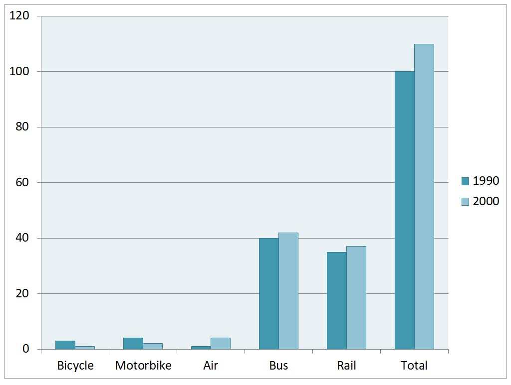
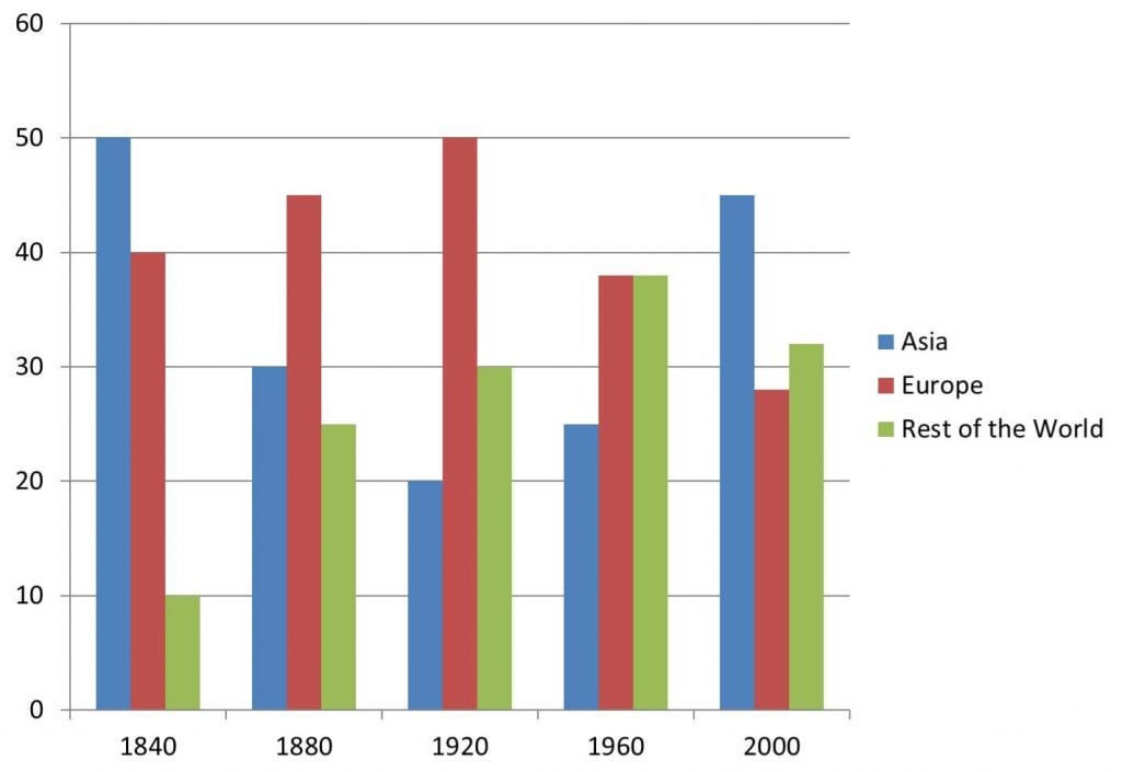
The bar graph shows the total manufacturing production in percentages Asia, Europe, and the rest of the world.
Read my sample answer for this question here.
Read my sample answer for this question here.
Read my sample answer for this question here.
Read my sample answer for this question here.
| $HK billions | 2009 | 2010 | Changes |
| Equipment | 10.3 | 11.6 | 13% |
| Telecommunications | 7.9 | 12.7 | 61% |
| Clothing | 6 | 5 | -17% |
| Manufacturing | 5.5 | 4 | -27% |
| Metals | 2.3 | 5.1 | 122% |
| Overall | 32 | 38.4 | 20% |
Read my sample answer for the floorplan below here.
Read my sample answer for this question here.
Reported on IELTS December 7th
Read my sample answer for this question here.
Read my sample answer for this question here.

Read my sample answer for this question here.
Read my sample answer for this question here.
Read my sample answer for this question here.
Read my sample answer for this question here.
| in 2009 | in 2010 | % Change | |
| France | 76 | 76 | 0 |
| USA | 66 | 67 | 1.5 |
| Spain | 55 | 56 | 1.8 |
| UK | 55 | 57 | 3.6 |
| Italy | 44 | 45 | 2.3 |
| Turkey | 32 | 46 | 33 |
| China | 22 | 34 | 55 |
| Germany | 10 | 24 | 109 |
| Hong Kong | 10 | 9 | -11 |
Read my sample answer for this question here.
Read my sample answer for this question here.
Read my sample answer for this question here.
Read my sample answer for this chart and table here.
Read my sample answer for this question from IELTS Cambridge 15 here.
Read my sample answer for this process/diagram here.
Read my sample answer for this line graph here.
Read my sample answer for this process here.
Read my sample answer for this chart here.
Read my sample answer for this table here.
Read my sample answer for this bar chart here.
Read the sample answer for the table below here.
Read my sample answer for these charts here.
Read my sample answer for this bar chart question here.
I want to make some simple suggestions for how you can use these recent graphs to practice.
To be honest, students get too obsessed with the most recent questions.
You can practice with a question from years ago and a question from yesterday – it makes absolutely no difference.
What makes an actual difference is how you study.
Here is what I recommend:
- Practice writing about a graph in 20 minutes, in test conditions.
- This is your ability. Now, check it by underlining the vocabulary, grammar, data. Are there many grammar mistakes? Do you use the same words over and over? Do you include all the data?
- Now that you know your weaknesses, you can also sign up to have them marked by me here.
- Write about another one focusing on your mistakes. Don’t worry about timing. Take as long as you need to make it perfect.
- Repeat this process over and over until your start to notice your writing improving.
Hope that works for everyone!


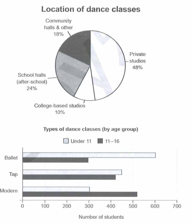
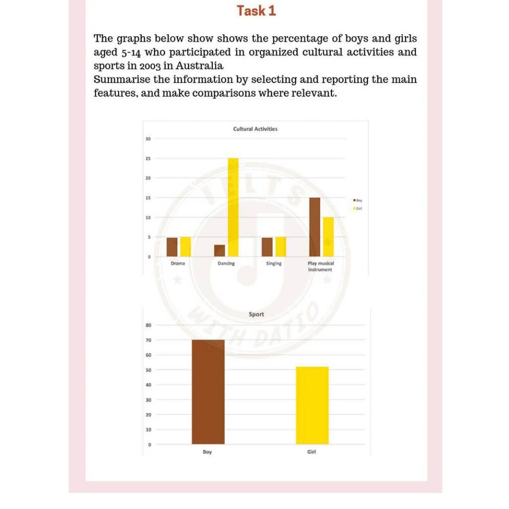
The bar graphs compare the rate of girls and boys between 5-14 years old who were engaged in cultural activites and sports in Australia in the year 2003. Overall, dancing was by far the most practiced activity among girls and the least for boys. Although practicing a sport was quite popular for both gender, it was noticeable higher for male children.
To begin, dancing was the most coveted spare activity for girls, a stunning 25% of them practicing it that year, whilst roughly 3% of boys did it. Playing a musical instrument, on the other hand, attracted a 15% and 10% of boys and girls, respectively, becoming the most popular for male children and adolescents. Drama and singing shared a similar rate, around 5% of all children were enganged in such programs, standing up as the least practiced, with the exception of dancing among boys.
With respect to sports, as expected, the proportion was by far higher for boys than for girls, 70% and 50%, respectively. In comparison with cultural activities, practicing sports definitively was the most predominat type of recreational activity among all children.
Great work! Your overview is clear enough for band 7+! Some small corrections ‘both genders, most common spare time, of boys participated, attrached 15%, being the most, being the least practiced, (take out the as expected bc it is too close to opinion)’
Merci beaucoup! I did not expect an answer, I just was practicing my ability to write a decent report in less than 20mnts. Thanks so much for your feedback, it is of great help. I’m using your site for self-preparation. Your explanations are clear, straightforward and appropriate. Hopefully, with your help (website, videos, blogs), I will hit my desired score. Great day! God bless you!
You’re welcome! What is your desired score? I can give you some more detailed feedback to help you get there…
I’m chasing a 7 in each skill.
You are close! Be careful with prepositions, make sure that your language isn’t too informal and small mistakes with grammar (infinitives, irregular past simple) might bring down your grammar score.
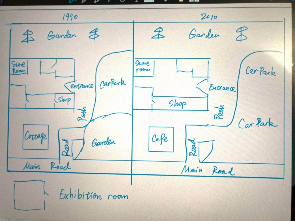
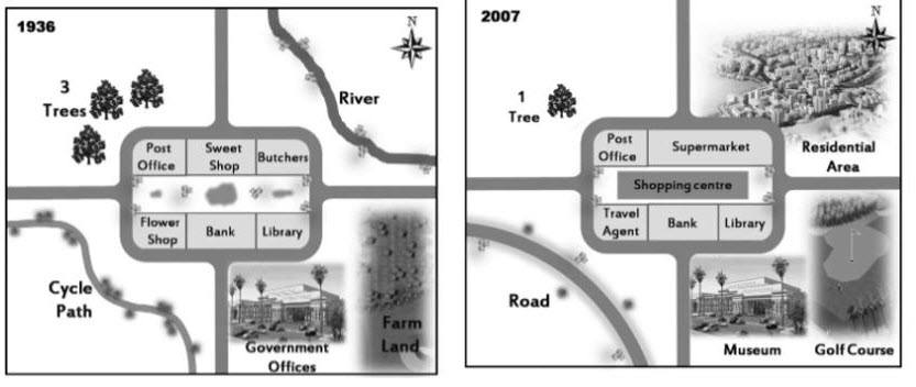
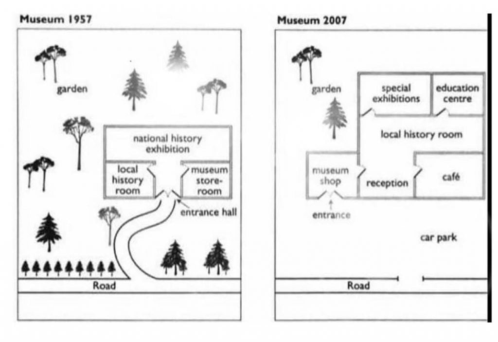
The given maps depict the changes that had taken place on a museum over a 60-year period, starting in 1957 to 2007. Overall, the museum grew in size and the majority of trees were removed in favor of that.
In 1957, there were a bunch of pine trees along the road and also on the museum’s surroundings. The museum facilities were made up just by a storeroom, a local history room and a national exhibition on the top center. Likewise, a straightforward path from the road leaded to the entrance hall.
By 2007, the museum witnessed several striking changes. Firstly, to built up a spacious car park, the path was bricked down and all the trees on the bottom (left-right) were cut down. Secondly, the building itself was enlarged on the north, and a completely new room was erected on the bottom left corner side, where the shop and main entrance were attached. With the exception of local history room , which was relocated on the center, the storeroom and national exhibition were eliminated. These changes allowed the introduction of a reception and cafe on the southern area, and a special exhibition and education center rooms on the north. Finally, the garden was the only element that remained untouched.
Good work again! Some corrections: The given maps depict the changes that took place in a museum over a 60-year period, starting in 1957 and ending in 2007. Overall, the museum grew in size allwoing for more customer focused shops and the majority of trees were removed.
In 1957, there was a grouping of pine trees along the road and also on the museum’s perimeter. The museum facilities were made up of just a storeroom, a local history room and a national exhibition on the top center. Likewise, a straightforward path from the road led to the entrance hall.
By 2007, the museum witnessed several striking changes. Firstly, to erect a spacious car park, the path was removed and all the trees on the bottom (left-right) were cut down. Secondly, the building itself was enlarged on the northern side, and a completely new room was erected in the bottom left corner, where the shop and main entrance are not located. Although the local history room was relocated to the center, the storeroom and national exhibition were eliminated. These changes allowed for the introduction of a reception and cafe on the southern area, and a special exhibition and education center rooms in the north. Finally, the garden was the only element that remained untouched.
Merci beaucoup monsieur! You’re right, after sending my draft I realized I had made quite a few grammar mistakes. To be honest, I always fight against preposition, specially those indicating “place”. I cannot identify when I need to use: IN, ON, TO when it comes to giving directions. As you can see: I used “on the north” instead “in the north” , or use the adjective “northern” without a noun. Please, suggest us a good grammar book to follow . Salut!
Sometimes prepositions are more like vocabulary than grammar. We always say ‘in’ not ‘on’ the north – just something to memorise! You can try this website: https://grammar.yourdictionary.com/parts-of-speech/prepositions/rules-for-prepositions.html
I also suggest keeping a list from my sample answers of the correct prepositions and using the list when you practice until you feel you have memorised them and no longer need the list. Good luck!
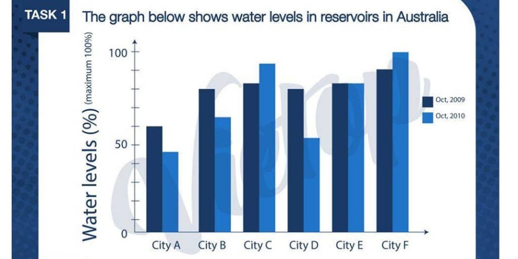
The given bar graph illustrates the levels of water in reservoirs in five Australia’s cities in 2009 and 2010. The data is measured in percentages.
Overall, the levels of water witnessed a significant decrease in city A, B and D, whilst city C and F showed a slight rise throughout the period.
In 2009, cities B, C, D and E shared a similar water levels around 70%. By contrast, city A stood out as that with the lowest levels at 50% and city F showed the highest ones at just above 80%.
With the exception of city E, which remained the same at 80%, all cities’ water reservoirs experienced changed by 2010. City C and F levels went up to just above 82% and approximately 99%, respectively. On the other hand, city D levels went down significantly from almost 70% to approximately 52%. The same occurred to city A and B, whose water rates dropped nearly 20%
Nice job again! The most important part is to be sure that you give some kind of overall ranking in terms of your overview as well.
Here are some small edits: “The given bar graph illustrates the levels of water in reservoirs in five of Australia’s cities in 2009 and 2010 in percentages. Overall, water levels witnessed a significant decrease in city A, B and D, whilst city C and F showed a slight rise throughout the period. City F had the highest water levels throughout while City A was consistently the lowest.
In 2009, cities B, C, D and E shared similar water levels at around 70%. By contrast, city A stood out as that with the lowest levels at 50% and city F showed the highest ones at just above 80%.
With the exception of city E, which remained the same at 80%, all cities’ water reservoirs experienced changes by 2010. City C and F levels went up to just above 82% and approximately 99%, respectively. On the other hand, city D levels went down significantly from almost 70% to approximately 52%. The same occurred to city A and B, whose water rates dropped nearly 20% a piece.
Thanks so much for your helpful feedback. I will soon sit the test, hopefully I will hit a high score.
Merci!
I really hope you do well on it! Be sure to write me a message to let me know how it turned out!
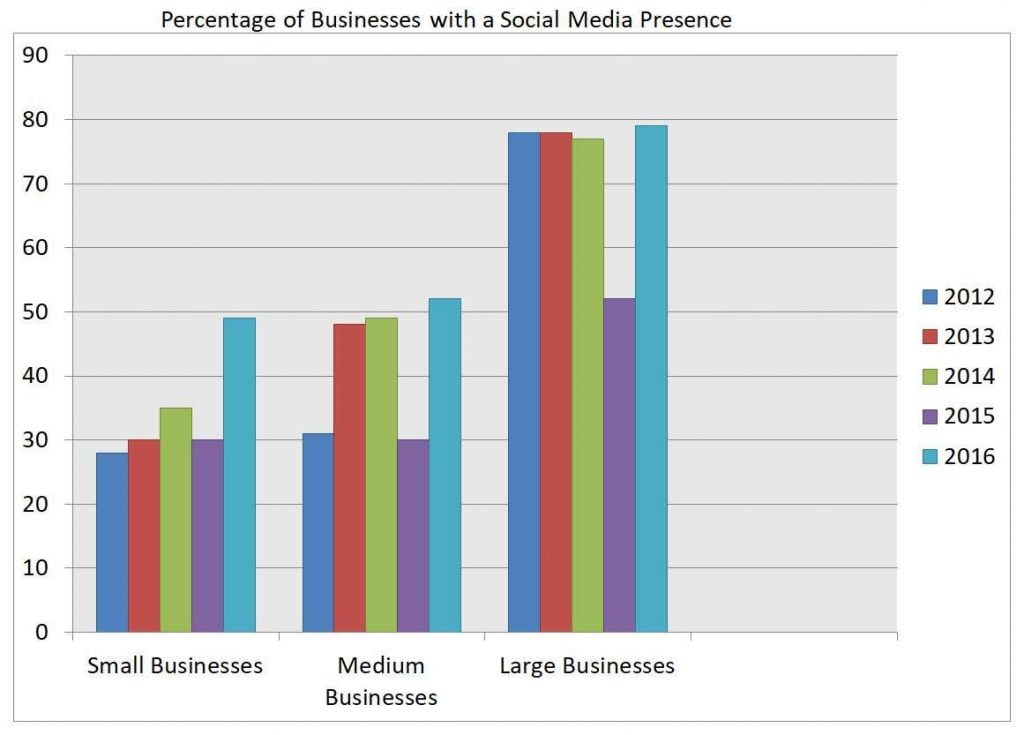
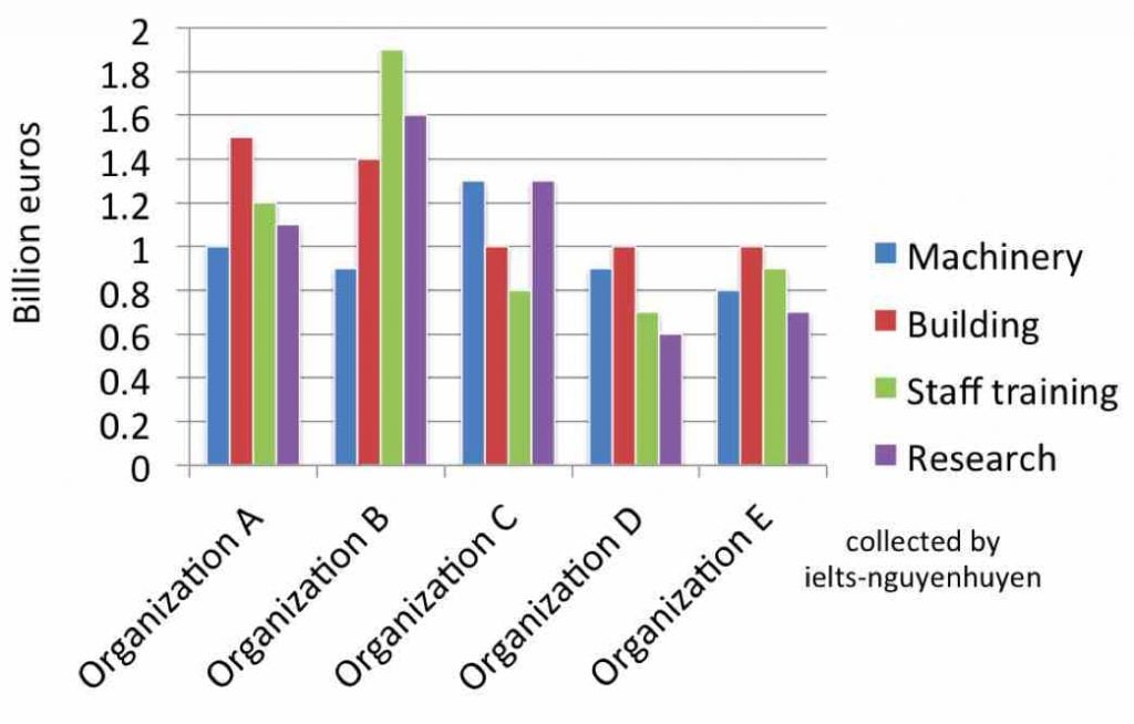
The rendered bar graph illustrates the information about the organisation A-E those spent billions of euros on machinery , building,staff training and research section.
One glance is enough to say that maximum euros was spent on staff training while the minimum euros was spent on research activity.
It is evident from the graph that organization A was spent 1 billion euros on machinery . This value increased substantially at 16 billion euros by organization c then organization D and E invest less euros on machinery and it was reached at approximately 0.8 billion euros. Moreover ,on building had been spent 1.3 billion euros by organization A and there was non-noticeable decrease on building almost 1.4 billion erros by organization B . After that organization C,D and E had spent equal amount that is 1 billion euros on building area.
Moving further, staff training was invested the highest amount that is 1.9 billion euros by organization B. There after , this value was declined by organization C ,D and E. However, organization B had invested nearly 1.6 billion euros on research section whereas , organization D and E was spent least amount on research area that is 0.7 billion euros.
Great work Navneet!
Some corrections:
The rendered bar graph illustrates information about organisations’ A-E spending in euros on machinery , building,staff training and research.
One glance is enough to say that maximum euros was spent on staff training while the minimum euros was spent on research activity.
(That phrase is too informal – better to say ‘Overall’, your overview must also touch on all areas and have a little more detail to get at least band 6 for task achievement.)
It is evident from the graph that organization A was spent 1 billion euros on machinery . This value increased substantially at 16 billion euros by organization c then organization D and E invest less euros on machinery and it was reached at approximately 0.8 billion euros. Moreover ,on building had been spent 1.3 billion euros by organization A and there was non-noticeable decrease on building almost 1.4 billion erros by organization B . After that organization C,D and E had spent equal amount that is 1 billion euros on building area.
(This graph does not show increase or decrease over time. It just shows 1 time period so try to compare the data and forget about it going up or down.)
Moving further, staff training was invested the highest amount that is 1.9 billion euros by organization B. There after , this value was declined by organization C ,D and E. However, organization B had invested nearly 1.6 billion euros on research section whereas , organization D and E was spent least amount on research area that is 0.7 billion euros.
(Good working describing most of the data but remember to compare for this type of graph, not show increase/decrease.)
Read more about graphs with no change over time here:
https://howtodoielts.com/ielts-writing-task-1-analyse-tables-not-over-time/
Sir, can u check my sentence formation in this task because if i realize my mistakes then i will continue this….
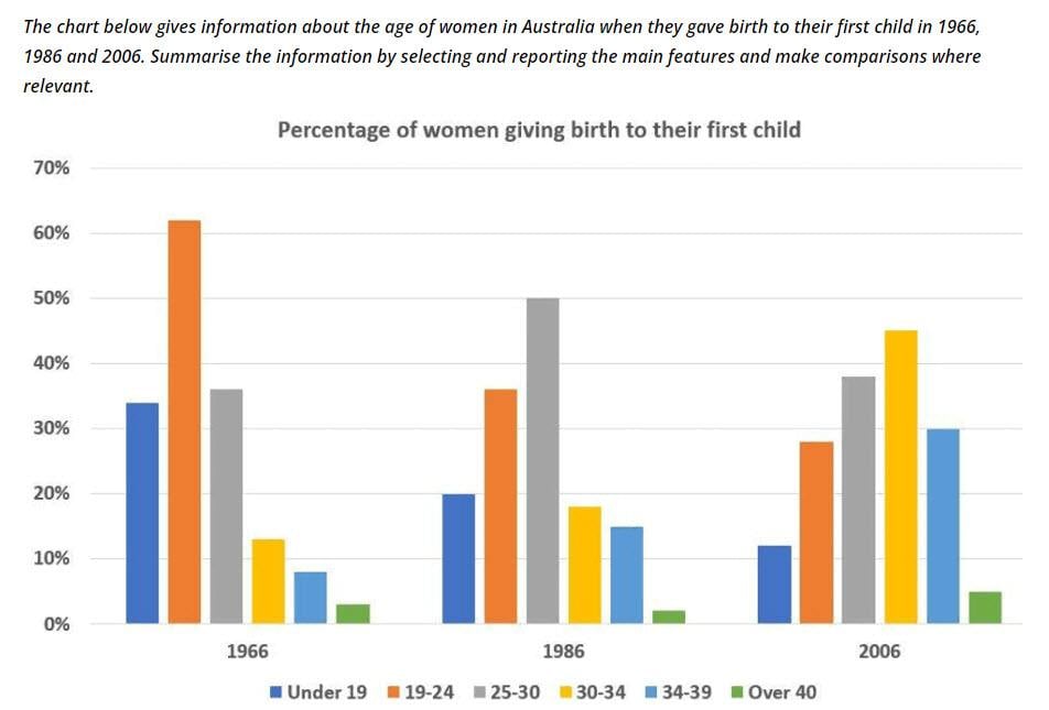
The rendered bar garaph illustrates the information about the percentage of women age in Australia since they gave birth to their first child in 1966,1985and 2006.
Overall,the maximum percentage of women was observed in younger age while ,the minimum percentage was calculated at older age in the whole period.
It is vivid from the graph that 19 and under aged women gaved the birth of 33%of chlid in 1956 wheras, this percentage decreased to 25% and 18% in 1986 and 2006 respectively.
Sure!
Some corrections:
Overall,the maximum percentage of women observed were younger age while the minimum percentage was calculated at older ages over the whole period.
It can be seen in the graph that… gave birth to…
Good start!
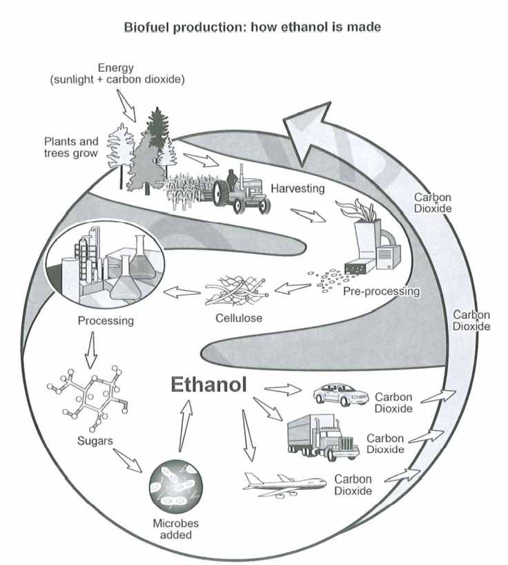
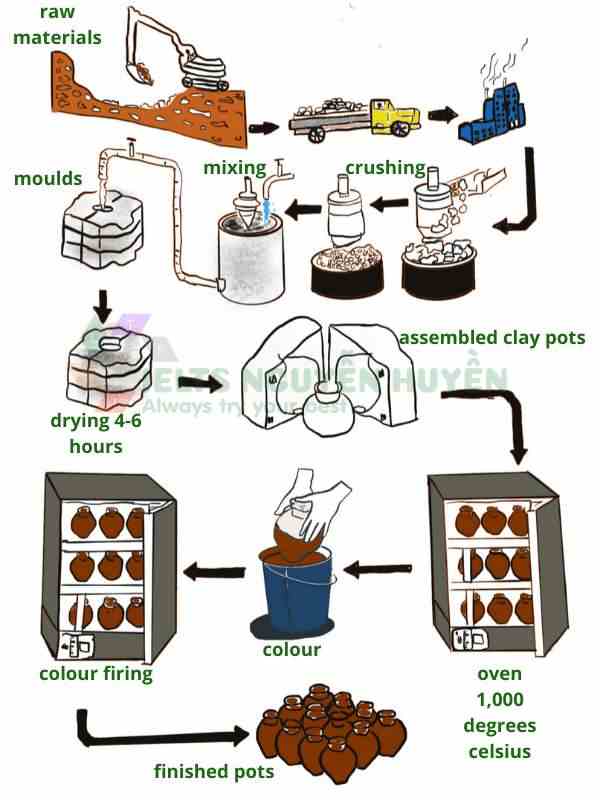
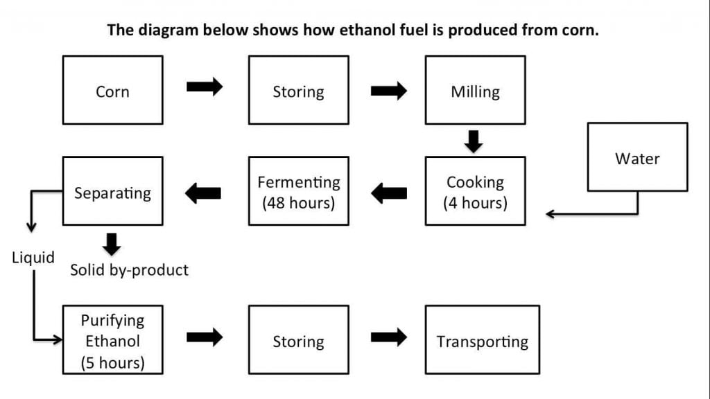
The given diagram illustrates the process, and its different steps, to produce ethanol fuel from raw corn. Overall, there are eight stages involved in the production of this renewable fuel, starting with corn storing and ending with its transportation to the public market.
First, the process initiate with having enough raw material (corn) for the ethanol production purpose. This corn is stored for a while, then it is milled profusely. Without delay, the milled corn is immediately mixed with water, to be then cooked it for exactly four hours. Shortly after, it is kept sealed in containers for up to 48 hours, allowing it ferments sufficiently.
Once the fermetation have finished, the liquid and the solid by-product are neatly separated, and the former undergone a purified procedure for five long hours. The ending product is purified ethanol, which is stored for an undefined time. Finally, the ethanol fuel is ready to be transported to its different destinations.
Good work again! Some correctins: ‘The given diagram illustrates the process, and its different steps, to produce ethanol fuel from raw corn. Overall, there are eight stages involved in the production of this renewable fuel (don’t need to include the number of steps in your overview), starting with corn storage and ending with its transportation to the public market.
First, the process initiates with having enough raw material (corn) for the ethanol production. This corn is stored for a while then it is milled before being mixed with water, to be then cooked it for exactly four hours. Shortly after, it is kept sealed in containers for up to 48 hours, allowing it ferments sufficiently.
Once the fermetation has finished, the liquid and the solid by-product are neatly separated and the former undergoes a purified procedure for five long hours. The ending product is purified ethanol, which is stored for an undefined amount of time. Finally, the ethanol fuel is ready to be transported to its different destinations.
A couple things: stay away from opinion/speculation like profusely, immediately, etc.
For your overview, try to group and define the stages – don’t need to say the number of stages.
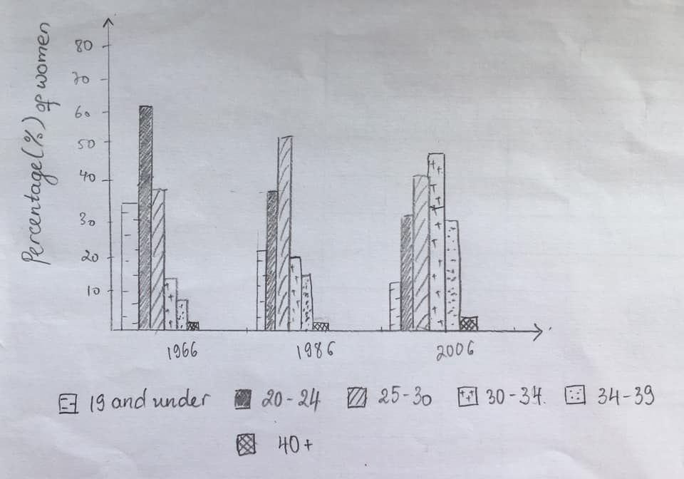
The graph illustrates the percentage of women in different age groups in years 1966, 1986 and 2006. The first age group of 19 and under was the highest in year 1966 at 35% and the lowest in year 2006 at 15%. In year 1966, the percentage of women who were 20-24 years old was 60%, which is more than both in 1986 and 2006. The age group of 25-30 years was 50% in 1986 and it was higher than both 1966 and 2006. The percentage of women in the age of 30-34 years has been increasing steadily since 1966. It was 15% in 1966, 20% in 1986 and 45% in 2006. Its rise is opposite to 20-24 age group, which declined between 1966 and 2006. Another age group that has been on the rise is the 34-39 years, as it was 5% in 1966, 15% in 1986 and 30% in 2006. Both age groups of age 30-34 and 34-39 have grown in percentage between 1966 and 2006. The last group of women aged 40 and above has remained the lowest among all the age groups.
Well done! Some corrections:
Your grammar is very accurage but it is a little mechanical because you don’t compare and most importantly there is no general overview so your maximum score is band 5 for task achievement even though all the data is accurate!
https://howtodoielts.com/ielts-writing-task1-band-7-overview/
Hi Dave,
thank you so much for your feedback man!!
I gave the test and got a 7 on written, and 8 overall.
thank you so much for you help 🙂
have a great year ahead!!
lovepreet
Thanks for letting my know – congrats on your score!
The given bar graphs depict the proportion of 5-14 males and females’ age group joined the cultural activities and sport in Australia in the year 2003. Overall, it is clear that most boys were more athletic and played a musical instrument, while girls were fond of dancing than boys.
Boys were more attracted to a sporting event, at 70%, while the figure for girls who participate was just above 50%. However, when it comes to cultural activities, female dancers recorded the highest percentage in the graph at 25%, compared to a marginal number of males at just 3%.
Almost identical figures for both genders can be seen in singing and drama with only 5% of them participated in these categories. Playing a musical instrument is the category that the same genders had the interest to do. Most participants came from a group of boys at 15%, compared to just 10% for girls.
Thanks for commenting!
Here are some corrections:
The given bar graphs depict the proportion of 5-14 males and females’ age group joining cultural activities and sport in Australia in the year 2003. Overall, it is clear that most boys were more athletic and played a musical instrument, while girls were fond of dancing than boys.
Boys were more attracted to a sporting events, at 70%, while the figure for girls who participated was just above 50%. However, when it comes to cultural activities, female dancers recorded the highest percentage in the graph at 25%, compared to a marginal number of males at just 3%.
Almost identical figures for both genders can be seen in singing and drama with only 5% of them participated in these categories. Playing a musical instrument is a category that interested both genders. Most participants came from a group of boys at 15%, compared to just 10% for girls.
Good work! Did you mention all areas on the graphs in your overview?
Yes, I mentioned it all. Sorry, this is my first time practicing a timed task. What would be my possible score if you will base in my answer? Thanks!
Your score is in the band 6.5/7 range in terms of language ability. What score are you going for on the exam?
My target is above 6.5 in writing. Hoping that I can achieve that band score. Thank you!
Keep up the hard work!
The diagram reveals the way of producing ethanol fuel from corn. Overall, it is clear that there are eight stages in the process, beginning with the corn harvest, fermentation and transition of corn into a liquid, to the transportation of the product made.
In the first stage of making purified ethanol is storing the corn before it undergoes milling. The milled corn is then added by water and cooked for 4 hours. After that stage, corn will be fermented for 48 hours. Separation of solid to liquid is the next step. While the solid by-product is not needed after the transition process, the melted corn is then kept.
In the subsequent stage, the melted corn product goes through a purification process. This process takes 5 hours to be able to produce purified ethanol. Storing of the made ethanol fuel product is the next step. Finally, ethanol fuel is transported to its destination.
Good overview Jessica!
Really good accuracy with your passive verbs – you are well within your target band scores range!
Thank you so much! Im a bit confused if what kind of tense should I use in diagram task?
For a diagram it should be mainly in the present and present passive, maybe some present perfect!
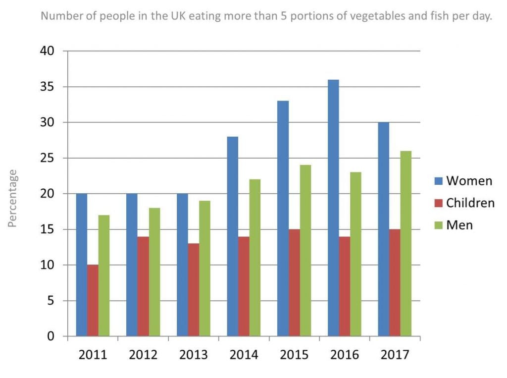
The bar graph give information on percentage of water level in reservoirs in six different Australian cities in October 2019 and 2010.
Overall, the greatest water level always was in city B and city F and increased , moderate for for city B and city D where decreased and for city E, where remainded the same, while the lowest for city A where decreased over the year.
Water level in city F and city C in 2009 was at 90% and 80% respectively and grew for both by 10% in 2010.
On the second position in case of resevoired water in 2009 was city B and city D with the figure of 80% which diminished to 65% and 50% respectively in 2010.
Although water level of city E was similar in 2009 to those of in city B and city D, it remained on the same level in 2010.
The modest water level was in city A.
For this city we can spot a drop from 60% in 2009 to 45% in 2010.
Well written, Iza!
Be careful with helping verbs. You don’t need to say ‘was increased’ just ‘increased’
Good work describing the full trend for your overview!
You need clearer paragraphs though – take a look here to see some examples: https://howtodoielts.com/category/writing-task-1/academic/
Keep working hard!
Hii Dave.. I really want your possible score on this writing task 1..
Hi Saini/Iza, this essay is in the band 5 range at the moment.
Hii Dave
Thank you!
But do you think it deserves 7 band?
The given bar graph illustrates that in the year 2003,the proportion of Australian boys and girls aged 5-14 participates in cultural as well as sports activity.. Overview the dancing activity was most favorable cultural activity shown by girls in comparison to boys.. The boys preferred more sports, although it was quite popular in both the gender….
To begin with, it can be clearly seen that, the percentage showed big difference in dancing activity, which was 25% girls participate in it, whereas there was less than 5% boys in same activity.. By contrast, the proportion of boys were 70% in sport which was highest rates…
Probing further, the drama as well as singing activity received the similar percentage 5% by both the gender in the year 2003, respectively.. Moreover, in the play musical instrument ,one in ten girls participated which was 5% inclined by boys in the Australian…
Thanks.. Dave I really want your response on this
Good work Saini!
Try copying some expressions from my sample answers more closely such as ‘Overall,’ instead of ‘overview.’
Don’t use … – that is too informal. Just use a period.
You are experimenting with a lot of new grammar and vocabulary which is good but you need to focus more on accuracy as it is quite hard to understand at times. Keep it up!
Thank you for your response.. What score I can get according to you on this task 1
This answer is i nthe band 5 range at the moment.
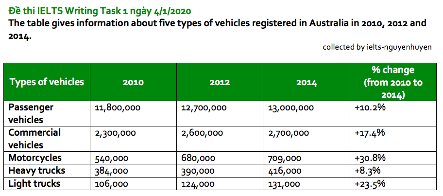
The table shows the details of five different kinds of vehicles registered in Australia in the years 2010, 2012 and 2014. Overall, it is clear that all types of vehicles increased in percentile over the given period in which the percentage for motorcycles had jumped most. It could be noticed also that passenger vehicles got the highest numbers while light trucks were the lowest.
A glance at the graph reveals passenger vehicles started from 11,800,000 units in 2010, rose almost a million over 2 years, then climbed to 13,000,000 in 2014, accounting for 10.2% over the period. Similarly, commercial vehicles uplifted to 17.4% from 2010 to 2014. In the first year, 2,300,000 were recorded, increased to 2,600,000 in 2012, before reaching 2,700,000 in 2014.
A most striking positive change can be seen in the proportion of motorcycles which is 30.8%. It started from 540,000 registered motorcycles in 2010 then rose dramatically to 680,000 and 709,000 in 2012 and 2014 respectively. Meanwhile, an almost identical positive trend can be seen in the numbers of heavy and light trucks. A marginal upward movement from 384,000 to 416,000 at 8.3% over 4 years for heavy trucks can be considered while a significant escalation at 23.5% is remarkable in the number of light trucks.
Good work!
given period and the, motorcycles jumped the most, it can also be seen that, had the, commercial vehices grew to, increating to 2,600,000, can be observed while
Keep it up!
The bar chart provides data on the water levels of reservoirs in six Australian cities from 2009 to 2010. Overall, city F recorded the overall highest levels, closely followed by city C and E, while the percentages of city A were the lowest in both Octobers. some cities, such as F and C recorded higher water levels in 2010 compared to 2009, whereas the remaining cities showed a reversed pattern except city E with both numbers leveling up.
Looking in more details, city F stood at 90 per cent in Oct, 2009 and climbed to nearly 100% in 2010, which was the highest among all. Likewise, city C experienced a considerable growth from just over 80 per cent to approximately 91% in the next year.
In contrast, city B and D showed a decline in water levels, from identically 80% to around 62% and 50% respectively. Figures of city A also dropped considerably from 60% to about 45% by 2010. The water level of city E was just above four fifths in 2009, and this number remained unchanged in the following year. (180 words)
Really nice writing again, Jing!
The chart presents data on the percentages of Australian children aged between 5 to 14 who join cultural activities and sports in 2003. Overall, sport was way more popular than cultural activities for both genders, while boys were more active than girls. A Lot less children participated cultural activities though the number of girls who danced stood out. Except for those who play musical instrument, the remaining culture activities only attracted a minimal amount of children.
Looking in more details, over half of female students joined sports, however the percentage of active boys was even higher at as much as 70%. Likewise, there were more boys who played musical instrument than girls, at 25% and 10% respectively. In contrast, Dancing was substantially more popular within girls, attracting a quarter of females compared to merely approximately 3% of males. Besides, both boys and girls showed least interest in drama and singing with only 5% in turn of either gender group did those activities. (162 words)
Good work Jing!
Be careful with your tenses, prepositions and fixed expresssions: Looking in more detail…
Keep it up!
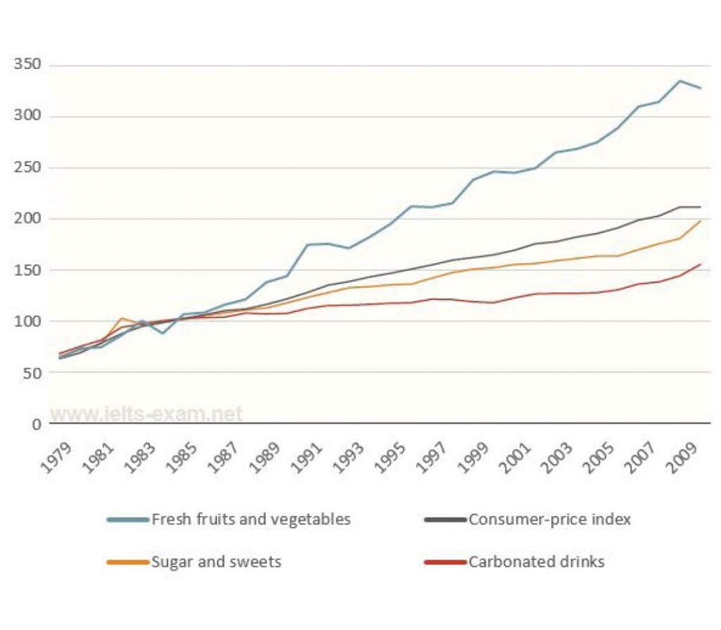
The line chart compares the priced of fresh fruits and vegetable, sugar and sweets as well as carbonated drink from 1979 to 2009. Overall, even though all categories started off at broadly identical prices, the growth in fresh fruits and vegetables overweighed consumer-price index by a massive margin, while the rest displayed a much slower upward trend.
Looking in more details, sugar and sweets closely following consumer-price index, showed a slow yet steady growth throughout the thirty-year period. The price of soft drinks, however, remained stable after a surge in 1984 at around 115 until 1999, when the price rose again slowly.
In contrast, there was a substantial growth in the price of fresh fruits and vegetables over the given period, which, despite a dip to about 90 in 1984 and some fluctuations, rose significantly from just above 50 in 1979 to nearly 350 by 2009. In fact, the price only levelled out temporarily between 1990 and 1992 and again from 2000 to 2001.
(164 words)
Good!
drinks, outweiged, followed, showing, inclue more data in the second paragraph!, levelled off
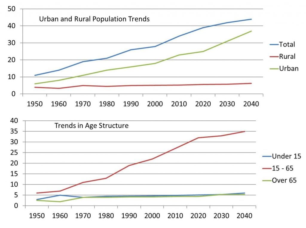
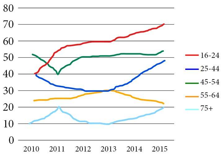
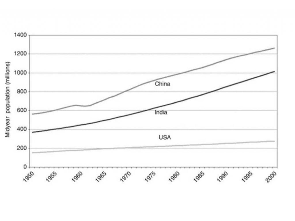
The line graph provides information on the number of middle-aged citizens in three countries over a 50-year period between 1950 to 2000. Looking from an overall perspective, this particular age group had grown at a broadly comparable pace in China and India, with Chinese midyear crowd continuously outnumbering that of the India’s, while the midyear population in USA also increased, but by a comparatively small margin over the years.
Looking in more details, Chinese mid-aged population started off the highest among three countries at just below 600 million in 1950, which outnumbered that of India by about 200 million, and USA by 400 million. Despite a short period of stability at approximately 620 million from 1960 to 1965, the number of China surged as rapidly as India’s. By the end of the period, the figures of China and India had reached 1200 million and 1000 million respectively. The increase of the US mid-agers, on the other hand, was relatively gentle. By 2000, the number of USA had risen slightly to only about 280 million, which was almost lower than the leading country’s by 1000 million. (185 words)
Good Jing!
You tend to overuse past perfect when you could just use past simple: grew
You use it correctly in your last sentence though!
Smaller margin, among the, numbers for China, US middle-aged residents
dear admin i would like to express my great appreciation for your hard work in collecting and answering all these samples, good job! i found your sample answers highly useful as well as being professional. please proceed with your work in assembling the latest task 1 questions.
Thanks so much, Homa – I really appreciate that!
I wish I could publish the task 1 essays as regularly but it is much harder for students to remember the graphs from the exam.
But I will continue to publish any task 1s that I get reports on!
Thank you very much for your efforts and your time to help all the students who are preparing themselves for the IELTS. I do really appreciate that.
I’ve just started preparing myself for the IELTS exam and this is my first writing attempt.
The graphs illustrate the rate of boys and girls who participated in organized sports and cultural activities
aged 5-14 in 2003 in Australia.
Overall, girls participation showed an upward trend in the cultural activities,while boys showed a dwonward in many activities.
Both boys and girls participation experienced some fluctuations in both activities, although boys had initially a lower participation
percentage, but they outraced girls in the end.
Boys rate was less than 5 percent in drama activities which was so close to girls rate, then it kept decreasing to
almost 3 percent in Dancing activities which is the lowest rate of all activities. the rate showed a gradual increase in singing
activities by approximately 2 percent, and it showed a significant raise to 15 percent in playing musical instrument.
Eventually boys outraced girls in sports activities hitting a high-point of 70 percent, which is the highest perentage
of all the period.
percentage of girls who participated in drama was as low as the percentage of girls who participated in singing activities,
then the rate showed a significant increase of 25 percent in dancing activities, it decreased by 15 percent in play musical
instrument. and it kept increasing to almost 52 percent in sports activities which is the highest percentage of all acitivities.
Thanks for saying that Madjid!
Careful of some informal words like outraced and try to be a little more accurate: significant rise, musical instruments, which was, etc.
Some simple mistakes but a great first effort!
Your overview is good too – keep working hard!
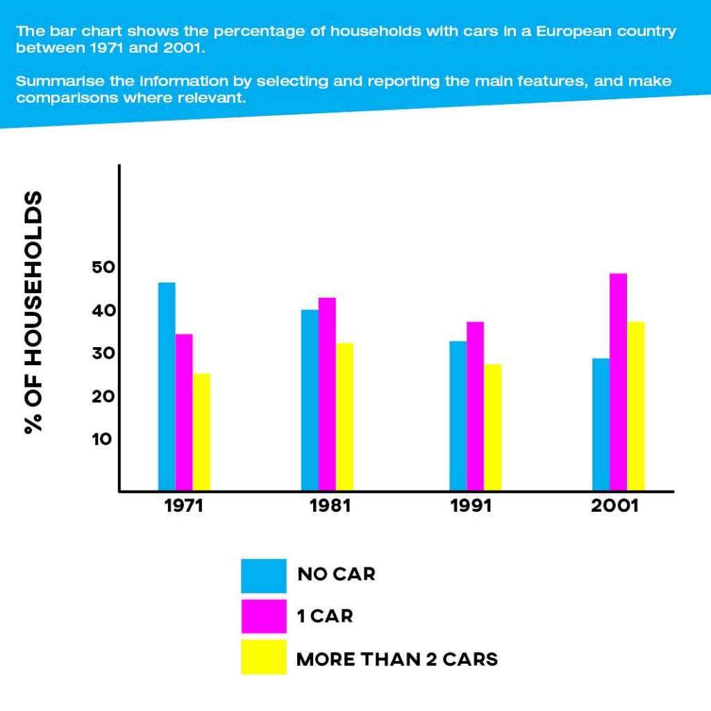
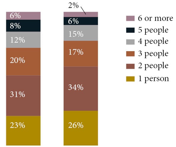
The bar graph compares the proportion of people living in households in the UK between 1981 and 2001. Overall, it is clear that households consisting of more people deteriorated while homes with fewer persons increased. The percentages for the two middle groups oppositely changed by the same margin.
A glance at the graph reveals that proportions for 1 and 2 people households both escalated by 3%, at 26% and 36% in 2001 respectively. These figures were the highest over the given period. An identical trend can be seen in the percentage of 4 people houses, it jumped from 12% to 15%.
On the other hand, the proportion of houses with 6 or more people plummeted from 6% to 2%, and 5-people homes percentage just dropped a quarter, from 8% to 6%. These two figures with the lowest percentages in 1981 remained at their place in 2001. Similarly, the figure for 3 people houses also fell by 3% over 20 years.
Well written Jessica!
‘Deteriorated’ has a negative connotation so I wouldn’t use that word.
Really nice linking and comparison in your writing!
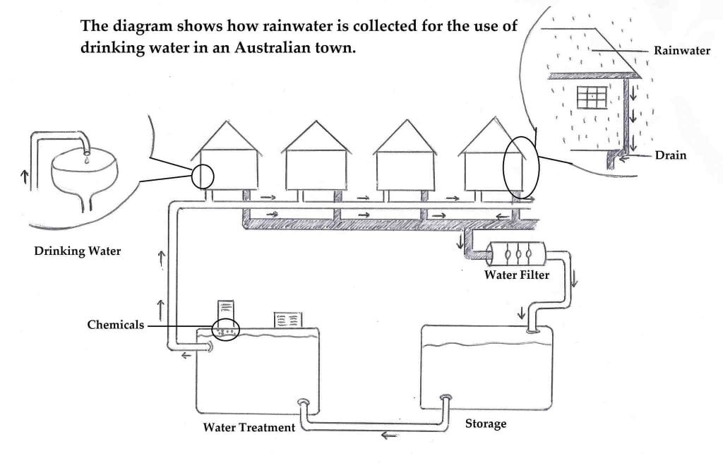
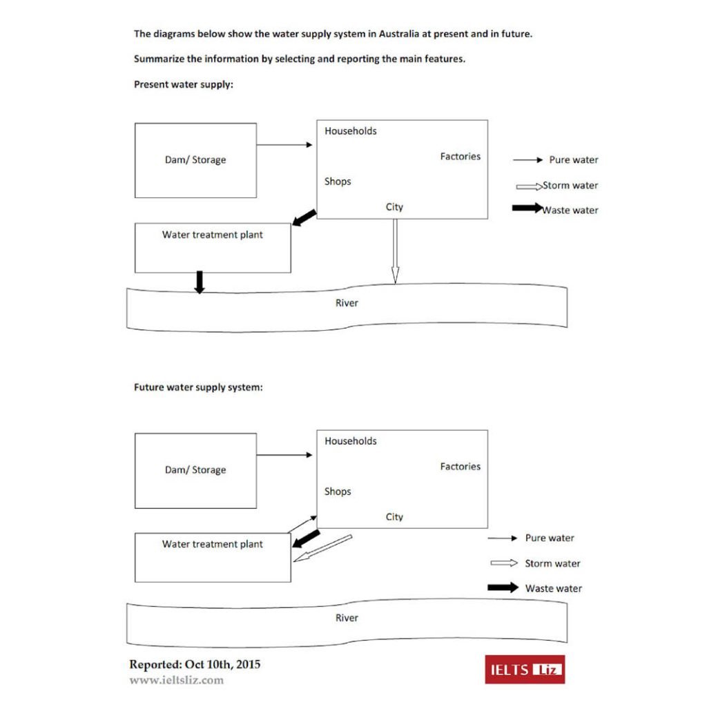
The diagram illustrates the filtration process of drinking water in a single town in Australia. Overall, there are four main stages as is presented above, beginning with the rainwater collection, water filtration and treatment, to the distribution of drinking water to households. The entire process is controlled by the plumbing system.
In the first stage, rainwater is collected through roof gutters and
downspouts of townhouses. The gathered water undergoes filtration through the pipe before being deposited in the storage tank.
In the subsequent stage, water from the storage tank then transferred by a pipe to the water treatment tank. At this stage, the removal of contaminants is being done by placing chemicals in the water treatment tank. After the purification process, the potable water is then finally distributed to townhouses. And, the treated water is regulated by faucets in every household and is now safe to drink.
Well written!
Really nice overview – it should be band 7+ for task achievement.
Careful with your singular/plural – through the pipes.
And your helping verbs: is then transferred…
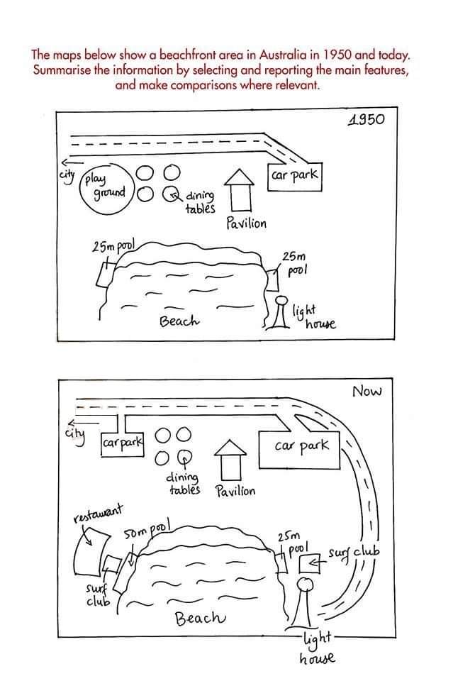
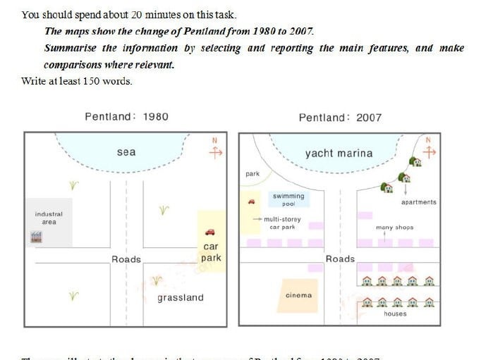
The maps illustrate the development of a museum between 1957 and 2007. Looking from the overall perspective, it is clear that significant changes had been made over the period. The most noticeable improvements were the size of the building which had been expanded and a car park which was created.
In 1957, there was a pathway from the main road to the museum. The entire building of the museum had only four parts, beginning with the entrance hall, local history room, museum store-room, and the national history exhibition. The garden was located in the northwest. Also, several trees were planted along the road and surrounding the building.
Over 50 years, a major transformation could be seen on the map. The pathway connecting the road and the museum was demolished, and trees in front of the building were cleared to make way for a car park. A number of trees circling the museum also removed for its expansion. Rooms in the building had been removed except for the local history room. Cafe, museum shop, reception, special exhibitions, and education center section were added. However, the garden in the northwest remains unchanged.
Good job Jessica!
from an overall… were made… which was expanded
Careful confusing past perfect, present perfect and past simple in your answers!
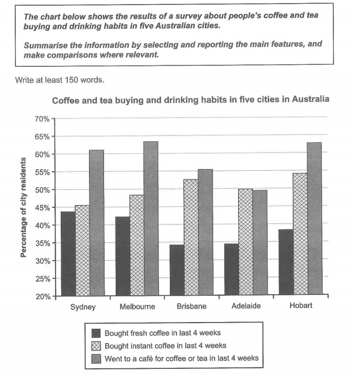
The Chat Represent the survey regarding people’s coffee and tea buying and drinking habits in five Australian cities.
The bar chart shows drinking habits in 5 Australian cities as a relate to coffee and tea on the last 4 weeks .Overall,the half population in all cities except Adelaide went to a cafe for coffee or tea, while buying coffee was also popular and buying fresh coffee generally less normal.
See, first of all at going to cafes,it was more merits of Melbourne and Hobart at 64% and after that 63%.Sydney was comparably high over 60%, followed by Brisbane at over 55%, and Adelaide at under 50%.Further more the Hobart, instant coffee purchases at 54%, Brisbane at 52%, Melbourne at 48% and lastly Sydney just over 45%.
So, the last i sum up according to all information,fresh coffee was below 45% for all cities and basically Sydney 44% and Melbourne 42%, Hobart was next at 39%,Adelaide and Brisbane were much lower ratio produced .
Good Nisha!
as they relate to… over the last … less common … Looking first of all at cafes… higher at over… Furthermore… at just over
Good but be careful with your accuracy!
The table illustrates the percentage of tourist visited in 9 countries between 2009 and 2010. Overall, it can be seen that the amount of visitors visit in France and USA stand out the most in both years and both Hong Kong and Germany are more than 100 percent.
According to the data the number of visitors in France remain the same by 76% while both USA and Spain has a slightly change by less than 2 percent. As for UK and Italy has a small change by less than 4 percent in both years.
However, both Turkey and China has a considerable change by less than 60 percent but more than 30 percent which cause them to rank the sixth and seventh out of nine countries. While, Germany has a huge change by more than 109 percent of visitors but Hong Kong was the lowest visitors by 10 percent in 2009 and in 2010 it
Great work Jane!
You should mention all categories in the overview (at least partially) to get above band 5 for TA.
Careful with your tense!
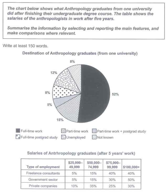
The pie chart below reveals the types of works do Anthropology graduates did after finishing their undergraduate course and the table records the salaries of Anthropology graduates for 5 years of work. It can be seen that most graduate students work as a full time and follow by part time workers unemployed full time postgrad study not known workers and part time with postgrad studies. Also the average of salaries of Freelance consultants is much higher than Government sector and Private companies.
Most graduate students were working as full time workers by more than half percent, follow by part time workers by 1\5 of the students and for the unemployed are less than a quarter just 12%. While, both full-time postgrad study and unknown workers have 8% of students. As for students occupation as past time with postgrad study has 5% of them.
However we can see that from $25000-49999 and $50000-74999 private company pay scale was the highest by 10% and 35%. While, government sector pay scale was the highest with the amount of $100000+ by 50%.
Another good one Jane – a really tricky one to do the overview for so I wouldn’t worry too much about this one.
Be careful with plurals, tense, and subordinate clauses/linking words.
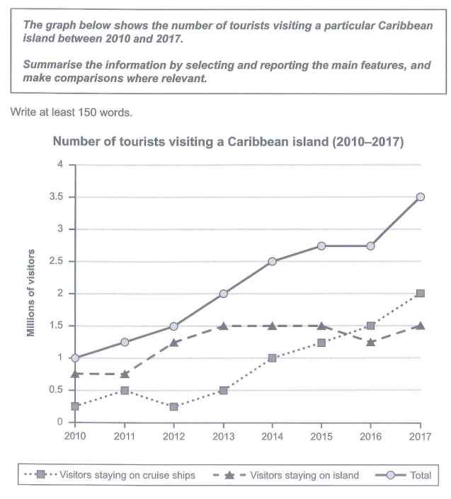
The graph below illustrates the number of tourists visiting Caribbean island as well for visitors staying on cruise ships staying on island and total number of visitors between 2010 and 2017. Overall, it can be seen that total visitors rose considerably follow by visitors staying on island and overtaken visitors staying on cruise ships.
Visitors staying on island remained the same from 210 to 2011 by 1.75 millions of visitors and it rose particularly in 2011 to 2013 and it remained the same for the next 2 years by 1.5 millions of visitors. It fluctuated between 2015 and 2017 by 1.5 millions of visitors. While number of visitors staying on cruise ships fluctuated between 2010 and 2013 by 0.25 to 0.5 million visitors. Then, it rose considerably for the next 5 years and reached its peak by 2 million visitors.
However, the number of total visitors from 2010 until 2015 rose significantly and it had not change in 2015 and 2016 but it reach it peaked by 3.5 million visitors by 2017.
Keep up the hard work with all these graphs, Jane!
Good overview for this one and better accuracy with your tense and grammar.
Thnx u
You’re welcome!
The graphs below illustrate the proportion of people who are smoker and consumer of alcohol in the USA, JAPAN, TURKEY and HOLLAND from 1960 to 2000. Overall, it can be seen, USA people had a substantial percentage in smoker and utilizing of alcohol during the specific years.
At first graph, the USA in 1960 60 percent of people were smoker and this amount had remained unchanged until 1970 whereas, in 1980 its number had noticeably declined to 46 percent and finally this flow stayed at 40% in 2000. Also, in JAPAN we are witnessed gradual decrease around 10 percent from 1960 to 2000 which same as the USA had stopped at 40%.
On the other side, in the second graph, there is a wide difference in TURKEY and two other countries. In HOLLAND in 1960 per person only drank 4 litres and this number had remarkably soared to 11 litres in 1980 and to 2000 had a slight drop to 11 litres. By contrast, in TURKEY at 1960 per person had consumed only1 litre and this line moved upward to 2 litres in 2000.
Great Mahsid!
There is some informality in your writing but otherwise easy to follow!
Thanks Dave for the study material.
You’re very welcome!
sorry, are these below corrections done for free?
The comments I post below are free, yes, Sima.
I don’t always have time to give detailed feedback.
You can consider the paid ones here: course.howtodoielts.com/band-scores-corrections
The pie chart above details the usage of water in Australia in 2004 by various sectors, while the bar chart expands on the residential use of water as it is apparent to be the highest compared to rest of the variables. Generally looking, residential houses took more than the half of the pie, this is followed with Industrial, residential apartments and business which are almost sharing similar percentages. On the other hand, the bar chart shows the peak in the bathroom figure and the most decline in the kitchen’s one.
To further analyze this into details, the pie chart presents residential houses as the major consumer of water by approximately 60%. Residential apartments come next by almost a quarter (20%). Business and the Industrial groups both have similar portions of the pie by almost 15% each. Water is less used in the Governmental sector by 10%, while other unidentified usage channels take less than 5%. The bar chart dives deeper into residential usage of water. Bathrooms took more than a quarter (26%), while gardens are almost 24%. This is followed by washing cloths 20%, toilets 15% and finally the kitchen 10%.
Sorry for the late reply Aala, I think your essay is strong overall and you describe the data well. Be careful with your special and punctuation though!
hello Mr. Dave, can check my essay on task 1, the last thing uploaded in the comments, I really need your feedback
I’ll try to get around to it tomorrow, Aala!
The pie chart above details the usage of water in Australia in 2004 by various sectors, while the bar chart expands on the residential use of water as it is apparent to be the highest compared to rest of the variables. Generally looking, residential houses took more than half of the pie, this is followed with Industrial, residential apartments and business which are almost sharing similar percentages. On the other hand, the bar chart shows the peak in the bathroom figure and the most decline in the kitchen’s one.
To further analyze this into details, the pie chart presents residential houses as the major consumer of water by approximately 60%. Residential apartments come next by almost a quarter (20%). Business and the Industrial groups both have similar portions of the pie by almost 15% each. Water is less used in the Governmental sector by 10%, while other unidentified usage channels took less than 5%. The bar chart dives deeper into the residential usage of water. Bathrooms took slightly less than a third (26%), while gardens are even less by 24%. This is followed with washing cloths 20%, toilets 15% and finally the kitchen 10% only.
Replied on the one above Aala! You can also check here: course.howtodoielts.com/band-scores-corrections
Very good orginized
Thanks, Shakha!
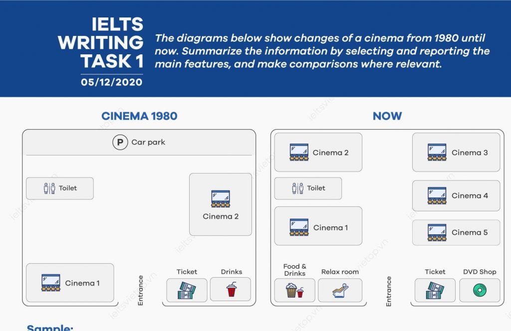
Given are two maps of an unnamed cinema illustrating changes that have been done from 1980 till now.
A glance at the figures provided reveals that the number of cinema halls upgraded from two to five being able to screen five different movies simultaneously; also noteworthy is the fact that on the lower-left corner of this place, which used to be a hall number1, a relax room and buffet which star to serve food as well as drinks, are constructed. In the place of the buffet of 1980, in which only drinks could be found, a DVD shop is opened.
One particularly interesting fact highlighted by the figure is that in 1980, the cinema was associated with a car park, which is now replaced with two other cinemas. The only similarities that can be found are the places of male and female toilets as well as ticket shop which remains on the right side of the main entrance.
Looking from an overall prospect, besides the increased number of cinema halls, not only a relax room and DVD shop are added but also an option of purchasing food as well as drinks are provided.
Well written! That have taken place since – don’t use glance because it is too informal.
The overview is also a bit too specific and careful with tense.
The diagram explains the modification of cinema according to the time from 1980 till date. From an overall perspective, it can be readily apparent that the same area has been customized with a variety of services than before.
Two cinema halls are replaced with five and the car park has been completely removed from the area. Back in 1980, the right side of the entrance was occupied with cinema 1, whereas it has been replaced with food and drinks and relax room. Similarly, on the left-hand side of the entrance, drinks have been replaced with a DVD shop while the ticket counter is at a previous place.
Moving forward from the entrance, on the right-hand side, there used to be a toilet; now toilet occupies the area between cinema 1 and cinema 2. On the opposite side, cinema 3,4,5 can be seen now, replacing cinema 2 previously.
Nice writing, Sushma!
There are a lot of mistakes with fixed expressions though so try to study my sample answers more closely and use the same phrases.
The overview needs work or you will be limited to a 5 for TA!
Can someone please mark the mistakes and evaluate the IELTS BANDS for me?
The given diagram illustrates the changes of a cinema from 1980 until now.
Overall, The cinema complex changes a lot throughout time, if we take the basic changes such as the number of theaters and different conveniences such as a Relax room and a DVD shop.
In the terms of cinema theaters right now in the complex, there are 5 theaters rather than 2 in 1980, during the time our world becoming more modern and especially digital so, that’s why there is a DVD shop where you rent and buy the latest movies and daily shows. And for the conveniences now there is a Relax room where you can enjoy and spent time.
But, there is the same thing which is still the same such as the number and position of toilet and ticket counter. There are some more changes but those changes are not that big such as position and list of the menu of the restaurant now it’s on the right side and now you can buy food also, And there is something which is missing now like car parking, Overall the feeling is still the same when we visit the cinema complex
Hi Sifar, you can find out your band score here: course.howtodoielts.com/band-scores-corrections
What score are you aiming for?
Australian water consumption in different sectors and the percentage of its usage in apartments or houses in 2004 are depicted in the pie chart and the graph. In general, it is salient that most of the utilisation of water was from residential sector.
To begin, the proportion of water consumption was relatively unbalanced. This is because the biggest contributor for water consumption in Australia was home owner with more than half of the total chart. Then, it was followed by apartments owner and business which had a similar proportion. Moreover, industry and goverment took the fourth and fifth place, consecutively. Lastly, with the least contributor of the chart was other.
Furthermore, the high percentage of residential water consumption in 2004 was specified into its bathroom, toilet, washing clothes, kitchen, and garden usage. Bathroom came in the first place with around 27%, which then followed by garden with a slight gap of approximately 2%. The third place belonged to washing fabrics which had about 20%. The utilisation of toilet was at 15%, which was 5% higher than kitchen.
Dear Dave, I hope you can give me some feedback on Task 1. Thank you in advance!
Nice effort, Rifqu!
You need to cover all areas in your overview or it is an automatic band 5 for TA!
The rest of the details are good though there could be more data. Keep working hard!
The diagram below illustrates the changes cinema has undergone starting from 1980 to the present.
Overall cinema center has modified such that there are more number of cinema screens and scope to eat and relax increased at the expense of car parking.
Figure of cinema screens has increased from two to five. car parking was removed and that place was used to accommodate cinema screens two and three,whereas cinema screen two was further divided into two different screens four and five.cinema one was moved beside to toilet and that place was used to construct relaxation room and foods and drink store.
Places which has retained their positions are toilet,ticket center and entrance,Parking was totally eliminated.In place of drinks, DVD shop was developed
Good effort, Madhuri!
Careful of opinion words like ‘relax’ and work on your grammar!
The given diagram compares the changes in cinema structure from 1980 till present.
Overall, It can be seen that, the number of cinema hall significantly increased over time.Also,recreational room and DVD shop were installed whereas car parking was completely removed as a part of redevelopment.
With regards to cinema hall, three new theaters were added thus making the count to increase from two in 1980 to five in present day.Moreover, car parking which took majority of space in 1980, was demolished later and readjustment of theaters were made in the available space.
In addition to cinema halls, recreational room and DVD shop were also introduced for people visiting theaters in current day as opposed to no relaxation room and DVD shop back in 1980.Additionally,Foods were also included along with drinks.
Nice writing Poonam!
Careful with your punctuation though!
The two Theatrical plans depict outlay of 1980 and current times , indicating that cinema outlets have become more than double and shops diversified with toilet remaining the same and parking zone disappearing altogether .
In 1980 every corner was occupied with cinema houses , servicing shops and a toilet ,whereas current times show the optimum utilization of spaces. While cinema houses have grown over the double , ,so have the variety of myriad servicing shops too have extended . The new shops erected on displaced theatres are now catering to variety of novel uses of entertainment to the viewers who can enjoy variety of snacks , relaxation and entertainment under one roof .
Toilets and Parking zone have either remained the same or have been wiped out altogether .
Earlier one zone which was allocated for car parking has now totally disappeared . Similarly the toilets too have remained unchanged over the time .
Nice work, Swati!
Only capitilise proper nouns and be careful with your adjectives.
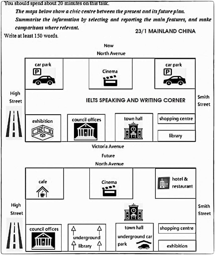
The given map represents the current and proposed plan of a civic center of the 23/1 Mainland China.
Overall, It can be seen that although the layout of the civic center has no change in the future, there has been quite significant modification in the area blocks.
The North of the current plan contains two blocks for car parking at the ends of the North Avenue which is proposed to be replaced by a cafe in the top left corner and hostel and restaurant in the top right corner. The cinema which is present in between the car parking is planned not to be changed. Moreover, the IELTS speaking and writing corner in the center of the area is expected to be completely removed in the future.
Moving towards the South of the proposed plan, the council offices have been shifted to the corner facing the High Street which was is in between the exhibition center and town hall. Next to the council offices, an underground library is an addition to the civic center. Additionally, an underground car parking is also expected along with the town hall. Although the shopping center is expected to remain unchanged, the library is supposed to be replaced by an exhibition center in the bottom right corner next to the Smith Street.
Nice writing Poonam – sorry about the watermark – that’s not part of the map…
Nice writing otherwise though be careful with your definite articles!
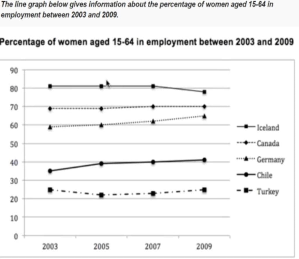
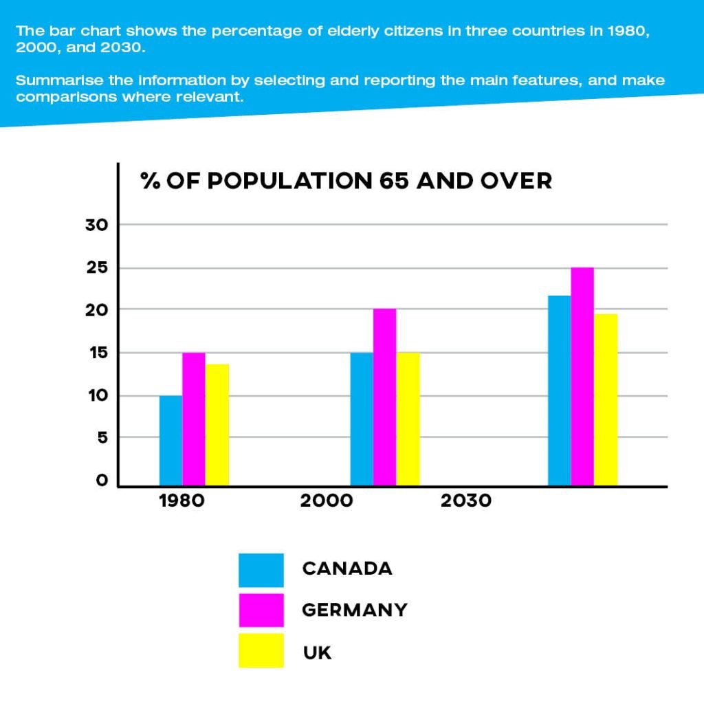
The bar chart illustrates the proportion of older people residing in Canada, Germany, and the UK during 1980 to 2030.
Overall, we can deduce that there is a gradual rise in the ratio of elderly individuals staying in these three countries.
In 1980, we can see that there was a slight difference of around 1% between the UK and Germany in terms of elderly residents of these countries. While, Canadian elderly consisted only 10% of the total population in that year.
Whereas, in the year 2000, there was a marked increase of 20%, which could be seen in the percentage of elderly native of Germany compared to the equal percentile of the rest two countries that was 15%.
In contrast, in the year 2030 Canadian elders made more percentage than the UK elderly by roughly 2% of the total, but Germany still remained the highest one among the other 2 countries in all the 50 years that was 25% of the total percentage.
Nice writing again, Archana.
Your overview needs a bit more detail as well – did any of the countries overtake the others?
We also don’t use ‘whereas’ to start a sentence.
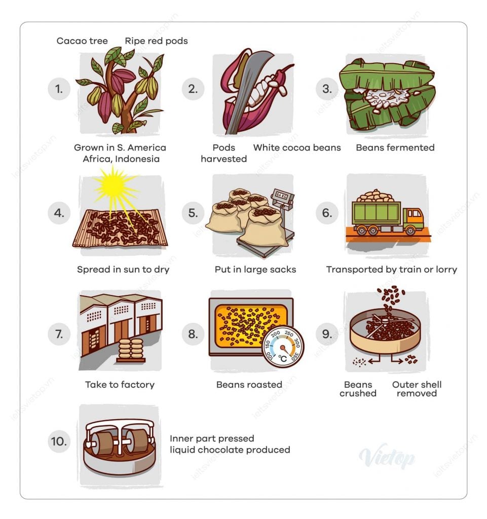
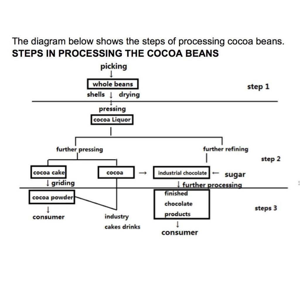
The process chart describes the ways by which cocoa products are manufactured for the commercial use. Overall, there are three steps in this process from collecting to dispensing the products.
During the initial stage, cocoa beans are collected by the worker from the cocoa field as a whole bean covered with shells. Then, these entire beans with shells are dried before sending it for pressing and draining the cocoa liquor.
Afterwards, some cocoa liquor is passed on to the further pressing to get the components for the preparation of cocoa cake and cocoa, rest cocoa liquid is transferred to the industries for the refining purpose for making chocolates by adding sugar and cocoa.
Then, these cocoa cakes are grinding to make cocoa powder and industrial cake drinks. Also, industrial chocolate, which was made in the subsequent step is refined further and processed before releasing it for the commercial purpose and finally, these products like cocoa powder, cake drinks and chocolates reach the market.
Good, but try to define the stages a bit more in your overview, Archana, otherwise you’ll be stuck at band 5 for task achievement.
Good use of linking words!
The two diagrams provide information on how the design plan of Mainland China’s Civic centre will undergo a change from now to coming days.
Overall In future new coffee shop, commercial building and food shops will be introduced in the place of parking lots in the side of North Avenue while the Victoria Avenue side will be more or less same with relocation of council office, library and exhibition centre between the High street and Smith street.
As the time passes the movie theater and markets will be in the same place with no change at all. The parking areas will be shifted underground from North Avenue towards Victoria Avenue on which the town hall will stand like before. There will be an interchange of places among the council office, library and exhibition centre.
The council office has tend to move just beside the High street with a new larger library built beneath the ground level along side. Unlike the library the Exhibition gallery will be smaller in size in the coming days and will replace the present library behind the malls just at the edge of Smith street.
Keep it up!
The two diagrams provide information on how the design plan of Mainland China’s Civic centre will undergo a change from now to coming days.
Overall In future new coffee shop, commercial building and food shops will be introduced in the place of parking lots in the side of North Avenue while the Victoria Avenue side will be more or less same with relocation of council office, library and exhibition centre between the High street and Smith street.
As the time passes the movie theater and markets will be in the same place with no change at all. The parking areas will be shifted underground from North Avenue towards Victoria Avenue on which the town hall will stand like before. There will be an interchange of places among the council office, library and exhibition centre.
The council office has tend to move just beside the High street with a new larger library built beneath the ground level along side. Unlike the library the Exhibition gallery will be smaller in size in the coming days and will replace the present library behind the malls just at the edge of Smith street.
Great work, Mafruha!
Where did you get that map from by the way?
Careful with words like ‘tend’.
Thankyou
I just took a screen shot
The map represents the layout of a museum in 1957 and 2007 . It can be clearly seen in a glance ; there where significant changes made to by 2007 in comparison to 1957.
The museum initially was centered around a garden. In 1957, the national history exhibition was a long room ,the entrance from the road directed to the national history exhibition . The local history room and museum store room where on the either sides of the entrance hall. The museum was parallel to the road .
In the year 2007,the museum has been expanded . In addition to other amenities . The national history exhibition is replaced with the local history room , in the top left corner is special exhibition and on the top right is the education center . The local history in 1957 was replaced with the reception in 2007 and the museum store room was replaced with a cafe.The entrance is relocated to an adjacent room that is newly constructed which is a museum shop.
From an overall perspective, it is readily apparent that there are some radical changes that took place over half a century from 1957 and 2007
Great work Lois!
You need to group and define your changes for the overview to be above band 5 though!
The Picture illustrates various changes till now from year 1980 in Cinema. Overall, numerous cinemas have been built within the region. Alongside, new rooms and shops have been set up with removal of car parking in the North .
From year 1980 to year 2020, new cinemas have been constructed within the premises, with only 2 cinemas in first year to total of 5 cinemas in the current year. The car parking has been permanently removed and it is now replaced by two cinemas numbered 2 and 3, one of which is relocated to the top right corner from its previous middle right position. Moreover, cinema numbered 1 has been repositioned to middle left just below the toilet.
On the other hand, new shops of refreshments and DVD’s are set up near the entrance replacing cinema number 1 and drinks shop respectively. Furthermore, A leisure room is also made available near the entrance for people to relax. The toilet room, ticket section and entrance position is kept the same over the given time period of four decades.
Great writing Aashish but be careful with punctuation and capilisation especially!
U r awesome buddy, thnx alot for this mind-blowing stuff
You’re very welcome!
please review my writing for task 1 regarding the civic centre!
Sure!
The maps illustrate a civic center at present and proposed changes for the future. Overall, it can be seen that the space occupied by car parking areas will be replaced by eateries, and both the car parking and the library will be shifted below the ground level.
Presently, along the North Avenue, there is a cinema hall in the middle with two parking lots at its both sides. The future plan delineates that a cafeteria will be built in place of a car park situated at the north west of the center, while hotel and restaurant will occupy the north east parking space.
The Victoria Avenue, which is located in the south of the civic center has an exhibition at the south west corner, close to the high street. Next to it, are council offices and then a town hall. Moving further to the east, in close access to the smith street, is shopping center and a library. In the future, council offices will be shifted to the bottom left, whereas exhibition will be moved to the bottom right of the center. Construction of an underground library will take place where there are council offices at present, and a new parking space will be provided below the town hall.
Nice writing but be careful with subject/verb agreement and using articles.
The overview is also a bit specific.
Keep working hard though!
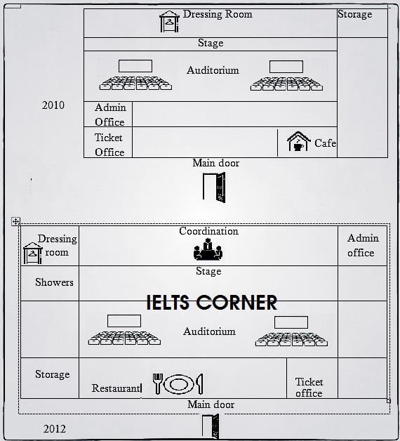
The map demonstrates the modification that took place in cinema hall over two-year period from 2010 to 1012.
Overall, it is seen that the area of movie theater was planned to expand its area with new facilities like restaurant, showers and coordination. All rooms were made bigger in size.
one of the key changes over two years was overall extension of area of cinema hall. Dressing room was replaced by coordination hall and shifted to top left corner of the hall. Similarly, storage room was converted into admin office. Stage and auditorium were expanded to larger in size. Likewise, ticket office was shifted to the room where there used to be café which was upgraded to a bigger restaurant replacing admin office and ticket office with some extension.
Showers were the facility that was added in 2012 which can be accessed on the south of the dressing room. The space immediately after main entrance was utilized for restaurant.
Nice writing, Roshna!
Modification isn’t a word we would use for this kind of map though.
Also be careful with your articles especially.
Keep up the hard work!
The above map delineates the present condition of a civic centre and its future expansion plan. From an overall perspective quite a few changes are planned for the future along with some extra facilities.
At present the cinema hall is in the North of the map with car parking in Northwest and Northeast. The position of the cinema hall would remain unchanged but the parking in Northwest would be replaced by a café while a hotel and a restaurant are planned to replace the parking in Northeast.
The exhibition center is in the Southwest west direction which would be replaced by council offices, and exhibition center would take place of library located in Southeast. The position of townhall would not be changed, but an underground parking would be developed under it. The library which would be replaced by exhibition centre would be moved underground next to car parking. The place where the shopping centre stands will remain unchanged in the future.
Good work, Shweta!
Careful with your use of would – try using the passive voice: is planned/projected to.
Keep it up!
how to write this in report form
You can click on the sample answers to see…
The chart given illustrates the relation between the abroad student and local student from in Australian universities between 2011 and 2010.
The line graph is given illustrate the midyear population per million in China, India, and the USA between 1950 and 2000. Overall, the USA was stand steady throughout the whole time. However, India and china registered a significant increased population.
Firstly, the population of the USA was less than two hundred million in 1950. And after fifty years it become about 300 million in 2000, which is less than India and China in 1950
Secondly, India showed a rapid growth between 1950 and 2000, which it has started in under 400 million to more than double the number at the end (1000 million). Also, china started in approximately 600 million, then maintained the same level from 1959 to 1962). Finally, from 1963 china population sharply rise until the population reached about 1300 million.
See my other comment, Muna!
The chart given illustrates the relation between the abroad student and local student from in Australian universities between 2011 and 2010.
The line graph is given illustrate the midyear population per million in China, India, and the USA between 1950 and 2000. Overall, the USA was stood steady throughout the whole time. However, India and China registered a significantly increased population.
Firstly, the population of the USA was less than two hundred million in 1950. And after fifty years it becomes about 300 million in 2000, which is less than India and China in 1950
Secondly, India showed a rapid growth between 1950 and 2000, which it has started at under 400 million to more than double the number at the end (1000 million). Also, china started at approximately 600 million, then maintained the same level from 1959 to 1962). Finally, from 1963 china’s population sharply rise until the population reached about 1300 million.
Nice writing, Muna!
Careful with your helping verbs and main verbs and your subject/verb agreement!
The rendered pie chart and table illustrates job opportunities for Anthropology graduates after completing their undergraduate degree course from a university and salaries of Anthropology graduates after 5 years of work respectively.The data is calibrated in percentage.
Looking from an overall perspective, it is evident that majority of Anthropology graduates are employed on full-time basis. Whilst only a small fraction of student graduates work part-time and continue their postgraduate study. A large number of graduates receive average salaries when employed in private companies wheres the highest wages are acquired in government sector.
To commence with, about 52% of Anthropology graduates work on full-time basis, followed by 15% of students engaged in part-time jobs. Out of total graduates 12% of them are unemployed. Anthropology graduates continuing full-time postgraduate study and those whose data is not known are equal at about 8%. A minimum ratio of about 5% students continue to work part-time along with their post graduate study.
Furthermore, $25,000-50,000 salary is given to 5% graduates by both freelance consultants and in government sector whereas, private companies offer such range of salary to about 10% students after 5 year’ work. Fraction of graduates getting salary between half a million and a million is 15-40% in freelance consultants, about 15-30% in government sector and 35-25% in private companies. 50% of Anthropology graduates receive salary of more than a million dollars while in freelance consultants and private companies it is 40% and 30% respectively.
Nice work though a little bit on the long side – aim for about 175 words!
It is a tough one. Try to add in some more commas on your complex sentences as well.
Keep it up!
how much band score would you give to the task?
You can sign up here to find out: Patreon.com/howtodoielts
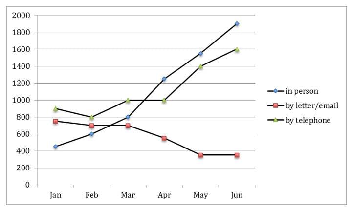
The displayed bar graph spell out the information pertaining about the total time spent on phone calls in UKin three different categories during the time frame from 1995 to 2002.
Beginning with local calls it is evident from the graph that the figures ascend by leap and bounds from the year 1995 to 1999.Morever, the striking feature of the graph was in the year 1999 with the highest minutes accounting upto 90 billion.However, the figures plunged and the ratio continued to decrease till the end of the period with 72 billion in 2002.On the contrary, if talked about national and international calls ratio it can be highlighted that the ratio began with the lowest i.e. around 38% but saw a considerable growth during the end of the period which means to reach a peak of 60 billion in 2002.
Meanwhile, all calls ratio witnesses a modest increase continuing till 2002. In addition, the ratio started with 5 billion and saw a slight rise till 1998. Afterwards, the figures boosts up and reaching to almost 45 billion.
Thus to wrap up it can be finally commented that national and international calls ratio rose steadily.Similarly, all calls ratio also rose gradually.
How much band score would u give to this report .
Nice work, Richard!
There are too many informal phrases though like ‘leaps and bounds’.
Sir how much band score I can achieve?
Discuss about 2 task
The line graph depicts the French and English teacher’s employment ratio in Ontario starting from 2001 and ending 6 years later in 2007.
At first glance, it can easily be seen that while the figure for French-language teachers showed an upward trend, the percentage of English-language teachers declined. Although, French-language teachers initially had a lower rate. it outraced the English-language teachers at the end of the period.
In 2001, the English-language teachers’ recruitment rate was about 72%, being a bit higher than the French-language teachers’ one by approximately 3%. Then, it declined drastically until 2003, accounting for 40%. However, the figure showed a gradual increase to about 45%, over the next 2 years. After 2005, it continued to decrease, reaching its lowest point at about 28% at the end of the period.
The employment ratio of French-language teachers was 70% in 2001 and over the next year decreased to about 52%. Then, the figure rose steadily to almost 70% in 2003 and continued to gradually grow until 2005, when it slightly dropped to about 68%. After that slight drop, it continued to increase, reaching its peak at about 72% in 2007.
In summary, it is obvious that in Ontario French-language teachers were employed more than the ones who teach English.
Word count: 214
I had a doubt in task 1. If you could please help.
Is it a rule that we are not suppose to write ing form of words in writing task 1.
Eg: looking ( looking from overall perspective)
Fluctuating.
Considering. Etc ?
please where is topics for task 1 2023
I’m sorry to ask ,but what is your Writing task 1 score for each of the sample writings here?