

Recommended For You
-

Latest IELTS Writing Task 1 2026 (Graphs, Charts, Maps, Processes)
These are the most recent/latest IELTS Writing Task 1 Task topics and questions starting in 2019, 2020, 2021, 2022, 2023, 2024, 2025, and continuing into 2026. ...
-

Recent IELTS Writing Topics and Questions 2026
Read here all the newest IELTS questions and topics from 2025 and 2024 and previous years with sample answers/essays. Be sure to check ...
-

-
The Complete Guide to IELTS Writing Task 1
This is the complete guide for everything you need for IELTS writing task 1 - including types of ...
-

IELTS Writing Task 2 Sample Answer: Foreign Languages (Cambridge 13)
This IELTS Writing Task 2 sample answer is from a past paper and was published in Cambridge 13. The topic is foreign languages and it ...
-

IELTS Writing Task 2 Sample Answer: Environmental Problems Plants and Animals (IELTS Cambridge 14)
This is an IELTS Writing Task 2 Sample Answer from IELTS Cambridge 14 about environmental problems effecting plants and animals and it is an interesting question. ...
The charts show the amount of Japanese tourists who travelled overseas from 1985 to 1995 as well as the market share of Australia during the same period. Overall, despite some minor fluctuations, the numbers of Japanese travellers increased by a massive margin over the years, and the market share of Australia also recorded an upward trend with fluctuations.
Looking in more details, number of Japanese oversea travellers climbed steadily from about 5 million in 1985 to as much as 11 million in 1990. After a dip in 1991, the figure continued to increase and reached a record high of over 15 million.
Likewise, the market share of Australia displayed a rapid growing trend between 1985 and 1988, from as low as 2% to almost 5% by 1985. Even though there was a sharp turn in the following year, Australia managed to break the downward trend and the proportion recovered before slowing down again at 6% by the end of the decade. (161 words)
Great overview again, Jing!
Careful with articles ‘the number of’ and prepositions ‘to 6%’
What score do you need?
Pls review mine
Where is yours?
please rate mine, i need about a band 4 score
The pie charts given provide information about how different age groups populated the countries Yemen and Italy and predictions for 2050.
Overall, people aged 0 to 14 and those who are above 60 years old are predicted to experience a downward trend in both countries while people who are aged 15 to 59 years old are predicted to witness an upward trend.
In the year 2000, the most significant age group in Yemen were those belonging in 0 to 14 years old while in Italy, the biggest segment was contributed by those aged 15 to 59 year olds. People who are 15 to 59 years old made up 46.3% in Yemen while in Italy, senior citizens made up 24.1% of the population. Lastly, in the year 2000, Yemen had those aged 60 and above to be the smallest part of the chart while Italy had the youngest age group which were those aged from 0 to 14 years old.
In 2050, it is expected that both Yemen and Italy will have those aged 15 to 59 years old to be the majority, with 57.3% and 46.2% respectively. Yemen and Italy are also both projected to have a decrease in population for those aged 0 to 14. By 2050, it is predicted that both countries will have an increase in the number of senior citizens residing in both countries.
If you only need band 4, then you should be fine…
Why such a low score?
Please ,is this a good overview ? I would really appreciate a feedback.
1. Overall, in Yemen ages 15- 59 had the highest percentage for both years,and the least percentage being people 60 years and above,with 0-14years at the middle. Italy on the other hand, also had its highest proportion as 15- 59,however 0-14 years became the least and 60+ at the middle.
4.Overall, it can be seen that the number of Japanese tourists travelling abroad showed an upward trend.
While the percentage of Australia’s share of Japanese tourist market ,also increased generally with only a slight fluctuation.
The overview covers all areas so it is good – it is very detailed and could be better grouped together to make it simpler – such as – are there any commonalities between the countries? Is one getting older and the other younger? Try to think more ‘overall’ for your overview.
The second one is find I think but I don’t know the graph for that one.
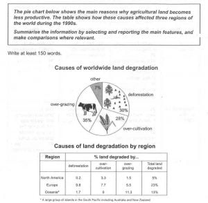
Overall, it is evident that Europe suffered more from farmland degradation than the other regions and the main causes there were deforestation and over-cultivation.
Great, Prahatish! And the table too?
The pie charts illustrates how the population growth will occur related to given age groups in both countries from the year 2000 to 2050.
Overall, adult population will be predicted to rise their proportions in both states over the time period. However, the young and middle age groups seems to decrease in proportion in Italy, while opposite seems to occur in Yemen in 2050.