This is an IELTS writing task 1 sample answer essay on the topic of a combine pie chart and table featuring populations in Australia.
Find all the most recent task 1 topics here and my full IELTS Ebooks here.
Dave
IELTS Essay: Combined Pie Chart and Table
The table and pie chart illustrate populations in Australia according to different nationalities and areas. Summarize the information by selecting and reporting the main features and make comparisons where relevant.
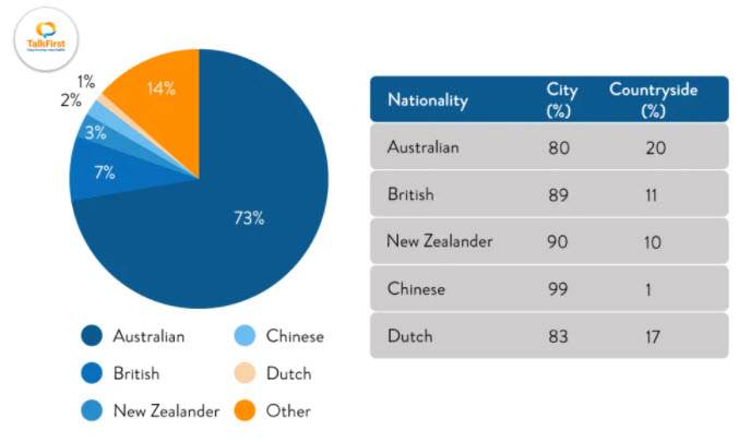
The pie chart and table detail population figures in Australia and if residents tended to live in rural or urban areas. Looking from an overall perspective, it is readily apparent that the vast majority of the population is Australian, followed by sizeable numbers for other and British nationals, and more marginal figures for New Zealanders, Chinese, and the Dutch. All demographics live overwhelmingly in cities, especially individuals from China.
The pie chart indicates that 73% of the Australian population is made up of Australians themselves. This figure is followed distantly by other at 14%, residents from Great Britain at 7%, New Zealanders at 3%, Chinese at 2%, and people from the Netherlands at just 1%.
In terms of livings areas, Australians are most likely to live outside cities, though 80% still live in urban environments. Similarly, 83% of the Dutch live in cities and 17% in the countryside. British and New Zealand residents display nearly identical proportions with around 90% in cities. Finally, the Chinese live predominately in the cities (99%).
Analysis
1. The pie chart and table detail population figures in Australia and if residents tended to live in rural or urban areas. 2. Looking from an overall perspective, it is readily apparent that the vast majority of the population is Australian, followed by sizeable numbers for other and British nationals, and more marginal figures for New Zealanders, Chinese, and the Dutch. 3. All demographics live overwhelmingly in cities, especially individuals from China.
- Paraphrase what the table shows.
- Write a clear overview summarising the differences.
- You might need another sentence for your overview.
1. The pie chart indicates that 73% of the Australian population is made up of Australians themselves. 2. This figure is followed distantly by other at 14%, residents from Great Britain at 7%, New Zealanders at 3%, Chinese at 2%, and people from the Netherlands at just 1%.
- Begin writing about the data for the first categories.
- Make sure you compare as much as possible.
- Don’t leave anything out!
1. In terms of livings areas, Australians are most likely to live outside cities, though 80% still live in urban environments. 2. Similarly, 83% of the Dutch live in cities and 17% in the countryside. 3. British and New Zealand residents display nearly identical proportions with around 90% in cities. 4. Finally, the Chinese live predominately in the cities (99%).
- Write about the final, other parts of the graph – include everything!
- Compare the categories.
- Group categories together too.
- Have some short, simple sentences to help your grammar score.
Vocabulary
What do the words in bold below mean? Take some notes on a piece of paper to aid your memory:
The pie chart and table detail population figures in Australia and if residents tended to live in rural or urban areas. Looking from an overall perspective, it is readily apparent that the vast majority of the population is Australian, followed by sizeable numbers for other and British nationals, and more marginal figures for New Zealanders, Chinese, and the Dutch. All demographics live overwhelmingly in cities, especially individuals from China.
The pie chart indicates that 73% of the Australian population is made up of Australians themselves. This figure is followed distantly by other at 14%, residents from Great Britain at 7%, New Zealanders at 3%, Chinese at 2%, and people from the Netherlands at just 1%.
In terms of livings areas, Australians are most likely to live outside cities, though 80% still live in urban environments. Similarly, 83% of the Dutch live in cities and 17% in the countryside. British and New Zealand residents display nearly identical proportions with around 90% in cities. Finally, the Chinese live predominately in the cities (99%).
Answers
Try to write down or think of an antonym/opposite word for further practice:
detail population figures show how many people live there
residents tended people living there usually
rural in the countryside
urban areas in cities
Looking from an overall perspective, it is readily apparent that overall
vast majority most of
followed by after that
sizeable numbers for a lot for
marginal figures smaller figures
demographics groups of people
overwhelmingly mostly
especially in particular
indicates shows
made up of constituted by
followed distantly a lot further behind
Great Britain England
Netherlands where the Dutch are from
just only
in terms of livings areas when it comes to where they live
outside not inside
urban environments cities
similarly the same
display showed
nearly almost
identical the same
proportions ratios
around about
predominately mostly
Pronunciation
Practice saying the words below using this tip with Google voice dictation:
ˈdiːteɪl ˌpɒpjʊˈleɪʃən ˈfɪgəz
ˈrɛzɪdənts ˈtɛndɪd
ˈrʊərəl
ˈɜːbən ˈeərɪəz
ˈlʊkɪŋ frɒm ən ˈəʊvərɔːl pəˈspɛktɪv, ɪt ɪz ˈrɛdɪli əˈpærənt ðæt
vɑːst məˈʤɒrɪti
ˈfɒləʊd baɪ
ˈsaɪzəbl ˈnʌmbəz fɔː
ˈmɑːʤɪnəl ˈfɪgəz
ˌdɛməˈgræfɪks
ˌəʊvəˈwɛlmɪŋli
ɪsˈpɛʃəli
ˈɪndɪkeɪts
meɪd ʌp ɒv
ˈfɒləʊd ˈdɪstəntli
greɪt ˈbrɪtn
ˈnɛðələndz
ʤʌst
ɪn tɜːmz ɒv ˈlɪvɪŋz ˈeərɪəz
ˌaʊtˈsaɪd
ˈɜːbən ɪnˈvaɪərənmənts
ˈsɪmɪləli
dɪsˈpleɪd
ˈnɪəli
aɪˈdɛntɪkəl
prəˈpɔːʃənz
əˈraʊnd
prɪˈdɒmɪneɪtli
Vocabulary Practice
The pie chart and table d____________________________s in Australia and if r_________________d to live in r_____l or u___________s. L_____________________________________________t the v_____________y of the population is Australian, f_____________y s______________________r other and British nationals, and more m_______________s for New Zealanders, Chinese, and the Dutch. All d_____________s live o_____________y in cities, e________y individuals from China.
The pie chart i__________s that 73% of the Australian population is m____________f Australians themselves. This figure is f___________________y by other at 14%, residents from G_____________n at 7%, New Zealanders at 3%, Chinese at 2%, and people from the N______________s at j___t 1%.
I_________________________s, Australians are most likely to live o__________e cities, though 80% still live in u____________________s. S_________y, 83% of the Dutch live in cities and 17% in the countryside. British and New Zealand residents d____________y n_________y i__________l p_________s with a________d 90% in cities. Finally, the Chinese live p________________y in the cities (99%).
Listening Practice
Reading Practice
https://www.planetware.com/australia/top-rated-beaches-in-australia-aus-1-32.htm
Speaking Practice
Practice with the following related questions from the real IELTS speaking exam:
Your Home Nation/Country
- Where are you from?
- What do you like the most about your country?
- Where would you like to live in your country?
- Are people in your country patriotic?
Writing Practice
Practice with the related chart below and then check with my sample answer:


why did you use past and present tenses to explain the same context?
There are slight variations that might make it a little confusing – I changed them to present to make it a little more consistent and easier for students.
Thanks for the feedback, Di!