IELTS Task 1: Comparison of Energy Production
The pie charts show information about energy production in a country in two separate years.

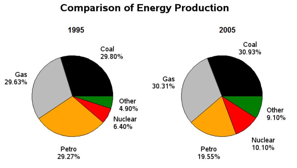
The pie charts detail the distribution of various energy sources in a given nation in the years 1995 and 2005. Looking from an overall perspective, it is readily apparent that production of two main energies (coal and gas) rose marginally, while petrol declined considerably. ‘Other’ and nuclear production also grew greatly, despite remaining less popular in both years.
In 1995, coal, gas, and petrol were roughly equal in terms of energy production with each slightly above 29%. By 2005, the figures for coal and gas had risen moderately (30.93% and 30.31%, respectively) while petrol exploitation declined to represent just 19.55% of all sources.
The data for the remaining categories was considerably lower with ‘other’ accounting for 4.9% of energy production to begin the period and nuclear noticeably higher at 6.4%. By 2005, ‘other’ had narrowed the disparity and nearly doubled to 9.1% as nuclear energy use grew more slowly to reach 10.1%.
Analysis
1. The pie charts detail the distribution of various energy sources in a given nation in the years 1995 and 2005. 2. Looking from an overall perspective, it is readily apparent that production of two main energies (coal and gas) rose marginally, while petrol declined considerably. 3. ‘Other’ and nuclear production also grew greatly, despite remaining less popular in both years.
- Paraphrase what the bar chart shows.
- Write a clear overview summarising the differences and the overall trend.
- This one is a little complex so it needs a second sentence for the overview.
1. In 1995, coal, gas, and petrol were roughly equal in terms of energy production with each slightly above 29%. 2. By 2005, the figures for coal and gas had risen moderately (30.93% and 30.31%, respectively) while petrol exploitation declined to represent just 19.55% of all sources.
- Begin writing about the data for the first categories.
- Compare between each sentence.
1. The data for the remaining categories was considerably lower with ‘other’ accounting for 4.9% of energy production to begin the period and nuclear noticeably higher at 6.4%. 2. By 2005, ‘other’ had narrowed the disparity and nearly doubled to 9.1% as nuclear energy use grew more slowly to reach 10.1%.
- Write about the final other parts of the graph – include everything!
- Compare the categories.
Vocabulary
The pie charts detail the distribution of various energy sources in a given nation in the years 1995 and 2005. Looking from an overall perspective, it is readily apparent that production of two main energies (coal and gas) rose marginally, while petrol declined considerably. ‘Other’ and nuclear production also grew greatly, despite remaining less popular in both years.
In 1995, coal, gas, and petrol were roughly equal in terms of energy production with each slightly above 29%. By 2005, the figures for coal and gas had risen moderately (30.93% and 30.31%, respectively) while petrol exploitation declined to represent just 19.55% of all sources.
The data for the remaining categories was considerably lower with ‘other’ accounting for 4.9% of energy production to begin the period and nuclear noticeably higher at 6.4%. By 2005, ‘other’ had narrowed the disparity and nearly doubled to 9.1% as nuclear energy use grew more slowly to reach 10.1%.
Answers
For extra practice, write an antonym (opposite word) on a piece of paper to help you remember the new vocabulary:
detail show
distribution how it is allocated to each category
various energy sources in a given nation where energy comes from in a country
Looking from an overall perspective, it is readily apparent that overall
rose marginally increased a bit
petrol declined considerably gas went down a lot
nuclear related to radiation and uranium
grew greatly increased a lot
despite remaining less popular in both years regardless of being less common in each time period
roughly equal in terms of about the same concerning
slightly above just a bit over
figures numbers
had risen moderately had increased a bit
respectively in turn
exploitation declined taking advantage of decreased
represent just stand for only
data figures
remaining categories extra areas
considerably lower with much less than
accounting for representing
to begin the period starting the time at
noticeably higher at much bigger at
narrowed the disparity came much closer to each other, to being equal
nearly doubled almost 2x
grew more slowly to reach increased slightly to get to
Pronunciation
Practice saying the vocabulary below and use this tip about Google voice search:
ˈdiːteɪl
ˌdɪstrɪˈbjuːʃən
ˈveərɪəs ˈɛnəʤi ˈsɔːsɪz ɪn ə ˈgɪvn ˈneɪʃən
ˈlʊkɪŋ frɒm ən ˈəʊvərɔːl pəˈspɛktɪv, ɪt ɪz ˈrɛdɪli əˈpærənt ðæt
rəʊz ˈmɑːʤɪnəli
ˈpɛtrəl dɪˈklaɪnd kənˈsɪdərəbli
ˈnjuːklɪə
gruː ˈgreɪtli
dɪsˈpaɪt rɪˈmeɪnɪŋ lɛs ˈpɒpjʊlər ɪn bəʊθ jɪəz
ˈrʌfli ˈiːkwəl ɪn tɜːmz ɒv
ˈslaɪtli əˈbʌv
ˈfɪgəz
hæd ˈrɪzn ˈmɒdərɪtli
rɪsˈpɛktɪvli
ˌɛksplɔɪˈteɪʃən dɪˈklaɪnd
ˌrɛprɪˈzɛnt ʤʌst
ˈdeɪtə
rɪˈmeɪnɪŋ ˈkætɪgəriz
kənˈsɪdərəbli ˈləʊə wɪð
əˈkaʊntɪŋ fɔː
tuː bɪˈgɪn ðə ˈpɪərɪəd
ˈnəʊtɪsəbli ˈhaɪər æt
ˈnærəʊd ðə dɪsˈpærɪti
ˈnɪəli ˈdʌbld
gruː mɔː ˈsləʊli tuː riːʧ
Vocabulary Practice
The pie charts d_______l the d______________n of v_________________________________________n in the years 1995 and 2005. L______________________________________________t production of two main energies (coal and gas) r______________y, while p______________________________y. ‘Other’ and n___________r production also g____________y, d___________________________________s.
In 1995, coal, gas, and petrol were r_________________________f energy production with each s____________e 29%. By 2005, the f_________s for coal and gas h______________________y (30.93% and 30.31%, r_____________y) while petrol e_______________________d to r___________t 19.55% of all sources.
The d_____a for the r___________________________s was c_____________________________h ‘other’ a____________________r 4.9% of energy production t______________________d and nuclear n_______________________t 6.4%. By 2005, ‘other’ had n________________________y and n_______________d to 9.1% as nuclear energy use g_____________________________h 10.1%.
Listening Practice
Reading Practice
Speaking Practice
Environment
- How are environmental problems dealt with in your country?
- What can be done to make people recycle more often?
- What is the most pressing environmental problem?
- Is recycling a common practice in your country?
- Are governments or individuals more responsible?
Writing Practice


why is ur ielts writing task only have 3 paragraphs? doesnt this marks you with lower band/?.
This is normal for a task 1 essay.