
I recently wrote a post about how to analyse tables and it was so popular that I decided to do the same for pie charts, which lots of student also find very difficult to analyse.
So, again I will show you how to make simple notes, that will make analysing pie charts easier, helping you to recognise (see) and remember all of the important trends.
Here is a recent pie chart sample answer from the real test.
Be sure to avoid the mistakes that most students make on writing by signing up for my exclusive IELTS Ebooks here on Patreon.
Dave
Why Pie Charts are Difficult
It’s no surprise that students struggle with pie charts. After all, it is much easier to see the overall trend in a line chart or a bar graph than in a pie chart.
In a pie chart you are looking at two or three specific time points so you have to look carefully to identify (find) the trends.
And the chart in the real exam is ALWAYS in black and white, which makes it more difficult to see the trends and make comparisons quickly.
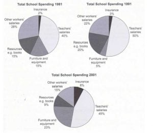
First you need to know what you are looking at. For the chart below, taken from a previous IELTS exam (Cambridge 8), you are looking at the same kind of data (total school spending), divided into five fields in three different years.
Make Notes about Figures
In the charts below you can see I’ve followed the charts for each of the five fields from 1981 via
(through) 1991 to 2001, and drawn an arrow to show the overall trends and calculated the overall changes.
For example, Insurance went from 2% to 3% to 8% so that is a clear upward trend, so I made a note on the final pie chart of x4 (four times), and I drew a straight upward arrow to show a clear large increase.
In contrast, Teachers’ salaries initially went up from 40% to 50% before falling to 45%, so it was an overall increase of 5% (or about 10% of the original 40%).
So I made a note on the final pie chart of +10% and I drew a fluctuating arrow but with a clear increase overall.

Make Notes about Positions
Next, in the chart below you can see I noted all the positions in the first and last years so I can clearly see any changes overall.
For example, in 1999 Other workers’ salaries was the 2nd largest area of school spending, whereas in 2001 it had dropped to the 3rd largest area.
So I wrote 2 and 3 next to that part of the pie chart for 2001, and I drew with an arrow to show the direction of the change.


Thanks for your fantastic and clear analysis! It does help organize my own thoughts in my writing!!Thanks a lot!!!
So happy to help – you’re welcome!
I love your analysis instructions so much!! Thanks for all of them.
Thank you for the feedback and you’re welcome!
The pie charts illustrate the change of school spending in five different categories between 1981 and 2001. Overall, teachers’ salaries remained the largest area of spending throughout the twenty years period. While the salaries of other workers and resources displayed a downward trend, other categories showed the opposite.
Looking in more details, two fifths of school funding went to teachers’ salaries in the year of 1981, which increased considerably to 50% in 1991 before a slight dip to 45% by 2001. However, the second largest category at the beginning, other workers’ salaries dropped constantly by half to as low as 15%. By the end of the period, three times as much was spent on teachers’ salaries compared to other workers’ salaries.
In contrast, the proportion spent on furniture and equipment climbed despite the fluctuation to the second position at 23%. Book resources, on the other hand, dropped moderately from 15% to 9%, which was comparable to the increasing spending sector of insurance (8%) by 2001. (165 words)
Good!
Opposite trend, twenty year period, in more detail, two-fifths
Very accurate work!
The pie charts below present data of school spending on 5 different categories during three time points. Teachers spending stays the highest spending during surveyed years followed by “Other workers spending” during 1981 and 1991 and Furniture and Equipment in 2001 as the second rank of spending. Teachers’ Salary spending raised by 10 percent in 1991 but then felt by 5 percent in 2001. While the Furniture and Equipment spending have dramatically increased in 2001 overtaking the “ Other workers Salaries, the “Resources and e.g. Books” have fallen sharply in 2001 in comparison to 1981 and 1991. Insurance spending experienced a steady rate of increase during the surveyed years.
Good work, Behi!
It should be longer and broken up into paragraphs, of course.
The given pie charts compare total school expenditure on five different categories in three different educational years.
Overall, it can be easily seen from the charts that while other workers’ salaries decreased regularly and spending on other three categories fluctuated; insurance outlay increased steadily. However, teacher salaries were the category with the highest expenditure whereas insurance spending was the lowest figure in three separate years.
It is clear that most of the spending in all given educational years was on teacher salaries which ranged from 40 percent to 50 percent while insurance spending ranged from 2 percent to 8 percent. Therefore, there was a twofold difference between the amount of money spent on teacher salaries and insurance expenses in 1981. Although the difference in spending between these two categories decreased by fivefold in 2001, insurance expenses, which was only 8 percent, remained the lowest percentage.
In terms of other workers’ salaries, a systematic decrease was seen from 1981 to 2001, with a drop by %6 from 1981 to 1991 and a drop by %7 from 1991 to 2001. On the other hand, spending on resources and furniture and equipment was same by 15 percent in 1981 while the percentage of spending on resources dropped by 4 percent in 2001 and the figure of expenditure on furniture and equipment rose by 8 percent from %15 to %23.
Good work, Nurut!
on the other threee, – careful with some punctuation too -, you could be more concise linking the data as well.
Keep it up!
Hi Dave, thank you for sharing the insights on analyzing pie charts with us. I just have one question regarding this task 1 – how did you figure out there was a 30% increase of spending on Furniture and equipment?
Good point noticing that, Evander – wasn’t thinking when I wrote it I guess!
Don’t make that mistake on your test!