This is an IELTS writing task 1 sample answer essay on the topic of various age groups attending concerts from real IELTS exam.
Line charts can be tricky to write about because there is so much data it is hard to group it all.
See how I handled it below!
Be sure to sign up on Patreon.com/HowtodoIELTS for my exclusive Ebooks and other materials!
Dave
IELTS Writing Task 1 Sample Answer Essay: Concerts Line Chart
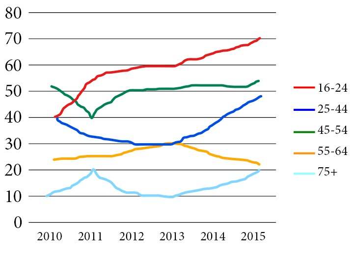
The graph below shows the percentage of people in different age groups in one city who attended music concerts between 2010 and 2015.

The given line chart details the percentages of people attending concerts from 2010 to 2015 across various age groups. Looking from an overall perspective, it is readily apparent that all ages showed increasing trends except for 55-64 and that younger people tended to go to concerts more often.
52% of those between the ages of 45 and 54 went to concerts in 2010, leading all age brackets, but there was a dip to 40% in 2011 which allowed the 16-24 group to rise 15% to 55% and lead all concert-goers. From there, both groups increased with broadly similar trends as the 16-24 year olds had risen to 70% by 2015 and the former group had grown to 54%.
The 25-44 and 55-64 groups showed inverse trends with the former group dipping from 40% in 2010 to a low of 30% in 2013 before sloping upwards to nearly 50% by the end of the period. The latter group rose steadily from a starting point of 20% to intersect with the younger group at 30% in 2013 and then fell to just over 20% in 2015. The final group, aged 75+, doubled to 20% in the first year, had surrendered those gains by 2013, before undergoing a stable increase and reaching 20% to finish the period.
Analysis
1. The given line chart details the percentages of people attending concerts from 2010 to 2015 across various age groups. 2. Looking from an overall perspective, it is readily apparent that all ages showed increasing trends except for 55-64 and that younger people tended to go to concerts more often.
- Paraphrase what the graph shows.
- Write an overview that includes whether or not the categories went up or down and the general overall ranking of each.
1. 52% of those between the ages of 45 and 54 went to concerts in 2010, leading all age brackets, but there was a dip to 40% in 2011 which allowed the 16-24 group to rise 15% to 55% and lead all concert-goers. 2. From there, both groups increased with broadly similar trends as the 16-24 year olds had risen to 70% by 2015 and the former group had grown to 54%.
- Begin to describe the data by comparing different groups.
- Continue comparing and list all the groups. You don’t need all the data but make sure the start and end point is clear and how quickly/slowly it rose/fell.
1. The 25-44 and 55-64 groups showed inverse trends with the former group dipping from 40% in 2010 to a low of 30% in 2013 before sloping upwards to nearly 50% by the end of the period. 2. The latter group rose steadily from a starting point of 20% to intersect with the younger group at 30% in 2013 and then fell to just over 20% in 2015. 3. The final group, aged 75+, doubled to 20% in the first year, had surrendered those gains by 2013, before undergoing a stable increase and reaching 20% to finish the period.
- Begin to compare the other data.
- Continue comparing it listing all the data.
- Include any areas that you didn’t talk about at the end as I do here.
Vocabulary
What do the words in bold below mean?
The given line chart details the percentages of people attending concerts from 2010 to 2015 across various age groups. Looking from an overall perspective, it is readily apparent that all ages showed increasing trends except for 55-64 and that younger people tended to go to concerts more often.
52% of those between the ages of 45 and 54 went to concerts in 2010, leading all age brackets, but there was a dip to 40% in 2011 which allowed the 16-24 group to rise 15% to 55% and lead all concert-goers. From there, both groups increased with broadly similar trends as the 16-24 year olds had risen to 70% by 2015 and the former group had grown to 54%.
The 25-44 and 55-64 groups showed inverse trends with the former group dipping from 40% in 2010 to a low of 30% in 2013 before sloping upwards to nearly 50% by the end of the period. The latter group rose steadily from a starting point of 20% to intersect with the younger group at 30% in 2013 and then fell to just over 20% in 2015. The final group, aged 75+, doubled to 20% in the first year, had surrendered those gains by 2013, before undergoing a stable increase and reaching 20% to finish the period.
Answers
given presented
details describes
attending concerts going to music shows
across various age groups at different ages
Looking from an overall perspective, it is readily apparent that Overall
increasing trends more and more
tended were more likely to
leading in front of
age brackets age groups
dip fall
rise increase
concert-goers people who go to concerts
broadly similar trends in general had the same pattern
former one mentioned first
showed inverse trends had opposite patterns
dipping from falling from
a low of the minimum point
sloping upwards gently increasing
latter more recent one
steadily at regular intervals
starting point beginning with
intersect with cross each other at
just over a little above
doubled increased by 2x
surrendered gave up
undergoing experiencing
stable increase regular rise
reaching getting to
to finish the period at the end of the surveyed time
Pronunciation
Listen and repeat:
ˈgɪvn
ˈdiːteɪlz
əˈtɛndɪŋ ˈkɒnsə(ː)ts
əˈkrɒs ˈveərɪəs eɪʤ gruːps
ˈlʊkɪŋ frɒm ən ˈəʊvərɔːl pəˈspɛktɪv, ɪt ɪz ˈrɛdɪli əˈpærənt ðæt
ɪnˈkriːsɪŋ trɛndz
ˈtɛndɪd
ˈliːdɪŋ
eɪʤ ˈbrækɪts
dɪp
raɪz
ˈkɒnsə(ː)t-ˈgəʊəz
ˈbrɔːdli ˈsɪmɪlə trɛndz
ˈfɔːmə
ʃəʊd ɪnˈvɜːs trɛndz
ˈdɪpɪŋ frɒm
ə ləʊ ɒv
ˈsləʊpɪŋ ˈʌpwədz
ˈlætə
ˈstɛdɪli
ˈstɑːtɪŋ pɔɪnt
ˌɪntə(ː)ˈsɛkt wɪð
ʤʌst ˈəʊvə
ˈdʌbld
səˈrɛndəd
ˌʌndəˈgəʊɪŋ
ˈsteɪbl ˈɪnkriːs
ˈriːʧɪŋ
tuː ˈfɪnɪʃ ðə ˈpɪərɪəd
Vocabulary Practice
What do the words in bold below mean?
The g______n line chart d__________s the percentages of people a______________________s from 2010 to 2015 a____________________________s. L___________________________________________________________t all ages showed i________________________s except for 55-64 and that younger people t_________d to go to concerts more often.
52% of those between the ages of 45 and 54 went to concerts in 2010, l____________g all a______________s, but there was a d____p to 40% in 2011 which allowed the 16-24 group to r_____e 15% to 55% and lead all c______________s. From there, both groups increased with b___________________________s as the 16-24 year olds had risen to 70% by 2015 and the f_______r group had grown to 54%.
The 25-44 and 55-64 groups s________________________s with the former group d_____________m 40% in 2010 to a________f 30% in 2013 before s_____________________s to nearly 50% by the end of the period. The l________r group rose s____________y from a s___________________t of 20% to i_____________________h the younger group at 30% in 2013 and then fell to j____________r 20% in 2015. The final group, aged 75+, d___________d to 20% in the first year, had s___________________d those gains by 2013, before u________________g a s_______________e and r______________g 20% t____________________________d.
Writing Courses Preview
Watch a preview from my online courses below:
Speaking Practice
Answer the following speaking questions from the real exam about music:
Music
Do you enjoy listening to music?
Which types of music do you like?
Would you like to learn a musical instrument?
Do you prefer listening to music alone or with others?
Real Past IELTS Exam
Writing Practice
Write about the following graph then check with my sample answer below:


Could anyone check my writing, please?
The line graph compares changes in the proportion of individuals from five different age ranges (16 to 24, 25 to 44, 45 to 54, 55 to 64, and 65 to above 75) who attended music concerts from 2010 to 2015.
Overall, the youngest age group attended more concerts than any age group, except for 2010, when people aged 45 to 54 attended more than others. In contrast, elder people aged 65 to 75 showed the least interest in those events. Furthermore, there was a growth in figures for people attending concerts for all age ranges, except for people aged 55 to 64.
Regarding the lowest and highest age ranges’ attendance figures, in 2010, 40% of the former group attended concerts more than as opposed to a mere 10% of the latter group. From that point, there was a rapid growth in the proportion of people below 24, reaching a peak of 70% in 2015. However, the percentage of elderly peaked twice at 20% in 2011 and 2015.
Turning to the remaining groups, in 2010, just over half of those aged 45-54 went to concerts, which was 10% and 35% greater than the younger and older age ranges respectively. Following this, the figures for people ages 24-44 and 55-64 showed a reverse trend, finishing at almost 50% and 20% respectively. Finally, there was a sharp decline in the proportion of people aged 54 to 64 attending concerts in 2011, before rising again and finishing at 55% in 2015.
Good work Saad!
Really strong overview!
Work on your comparative grammar – totherwise really great writing – what score do you need?
Thanks Dave, I want to get 7+
The line graph illustrates the proportion of people in five different age brackets in a single city attending music concerts from 2010 to 2015. In general, the percentages of attendees on a significant majority of age groups increased over the period, except ages 55-64, which remained relatively stable. Another striking detail is the younger age group, which often attended concerts.
In 2010, the highest figure can be seen is the group of ages 45-54, 52% were fond of concerts. It was followed by 16-24 and 25-44 age brackets, which both stood at around 40%. The figures for ages 55-64 and 75 above were lower, at about 24% and 10% respectively.
By 2015, the proportion of ages 16-24 attending concerts was remarkably highest, at roughly 70%. It could be noticed also that the figures for 45-54 and 25-44 age groups gradually moved upward, finishing the given period at 54% for the former and 48% for the latter. Surprisingly, the oldest group enjoyed watching music concerts as the years progressed, jumped by 10% in 2015. In contrast, concert attendees from the 55-64 age group declined a very small proportion over 5 years.
Good work Jessica!
Very good overview with the complete trend!
‘that can be seen’ ‘This was’ 10%,respectively ‘declined marginally over the 5 years’
Keep it up!
Sir my overview…..
Overall, it is readily apparent that the younger ones preference to attend music concerts grew significantly over the years. Interestingly, all age groups experienced increasing trends with the exception of age 55 to 64 which showed little fluctuations.
Made little correction
Overall, it is readily apparent that the younger ones preference to attend music concerts grew significantly over the years, while the older ones (age75+)showed the least interest. Interestingly, all age groups experienced increasing trends with the exception of age 55 to 64 which showed little fluctuations.
Good! Did that age group go up or down overall?
You must mention that as well.
Dave,check my writing and assess please(what score do i deserve 6+?). my ielts exam is coming next week!! Additionally, I have not read the sample because of this, probably some details may coincide.
The line graph details the percentage of five various age group in certain town who attended music performance for a 6 year period from 2010.
From an overall perspective, it is apparent that percentage of all age categories increased over the time surveyed period, except 55-64 years old individuals, which end period lower than began.
As the data suggest, the youngsters start period with exactly 40%, whereas 45-54 years old people start with slightly over 50%. Then, both of their index intersected in midway through 2010. Afterwards, proportion of former increased exponentially to hit a peak of 20% in 2015. At which point, latter followed a similar trend and reached a peak approximately 54% with some fluctuations in preceding years.
Moving further,remaining 3 groups also underwent upward trend.It is evident that lowest place on the illustration took elderly people(over 75) which index double folded by the end of period. In 2010, percentage of 25-44 and 55-64 years old people were 25% and 40% respectively. Then, former gradually dipped till 2013 and soared in the following years to reach a almost 49%. However, reversed pattern can be used for a latter.
Very good
The chart shows the percentage of each age group who participated in concerts from 2010 to 2015.
We see that the younger audience, the more attendance except in green and blue line, which is 45-54 and 25-44 respectively.
The whole trend of going to concerts witnessed an increase over the years, but in detail, some age groups show less interest in concerts.
In 2010 the figure shows the most interested group for concerts was 45-54 but after that youngest group stayed at a top rate until 2015.
In 2011 something strange happened; After this year line slope of the attendance rate reversed in two groups of 45-54 and 75+, this year’s percentage of attendance reached in lowest value in the 45-54 age group, and the 75+ group attendance rate reached the maximum value.
Obviously, we see only one line goes upper all the time, and it is the youngest group and other groups were concave or convex.
Finally, we see the participation in all groups from young to old increased lately except the yellow one for 55-64.
-Alif
Well written, Alif!
You shouldn’t really mention the color of the lines and some vocabulary like ‘obviously’ is too informal.
Keep it up!
Can you check my overview please
Overall, young people from 16-24 years old attended by far the most concerts over periods with a significant increased while other age group had comparatively slight increased, except for the 55-64 group which experienced a small drop off.
Great – you have covered all categories fully and that is what you need to do New – keep it up!