This is an IELTS writing task 1 sample answer essay on a line chart showing temperate and sunshine in London, New York, and Sydney.
Be sure to sign up for on Patreon.com/HowtodoIELTS for my exclusive Ebooks and other materials!
Dave
IELTS Writing Task 1 Sample Answer Essay Line Chart: Temperature & Sunshine
The charts below give information about the typical temperatures in London, New York, and Sydney as well as total hours of sunshine for each city.
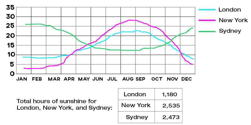
The line chart and table detail both average annual temperatures and total hours of sunshine in a given year in London, New York, and Sydney. Overall, London and New York display broadly similar four-season climates, though the extremes are more pronounced in New York while Sydney has a reverse weather pattern with milder overall temperatures. In terms of overall sunshine, New York leads, followed closely by Sydney and distantly by London.
Looking first of all at London and New York, both undergo serious drops in temperature beginning in November as the former falls to just over 10 degrees Celsius, intersecting the latter at the same point. From there, temperatures in New York plummet throughout the winter with a low of under 5°C in January and February, while London bottoms out at around 9 degrees. Both rise steadily in the spring and peak in summer at around 23°C for London and nearly 30°C for New York. In contrast, Sydney is warmest from December to February (plateauing at over 25 degrees) and cools steadily to under 15 degrees from June to October.
Overall sunshine shows a different pattern with New York (2,535 hours) and Sydney (2,473) proximate and London much lower at 1,180.
Analysis
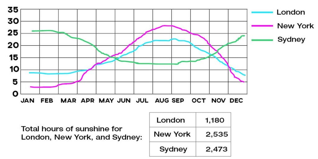
1. The line chart and table detail both average annual temperatures and total hours of sunshine in a given year in London, New York, and Sydney. 2. Overall, London and New York display broadly similar four-season climates, though the extremes are more pronounced in New York while Sydney has a reverse weather pattern with milder overall temperatures. 3. In terms of overall sunshine, New York leads, followed closely by Sydney and distantly by London.
- Paraphrase what the graph or chart shows.
- Write a general overview that covers all areas – don’t leave anything out but don’t be too specific by including data.
- Make sure that you mention the table as well.
1. Looking first of all at London and New York, both undergo serious drops in temperature beginning in November as the former falls to just over 10 degrees Celsius, intersecting the latter at the same point. 2. From there, temperatures in New York plummet throughout the winter with a low of under 5°C in January and February, while London bottoms out at around 9 degrees. 3. Both rise steadily in the spring and peak in summer at around 23°C for London and nearly 30°C for New York. 4. In contrast, Sydney is warmest from December to February (plateauing at over 25 degrees) and cools steadily to under 15 degrees from June to October.
- Begin to compare the data.
- Finish comparing the data.
- Shift to the last area and describe all the data there.
1. Overall sunshine shows a different pattern with New York (2,535 hours) and Sydney (2,473) proximate and London much lower at 1,180.
- Describe the table fully as well. Sometimes the table and graph will relate to each other closely but these ones don’t so you don’t have to compare them.
Vocabulary
What do the words in bold below mean?
The line chart and table detail both average annual temperatures and total hours of sunshine in a given year in London, New York, and Sydney. Overall, London and New York display broadly similar four-season climates, though the extremes are more pronounced in New York while Sydney has a reverse weather pattern with milder overall temperatures. In terms of overall sunshine, New York leads, followed closely by Sydney and distantly by London.
Looking first of all at London and New York, both undergo serious drops in temperature beginning in November as the former falls to just over 10 degrees Celsius, intersecting the latter at the same point. From there, temperatures in New York plummet throughout the winter with a low of under 5°C in January and February, while London bottoms out at around 9 degrees. Both rise steadily in the spring and peak in summer at around 23°C for London and nearly 30°C for New York. In contrast, Sydney is warmest from December to February (plateauing at over 25 degrees) and cools steadily to under 15 degrees from June to October.
Overall sunshine shows a different pattern with New York (2,535 hours) and Sydney (2,473) proximate and London much lower at 1,180.
Answers
detail describe
average annual temperatures how hot/cold it usually is
total hours of sunshine how much sun they get
given year any year
display broadly similar show almost the same
four-season climates spring, summer, fall, winter places
extremes at the high and low
pronounced striking, stronger
reverse weather pattern opposite trends
milder in the middle, not extreme
leads is highest
followed closely behind it a bit
distantly behind it a lot
looking first of all at considering firstly
undergo serious drops experience big falls
former mentioned first
intersecting cross over
latter mentioned last
same point intersection
plummet throughout the winter descrease a lot all during winter
a low of lowest point
bottoms out decreases to a low point at
rise steadily increase at regular intervals
peak reach a highpoint
nearly almost
in contrast in comparison
warmest not cold
plateauing levelling off
cools steadily gets cooler gradually
different pattern not the same trend
proximate close
much lower a lot less
Pronunciation
Listen and repeat:
ˈdiːteɪl
ˈævərɪʤ ˈænjʊəl ˈtɛmprɪʧəz
ˈtəʊtl ˈaʊəz ɒv ˈsʌnʃaɪn
ˈgɪvn jɪə
dɪsˈpleɪ ˈbrɔːdli ˈsɪmɪlə
fɔː-ˈsiːzn ˈklaɪmɪts
ɪksˈtriːmz
prəˈnaʊnst
rɪˈvɜːs ˈwɛðə ˈpætən
ˈmaɪldə
liːdz
ˈfɒləʊd ˈkləʊsli
ˈdɪstəntli
ˈlʊkɪŋ fɜːst ɒv ɔːl æt
ˌʌndəˈgəʊ ˈsɪərɪəs drɒps
ˈfɔːmə
ˌɪntə(ː)ˈsɛktɪŋ
ˈlætə
seɪm pɔɪnt
ˈplʌmɪt θru(ː)ˈaʊt ðə ˈwɪntə
ə ləʊ ɒv
ˈbɒtəmz aʊt
raɪz ˈstɛdɪli
piːk
ˈnɪəli
ɪn ˈkɒntrɑːst
ˈwɔːmɪst
ˈplætəʊɪŋ
kuːlz ˈstɛdɪli
ˈdɪfrənt ˈpætən
ˈprɒksɪmɪt
mʌʧ ˈləʊə
Vocabulary Practice
Remember and fill in the blanks:
The line chart and table d________l both a___________________________s and t_____________________________e in a g______________r in London, New York, and Sydney. Overall, London and New York d______________________r f___________________________s, though the e_____________s are more p___________________d in New York while Sydney has a r______________________n with m____________r overall temperatures. In terms of overall sunshine, New York l_______s, f____________________y by Sydney and d_____________y by London.
L__________________________t London and New York, both u__________________________s in temperature beginning in November as the f____________r falls to just over 10 degrees Celsius, i________________g the l___________r at the s________________t. From there, temperatures in New York p________________________________r with a____________f under 5°C in January and February, while London b________________t at around 9 degrees. Both r___________________y in the spring and p_________k in summer at around 23°C for London and n____________y 30°C for New York. I__________________t, Sydney is w_______________t from December to February (p__________________g at over 25 degrees) and c_______________y to under 15 degrees from June to October.
Overall sunshine shows a d____________________n with New York (2,535 hours) and Sydney (2,473) p______________e and London m______________r at 1,180.
Listen and check:
Listening Practice
Learn here about winter in New York:
Reading Practice
Learn more about British weather here:
https://www.bbc.com/news/magazine-24305230
Speaking Practice
Practice with the following questions from the real speaking exam:
Skies
Do you often look at the sky?
Do you prefer to look at the sky during the day or at night?
Have you ever taken a course about stars?
Where is the best view of the sky where you live?
Real Past IELTS Speaking Exam
Writing Practice
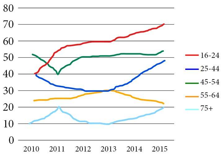
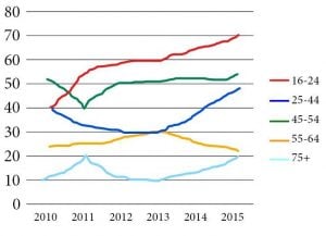
Write about the following graph then check with my sample answer. The graph below shows the percentage of people in different age groups in one city who attended music concerts between 2010 and 2015.


Hi Dave, Could U please feedback.
The line graph illustrates changes in temperatures in three cities, namely London, New York, and Sydney, throughout a year, while the table shows the number of hours that the Sun shines in the same three areas yearly.
Overall, temperatures show similar trends in both London and New York, peaking in summer months, whereas the reverse is true in Sydney. Regarding the sunshine, it shines in New York and Sydney for far longer hours compared to London.
In terms of temperatures in London and New York, they start at merely 9C and 3-degree Celsius respectively in January. From that point, there is a rapid rise in temperatures in both cities, reaching a peak of 27 for the former region and 22 degrees for the latter in summer months. After that, in December, temperatures drop dramatically to a mere 7C in London as opposed to 5C in New York. The reverse can be seen in Sydney, where the figure is highest at over 25C in January, before dropping sharply to a low of almost 13C between June and August. Following this, the temperature goes up steadily to just under 25C in December.
Turning to the number of hours the sun shines, in New York and Sydney, it shines for 2,535 and 2,473 hours annually, which is over double the figure for London at 1,180 hours.
Good work!
Your overview is clear, the data is accurate and your writing is extremely accurate.
Mere is a little informal so I would avoid it. Goes up as well – you can use a work like grow, rise, increase, etc.
Keep it up!
Dave,
Question!, can I get 7+ if I write in the same way/accuracy in the exam?
Absolutely!
Hi Dave, can you give me the feedback
The line chart and table show the average monthly temperature in three different cities (London, New York, and Sydney) as well as the total number of sunshine hours in a given year. Overall, NewYork has more hours of sunshine than Sydney and London, it also has the most extreme weather than the other two cities, with the coldest winter and the hottest summer. London and New York share a quite striking similar temperature pattern while Sydney shows the opposite.
In more detail, the coldest months in New York and Sydney are December and January, typically below 5 degrees Celcius and 10 degrees Celcius respectively. The hottest months of these two cities are in August and September, with NewYork temperature reaching highest at 28 degrees Celcius and Sydney temperature peaking at 23 degrees Celcius. In contrast, Sydney hottest months are January, February, and December with the temperature hovering over 25 degrees Celcius, and the coldest months are in August and September, with the temperature hovering around 12 degrees Celcius.
NewYork has 2535 hours of sunshine every year, followed closely by Sydney with 2473 hours. London takes last place with 1180 hours of sunshine per year.
Hi Tony!
Good work!
Be careful with subject/verb agreement, articles, possessives and repeating the same structure too much.
Keep working hard!
Hello Dave,
I have a question. The spring and summer, spring needs to be with preposition, ‘the’ but not for summer?
It depends – sometimes you can say ‘the’ before both, sometimes drop them.