This is an IELTS writing task 1 sample answer essay on the topic of a bar chart showing airline ticket prices from the real IELTS exam.
Find all the most recent task 1 topics here and my full IELTS Ebooks here and my online courses here.
Dave
IELTS Essay: Airline Ticket Prices
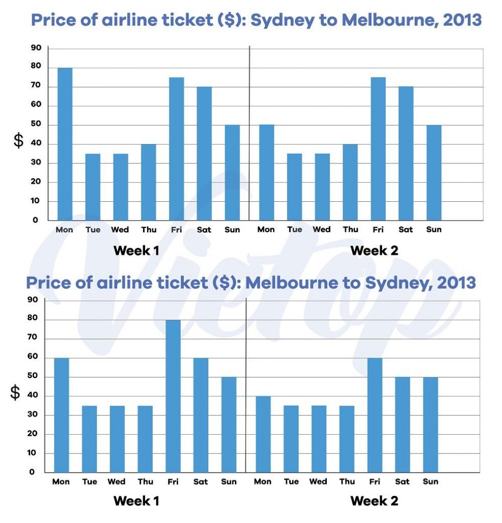
The charts below give information about the price of tickets on one airline between Sydney and Melbourne, Australia, over a two-week period in 2013.

The bar charts display information for the price of airline tickets from Sydney to Melbourne and the reverse flight over a two week period in 2013. Looking from an overall perspective, it is readily apparent that flights in both directions displayed broadly similar patterns with higher prices Friday through Monday. Compared to week 1, week 2 prices were either greatly deflated or identical for nearly all flights.
In week 1, flights from Sydney to Melbourne started at 80$ on Monday, were all under $40 over the next 3 days before a spike to $75, $70, and $50 on Friday, Saturday and Sunday, respectively. During the second week, the prices were unchanged with the notable exception of a decline on Monday to $50 fares.
In terms of flights from Melbourne to Sydney, the trend was comparable with flights on Monday of week 1 elevated to $60, sub-$40 flights on Tuesday, Wednesday, and Thursday and the most expensive flight on Friday at $80. Flights on Saturday and Sunday were also relatively costly at $60 and $50 each day. In week 2, Monday prices displayed a dramatic decline to $40 and there was more variance later in the week. Friday fell to $50 and Saturday to $50. All other tickets remained the same in week 2.
Analysis
1. The bar charts display information for the price of airline tickets from Sydney to Melbourne and the reverse flight over a two week period in 2013. 2. Looking from an overall perspective, it is readily apparent that flights in both directions displayed broadly similar patterns with higher prices Friday through Monday. 3. Compared to week 1, week 2 prices were either greatly deflated or identical for nearly all flights.
- Paraphrase what the bar chart shows.
- Write a clear overview summarising the differences.
- You might need another sentence for your overview.
1. In week 1, flights from Sydney to Melbourne started at 80$ on Monday, were all under $40 over the next 3 days before a spike to $75, $70, and $50 on Friday, Saturday and Sunday, respectively. 2. During the second week, the prices were unchanged with the notable exception of a decline on Monday to $50 fares.
- Begin writing about the data for the first categories.
- Make sure you compare as much as possible.
- Vary long and short sentences.
1. In terms of flights from Melbourne to Sydney, the trend was comparable with flights on Monday of week 1 elevated to $60, sub-$40 flights on Tuesday, Wednesday, and Thursday and the most expensive flight on Friday at $80. 2. Flights on Saturday and Sunday were also relatively costly at $60 and $50 each day. 3. In week 2, Monday prices displayed a dramatic decline to $40 and there was more variance later in the week. 4. Friday fell to $50 and Saturday to $50. All other tickets remained the same in week 2.
- Write about the final other parts of the graph – include everything!
- Compare the categories.
- This is a tricky one, but try to group information too.
- Finish with the rest of the data.
Vocabulary
What do the words in bold below mean? Take some notes on a piece of paper to aid your memory:
The bar charts display information for the price of airline tickets from Sydney to Melbourne and the reverse flight over a two week period in 2013. Looking from an overall perspective, it is readily apparent that flights in both directions displayed broadly similar patterns with higher prices Friday through Monday. Compared to week 1, week 2 prices were either greatly deflated or identical for nearly all flights.
In week 1, flights from Sydney to Melbourne started at 80$ on Monday, were all under $40 over the next 3 days before a spike to $75, $70, and $50 on Friday, Saturday and Sunday, respectively. During the second week, the prices were unchanged with the notable exception of a decline on Monday to $50 fares.
In terms of flights from Melbourne to Sydney, the trend was comparable with flights on Monday of week 1 elevated to $60, sub-$40 flights on Tuesday, Wednesday, and Thursday and the most expensive flight on Friday at $80. Flights on Saturday and Sunday were also relatively costly at $60 and $50 each day. In week 2, Monday prices displayed a dramatic decline to $40 and there was more variance later in the week. Friday fell to $50 and Saturday to $50. All other tickets remained the same in week 2.
Answers
Try to write down or think of an antonym/opposite word for further practice:
display information show the data
airline tickets flights
reverse flight return way
over a two week period in for around 14 days
Looking from an overall perspective, it is readily apparent that overall
directions displayed broadly similar patterns going each way showed about the same trend
higher more than
greatly deflated a lot less
identical the exact same
nearly almost
started began
spike surge
respectively in turn
unchanged no difference
notable exception big instance
decline decrease
fares tickets
in terms of flights from when it comes to plans from
trend pattern
comparable compared to
elevated increased
sub under
most expensive really costly
displayed showed
dramatic decline siginificant fall
variance difference
remained the same didn’t change
Pronunciation
Practice saying the words below using this tip with Google voice dictation:
ˈlʊkɪŋ frɒm ən ˈəʊvərɔːl pəˈspɛktɪv, ɪt ɪz ˈrɛdɪli əˈpærənt ðæt
dɪˈrɛkʃənz dɪsˈpleɪd ˈbrɔːdli ˈsɪmɪlə ˈpætənz
ˈhaɪə
ˈgreɪtli dɪˈfleɪtɪd
aɪˈdɛntɪkəl
ˈnɪəli
ˈstɑːtɪd
spaɪk
rɪsˈpɛktɪvli
ʌnˈʧeɪnʤd
ˈnəʊtəbl ɪkˈsɛpʃən
dɪˈklaɪn
feəz
ɪn tɜːmz ɒv flaɪts frɒm
trɛnd
ˈkɒmpərəbl
ˈɛlɪveɪtɪd
sʌb
məʊst ɪksˈpɛnsɪv
dɪsˈpleɪd
drəˈmætɪk dɪˈklaɪn
ˈveərɪəns
rɪˈmeɪnd ðə seɪm
Vocabulary Practice
Remember and fill in the blanks. Note it on a piece of paper so you can remember better:
The bar charts d_____________________n for the price of a_____________________s from Sydney to Melbourne and the r_______________t o________________________n 2013. L______________________________________________________t flights in both d____________s d_____________________________________s with h________r prices Friday through Monday. Compared to week 1, week 2 prices were either g___________________d or i_____________l for n______y all flights.
In week 1, flights from Sydney to Melbourne s__________d at 80$ on Monday, were all under $40 over the next 3 days before a s_______e to $75, $70, and $50 on Friday, Saturday and Sunday, r____________y. During the second week, the prices were u_______________d with the n__________________n of a d_________e on Monday to $50 f_______s.
I____________________m Melbourne to Sydney, the t______d was c____________e with flights on Monday of week 1 e__________d to $60, sub-$40 flights on Tuesday, Wednesday, and Thursday and the m____________e flight on Friday at $80. Flights on Saturday and Sunday were also relatively costly at $60 and $50 each day. In week 2, Monday prices d________d a d_______________e to $40 and there was more v___________e later in the week. Friday fell to $50 and Saturday to $50. All other tickets r______________________e in week 2.
Listening Practice
Listen to the related topic below and practice with these activities:
Reading Practice
Read more and use these ideas to practice:
https://www.cnbc.com/2021/09/29/qatar-airways-delta-air-lines-top-worlds-best-airline-rankings.html
Speaking Practice
Practice with the following related questions from the real IELTS speaking exam:
Flying
- Are there many airlines in your country?
- Have you ever flown anywhere?
- Where would you like to fly?
- Are you scared of flying?
Writing Practice
Practice with the related chart below and then check with my sample answer:


0 Comments