This is an IELTS writing task 1 sample answer essay on the topic of total world production across 3 different regions.
Please consider supporting my efforts to creative high quality IELTS materials for students around the world by signing up for my Patreon (and so you won’t miss out on any of my exclusive IELTS Ebooks)!
Dave
IELTS Essay Task 1: World Production
The bar graph shows the total manufacturing production in percentages Asia, Europe, and the rest of the world.
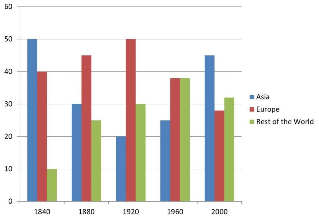
The bar chart details manufacturing production figures proportionally for Asia, Europe and the rest for the world from 1840 to 2000. Looking from an overall perspective, it is readily apparent that while Asia and Europe’s numbers are in decline overall, Asia is on the rise. The rest of the world experienced the most steady increase and by the end was second to Asia in production.
Asia began the period with the highest levels of production at 50%, with Europe slightly lower at 40% and the rest of the world constituting the final 10%. By 1880, the differences had narrowed with Asia falling to 30%, Europe at 45% and the rest of the world more than doubling to 15%. This trend continued through 1920 as Europe and the rest of the world both rose an additional 5% and Asia dropped 10% further.
After 1960 the pattern shifted as Asia begin to rise precipitously, first to 15% and then to 45%. In contrast, Europe underwent a decline to 38% in 1960 and 28% by 2000. Lastly, the rest of the world peaked in 1960 at 38% (even with Europe) before falling back slightly to 32% by the end of the period.
Analysis
1. The bar chart details manufacturing production figures proportionally for Asia, Europe and the rest for the world from 1840 to 2000. 2. Looking from an overall perspective, it is readily apparent that while Asia and Europe’s numbers are in decline overall, Asia is on the rise. 3. The rest of the world experienced the most steady increase and by the end was second to Asia in production.
- Paraphrase what the graph shows.
- Write a clear overview summarising the major trends and differences.
- Add an extra sentence to be sure that you have covered everything.
1. Asia began the period with the highest levels of production at 50%, with Europe slightly lower at 40% and the rest of the world constituting the final 10%. 2. By 1880, the differences had narrowed with Asia falling to 30%, Europe at 45% and the rest of the world more than doubling to 15%. 3. This trend continued through 1920 as Europe and the rest of the world both rose an additional 5% and Asia dropped 10% further.
- Begin writing about the differences.
- Compare as much as possible.
- Make sure you mention all data.
1. After 1960 the pattern shifted as Asia begin to rise precipitously, first to 15% and then to 45%. 2. In contrast, Europe underwent a decline to 38% in 1960 and 28% by 2000. 3. Lastly, the rest of the world peaked in 1960 at 38% (even with Europe) before falling back slightly to 32% by the end of the period.
- Write about the rest of the information.
- Make sure you have detailed all the information.
- Don’t leave anything out!
Vocabulary
What do the words in bold below mean? Take some notes on a piece of paper to aid your memory:
The bar chart details manufacturing production figures proportionally for Asia, Europe and the rest for the world from 1840 to 2000. Looking from an overall perspective, it is readily apparent that while Asia and Europe’s numbers are in decline overall, Asia is on the rise. The rest of the world experienced the most steady increase and by the end was second to Asia in production.
Asia began the period with the highest levels of production at 50%, with Europe slightly lower at 40% and the rest of the world constituting the final 10%. By 1880, the differences had narrowed with Asia falling to 30%, Europe at 45% and the rest of the world more than doubling to 15%. This trend continued through 1920 as Europe and the rest of the world both rose an additional 5% and Asia dropped 10% further.
After 1960 the pattern shifted as Asia begin to rise precipitously, first to 15% and then to 45%. In contrast, Europe underwent a decline to 38% in 1960 and 28% by 2000. Lastly, the rest of the world peaked in 1960 at 38% (even with Europe) before falling back slightly to 32% by the end of the period.
Answers
details describes
manufacturing production figures date for the amount of items produced
proportionally by percentage
looking from an overall perspective, it is readily apparent that overall
decline overall decrease in general
on the rise growing
experienced underwent
most steady increase went up at regular intervals
was second to just below
began the period with start at
slightly lower a little less
constituting making up
differences had narrowed disparities smaller
falling to declining to
more than doubling increasing at least 200%
trend pattern
rose grew
additional extra
dropped fell
further moreso
pattern shifted trend changed
precipitously quickly/a lot
underwent experienced
decline decrease
lastly finally
peaked reached a high point
even equal
falling back slightly decreasing a little
by the end of the period at the end of the time surveyed
Pronunciation
ˈdiːteɪlz
ˌmænjʊˈfækʧərɪŋ prəˈdʌkʃən ˈfɪgəz
prəˈpɔːʃənli
ˈlʊkɪŋ frɒm ən ˈəʊvərɔːl pəˈspɛktɪv, ɪt ɪz ˈrɛdɪli əˈpærənt ðæt
dɪˈklaɪn ˈəʊvərɔːl
ɒn ðə raɪz
ɪksˈpɪərɪənst
məʊst ˈstɛdi ˈɪnkriːs
wɒz ˈsɛkənd tuː
bɪˈgæn ðə ˈpɪərɪəd wɪð
ˈslaɪtli ˈləʊə
ˈkɒnstɪtjuːtɪŋ
ˈdɪfrənsɪz hæd ˈnærəʊd
ˈfɔːlɪŋ tuː
mɔː ðæn ˈdʌblɪŋ
trɛnd
rəʊz
əˈdɪʃənl
drɒpt
ˈfɜːðə
ˈpætən ˈʃɪftɪd
prɪˈsɪpɪtəsli
ˌʌndəˈwɛnt
dɪˈklaɪn
ˈlɑːstli
piːkt
ˈiːvən
ˈfɔːlɪŋ bæk ˈslaɪtli
baɪ ði ɛnd ɒv ðə ˈpɪərɪəd
Vocabulary Practice
Remember and fill in the blanks:
The bar chart d______s m__________________________s p_____________y for Asia, Europe and the rest for the world from 1840 to 2000. L__________________________________________t while Asia and Europe’s numbers are in d______________l, Asia is o____________e. The rest of the world e______________d the m_________________e and by the end w____________o Asia in production.
Asia b_____________________h the highest levels of production at 50%, with Europe s_______________r at 40% and the rest of the world c____________g the final 10%. By 1880, the d__________________________d with Asia f____________o 30%, Europe at 45% and the rest of the world m__________________g to 15%. This t_______d continued through 1920 as Europe and the rest of the world both r_____e an a_____________l 5% and Asia d___________d 10% f_________r.
After 1960 the p_______________d as Asia begin to rise p______________y, first to 15% and then to 45%. In contrast, Europe u____________t a d________e to 38% in 1960 and 28% by 2000. L________y, the rest of the world p________d in 1960 at 38% (e_____n with Europe) before f__________________y to 32% b__________________________d.
Listening Practice
Listen to the related topic below and practice with these activities:
Reading Practice
Read more and use these ideas to practice:
Speaking Practice
Practice with the following related questions from the real IELTS speaking exam:
Travelling
- Do you like travelling?
- What is the most beautiful country you have visited?
- Would you like to have a job that demands travelling to other countries?
- What problems can occur when travelling?
Writing Practice
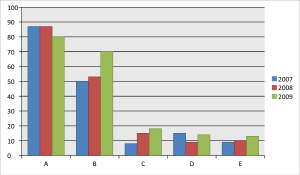
Practice with the related graph below related to film production in 5 countries and then check with my sample answer:


Dave, can you help me check this one 🙁 I find it kinda long but not sure where to shorten it
Given is a bar chart representing the figures for productions manufactured in Asia, Europe, and the remains of the world throughout 160 years starting from 1840. Looking from an overall perspective, while the three classes all experienced a decline eventually, Asia took the lead at the end of the day. However, the rest of the world was the only class to have a long-lasting increase and ended up in the second spot.
As can be observed from the bar chart, Asia’s statistics, albeit initially highest, started to decrease dramatically from 50 percent in 1840 to 30 percent in 1880 and finally reached its bottom at 20 percent in 1920. On the other hand, Europe and the remaining continents rose sharply during this period. Europe went up by 5 percent every 40 years and took first place from Asia in 1920. The same trend went with the rest of the world except during the first 40 years, its number jumped up to 25 percent, 15 percent higher than the former in 1840.
Since 1960, there were some critical changes in statistics as Asia’s production began to increase (for 5 percent in 1960) and got back to the first rank (45 percent) in 2000. In contrast with Asia, Europe went into a nosedive (approximately 38 percent in 1960) and descended at around 28 percent in 2000. The rest of the world reached its peak at 38 percent similar to Asia in 1960 and ended up with a moderate drop of 5 percent during the year 2000.
It is a bit long, Felix.
You have some wordy phrases in it even in the initial paraphrase that you could cut down. There are also a lot of informal expressions like ‘at the end of the day’ that don’t fit in academic writing.
Besides that, just try to group together more data and write a little more concisely – some charts are tougher and require more words.
The bar chart details the proportions of products manufactured in Asia, Europe and the rest of the world.
In general, while Asia and Europe’s numbers are in decline as a whole, figures for the rest of the world rose over this period of time.
the two continents mentioned experienced adverse changes in production. Specifically, Asia began the period with the highest levels of production at 50%, with Europe slightly lower at 40%. By contrast, in 2000, Asian’s production was higher than Europe’s at 45% and 28%, respectively.
Furthermore, the figure for Europe reached a peak of precisely 50% in 1920 whereas that of Asia fell to its lowest point of only 20%. From 1960 to 2000, while the percentages of production in Asia experienced a steady increase, with slightly less than a twofold climb, the other continent dropped by approximately 11%.
The rest of the world saw a continued rise, from only 10% to the highest in 1960 at 38% (a position shared with Europe), before a slight pullback to 32%.
Nice job – keep up the hard work!