
Which kind of Task 1 Writing questions are the most difficult? In my experience as an IELTS Teacher and Examiner, most students say it’s tables!
In this article I show you how to make simple notes on the table, so that it will be easier to recognise (see) and remember all of the important trends.
Here is a tricky table sample answer for your enjoyment too!
Be sure to avoid the mistakes that most students make on writing by signing up for my exclusive IELTS Ebooks here on Patreon.
Dave
Tables are Challenging
It’s no surprise that students struggle with tables. After all, it is much easier to see the overall trends in a line chart or a bar graph.
But in a table you are just looking at the naked data. Just look at the example below taken from a previous IELTS writing exam (taken from Cambridge 10).
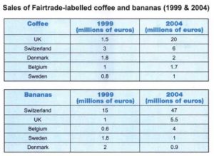
There are a lot of figures to process and it’s practically (nearly) impossible to see the trends quickly and then remember them as you are writing your report.
So what you need to do is make notes on the table about all the important changes. For the table above you need to note changes in sales and also changes in position.
Let’s look at changes in sales first.
Make Notes about Figures
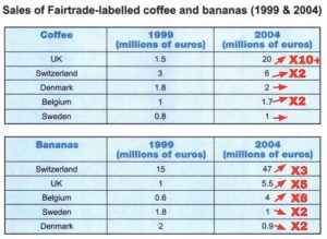
In the table below you can see I’ve roughly calculated the changes in sales of coffee and bananas for each country between 1999 and 2004, and I’ve made notes at the side of the most recent figures.
For example, in the UK the amount of coffee sold increased by more than 10 times so I’ve made a note of that as x10+, and I drew an arrow to show a large increase.
Similarly, for Sweden it increased by a very small amount (compared to other countries) so I only drew an arrow to show a very slight increase and no figure.
Make Notes about Positions
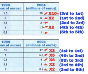
Next, in the table below you can see I noted all the positions for both time periods so I can clearly see any changes.
For example, in 1999 the UK sold the 3rd largest amount of coffee, whereas in 2004 it sold the most amount of coffee.
So I wrote 3 and 1 in the columns for 1999 and 2004 respectively, and I drew with an arrow to show the direction of the change.
By the way, it is now easy to spot (see) that the order of the country names for both Coffee and Bananas matches their positions in 2004.


The table present statistics of sales of two products at 1999 and 2004 in 5 surveyed countries. All countries have experienced an upward trend in coffee sales amount with UK standing out with more than ten-fold increase in coffee sales. When it comes to Bananas, one can follow an almost similar patter; however two countries had minor reduction in amount of sales of Bananas.
Nice overview Behi! Though the ten-fold increase is too specific – cut that out.
A breakdown of the analysis regarding the income of coffee and bananas in five different areas between 1999 and 2004 is depicted in the table. Looking for an overall perspective, it is readily apparent that the sales of coffee saw an upward trend in all of countries while the revenue of bananas two of the three countries experienced a downward trend. The largest increase of coffee sales was by far in the UK, whereas the most significant rise in bananas’ revenue was in Belgium.
A breakdown of the analysis regarding the income of coffee and bananas in five different areas between 1999 and 2004 is depicted in the table. Looking for an overall perspective, it is readily apparent that the sales of bananas saw an upward trend in all of countries while the revenue of bananas two of the three countries experienced a downward trend. The largest increase of coffee sales was by far in the UK, whereas the most significant rise in bananas’ revenue was in Belgium.
Good again, Nin!
But as I mentioned – be sure to name the countries…
A breakdown of the analysis regarding the income of coffee and bananas in five different areas between 1999 and 2004 is depicted in the table. Looking for an overall perspective, it is readily apparent that the sales of coffee saw an upward trend in all of countries while the revenue of bananas two of the three countries experienced a downward trend. The largest increase in coffee sales was by far in the UK, whereas the most significant rise in bananas’ revenue was in Belgium.
A more detailed look in the bar chart, the figure for coffee in the UK rose significantly, from 1.5 to 20 euros throughout the period, followed by Switzerland and Belgium increased slightly from 3 to 6 millions and 1 to 1,7 millions respectively. The remaining two countries remained unchanged the given five-year period.
Apart from the previous comparison, the sales of bananas experienced a slight increase in Belgium and UK , from 0,6 to 4 millions and 1 to 5 millions respectively, followed by Switzerland increased nearly threefold over the period. In contrast, the figure for Sweden and Denmark witnessed a slight dip, more than doubled in the end of year.
Good work, Nin!
Be sure to name which countries had the downward trend in your overview – technically you will get a 5 for TA because you don’t have that…
Good comparison of the data – keep working hard!
The tables compare the share of coffee and bananas with Fairtrade label in five European countries between 1999 and 2004.
Overall, it is readily apparent that all countries showed an upward trend in the sales of coffee during a half decade, while UK finished the period with the largest share and growth over the years. Another feature is that Switzerland remained its top seller in terms of bananas with the most significant increase throughout the years, while Sweden and Denmark saw a slight decrease.
Looking first of all at coffee, the sales in UK began at just 1.5 million euros but then surged by more than 13 times to 20 million euros in 2004, overtaking the original leading seller Switzerland (6 million euros) which saw a slight increase of 3 million euros in a 5-year interval. It is also followed distantly by Sweden, Belgium and Denmark, which their sales stood at between 1 and 2 million euros and recorded the comparatively smaller increases of below 1 million euros over the past 5 years.
Turning to bananas, Switzerland sold the most amount at around 15 million euros in 1999 and ended up with top sales among five countries after peaking to around 47 million euros. Meanwhile, UK and Belgium, despite recording an increase between 3.4 and 4.5 million respectively, were still at least 10 times lower than Switzerland. In contrast, both Sweden and Denmark experienced a moderate drop to just around 1 million euros at the same times.
1) Is my overview too long? Are there anything unnecessary to mention in the overview?
2) I found it difficult and time-consuming to present the statistics in different ways (even simple active/passive voice)…
Nice SC!
For your questions:
1. The overview is perfect – better a little too long than a little too short.
2. Keep practicing and it will become faster – you are doing it well so it is just a question of practice and speeding up.
Keep working hard!
That’s amazing, well done.