This is an IELTS writing task 1 sample answer from the real test/exam with 4 pie charts related to working in a town.
A student drew this picture so that we can all practice with it – big thanks to her!
Here are some other key IELTS exam resources to help you out:
Recent Speaking Questions and Topics
IELTS Writing Task 1 Sample Answers
Good luck with your test!
Dave
Before you read my sample answer, you can listen to the audio and make some notes (or don’t look at the graph and try to draw it from my audio):
IELTS Writing Task 1 Sample Answer: Working Pie Charts (Real Past IELTS Exam/Test)
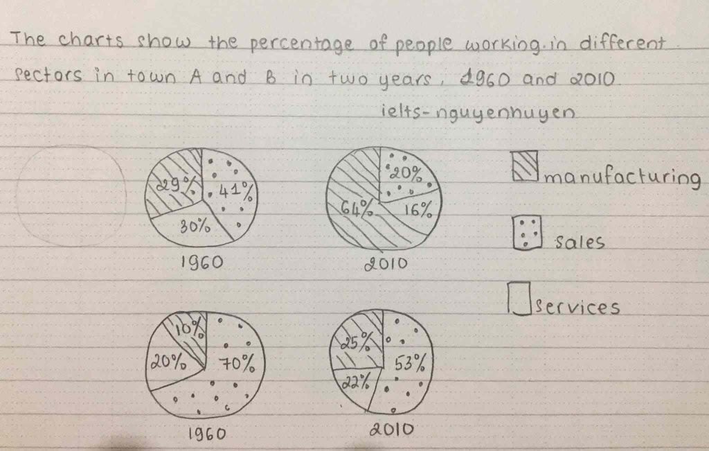
The given pie charts compare employment sectors in towns A and B in 1960 and 2010. Overall, sales positions became less common in both towns, while manufacturing showed the reverse trend and service jobs decreased in town A but not town B. By 2010, manufacturing supplanted sales as the predominant industry in town A, while in town B sales remained top.
Manufacturing underwent the largest growth going from 29% to an overwhelming 64% in town A and more than doubling from 10% to 25% in town B. For both towns this necessitated a decline in sales positions with town A dropping from 41% to 21% and town B falling from 70% to 53%, albeit still accounting for the majority of jobs.
Services had contrasting trends, though by 2010 this sector employed the lowest proportions for both towns. In town A services nearly halved (30% down to 16%) whereas in town B it rose marginally by 2% to 22%.
Analysis
1. The given pie charts compare employment sectors in towns A and B in 1960 and 2010. 2. Overall, sales positions became less common in both towns, while manufacturing showed the reverse trend and service jobs decreased in town A but not town B. 3. By 2010, manufacturing supplanted sales as the predominant industry in town A, while in town B sales remained top.
- Simply paraphrase what the graphs show for your first sentence. Don’t waste much time on this sentence.
- Begin your overview – maximum two sentences.
- For an overview you must full cover the trend (are the areas going up/down/staying the same) and some of the ranking or speed (which one is highest overall, maybe one of them has increased/decreased a lot). Read more about overviews here.
1. Manufacturing underwent the largest growth going from 29% to an overwhelming 64% in town A and more than doubling from 10% to 25% in town B. 2. For both towns this necessitated a decline in sales positions with town A dropping from 41% to 21% and town B falling from 70% to 53%, albeit still accounting for the majority of jobs.
- Begin to describe the data. You must describe all the data in the graphs.
- Make sure that you always compare. I divided the paragraphs into sectors with the same trend and then sectors with different trends below.
1. Services had contrasting trends, though by 2010 this sector employed the lowest proportions for both towns. 2. In town A services nearly halved (30% down to 16%) whereas in town B it rose marginally by 2% to 22%.
- Make sure that you have clear paragraphs and reasons for them. Here I switch to describe the smallest area which also had a differing trend for the two towns.
- Double check to make sure that you have mentioned all data.
Vocabulary
The given pie charts compare employment sectors in towns A and B in 1960 and 2010. Overall, sales positions became less common in both towns, while manufacturing showed the reverse trend and service jobs decreased in town A but not town B. By 2010, manufacturing supplanted sales as the predominant industry in town A, while in town B sales remained top.
Manufacturing underwent the largest growth going from 29% to an overwhelming 64% in town A and more than doubling from 10% to 25% in town B. For both towns this necessitated a decline in sales positions with town A dropping from 41% to 21% and town B falling from 70% to 53%, albeit still accounting for the majority of jobs.
Services had contrasting trends, though by 2010 this sector employed the lowest proportions for both towns. In town A services nearly halved (30% down to 16%) whereas in town B it rose marginally by 2% to 22%.
Answers
compare contrast
sectors areas
positions rankings
showed the reverse trend went in the opposite direction
supplanted overtook/took the place of
predominant industry most powerful sector
while in contrast to
underwent experienced/happened
overwhelming very strong
more than doubling increasing by more than 50%
necessitated required
dropping decreasing
falling decreasing
albeit although
accounting for taking up
majority most of
contrasting trends opposite patterns
lowest proportions smallest percentage
nearly halved almost cut in half
whereas in contrast to
rose marginally increase a little
Pronunciation
kəmˈpeə
ˈsɛktəz
pəˈzɪʃənz
ʃəʊd ðə rɪˈvɜːs trɛnd
səˈplɑːntɪd
prɪˈdɒmɪnənt ˈɪndəstri
waɪl
ˌʌndəˈwɛnt
ˌəʊvəˈwɛlmɪŋ
mɔː ðæn ˈdʌblɪŋ
nɪˈsɛsɪteɪtɪd
ˈdrɒpɪŋ
ˈfɔːlɪŋ
ɔːlˈbiːɪt
əˈkaʊntɪŋ fɔː
məˈʤɒrɪti
kənˈtrɑːstɪŋ trɛndz
ˈləʊɪst prəˈpɔːʃənz
ˈnɪəli hɑːvd
weərˈæz
rəʊz ˈmɑːʤɪnəli
Listen and repeat:
Vocabulary Practice
The given pie charts ___________ employment ___________ in towns A and B in 1960 and 2010. Overall, sales ___________ became less common in both towns, while manufacturing ___________ and service jobs decreased in town A but not town B. By 2010, manufacturing ___________ sales as the ___________ in town A, ___________ in town B sales remained top.
Manufacturing ___________ the largest growth going from 29% to an ___________ 64% in town A and ___________ from 10% to 25% in town B. For both towns this ___________ a decline in sales positions with town A ___________ from 41% to 21% and town B ___________ from 70% to 53%, ___________ still ___________ the ___________ of jobs.
Services had ___________, though by 2010 this sector employed the ___________ for both towns. In town A services ___________ (30% down to 16%) ___________ in town B it ___________ by 2% to 22%.
Listen and check:
Listening Practice
Review the topic of jobs with this video:
Reading Practice
Read more about pie charts here:
How to Analyse Pie Charts Over Time
Comment your questions or concerns below!


Hi Ipek, for my money, you have overused the word “decrease”, the percentage sign has been placed in the wrong position, “had been decreasing” would look good in lieu of “have been”. Similarly, starting the sentence with “And” only to repeat the same word in the same sentence doesn’t look good. You could have used “while/whereas” in the last sentence to show contrasting trend. Thank you. Have a great day. Please don’t take my comment personally.
Thank you for the feedback! But I only use the word ‘decrease’ one time so I don’t think it has been overused and the percentage signs are in the correct place – after the number (i.e. 35%). Using the past perfect progressive is possible in one of these essays but present perfect is also possible and doesn’t look any worse.
The issue about ‘and’ is a common one and I don’t think it is a problem but I didn’t start any sentences with ‘and’ in this essay. Can you clarify?
Hi Dave, this response is meant for “Ipek”. I have addressed not Dave. Dave yours is the perfect example.
Ah yes – sorry I didn’t notice that – thanks for posting the helpful feedback and I second it!
Thanks a lot Kishor!
**Hi Dave, coming back to you. I’m trying to improve, but still feel a bit confusion. Could you please check this as well. Always trying to follow your structure but still confusing with myself. **
The given pie charts illustrate the amount of individuals as a percentage, who are being employed in various types of industries, in two specific towns (Town A and B), in the years of 1960 and 2010. In overall, the most striking feature is, in both considered years, town B has the highest percentage of employees in the sector of sales, while, town A manifests the largest portion of employees who are engaged with manufacturing careers. On the other hand, both towns express decrements in sales whereas a remarkable increment in manufacturing, while, service sector exhibits slight fluctuations in numbers.
Looking first, town A had a comparatively higher number (30%) of people in 1960, who work for service firms than town B (20%) and this amount has decreased to 16% in town A while, Town B had grown up to 22%. Hence, in 2010, town B shows the maximum percentage of persons who work in service corporations. Meantime, in 1960, town A had an extensive ratio of number of workers who belong to manufacturing industries (22%) while town B had only 10%. With the time, this number had extraordinary developed in town A (64%) while town B had a diminutive
increment of 15% in 2010 (25% ).
Town B had the maximum figure of men and women under sales category (70%) in 1960 in opposed to town A (41%). This quantity elucidates a significant decline in both towns at the end of the period, for instance, town A has reduced to 20% from 41% whereas town B has gone down to 53% from 70%.
Much better on this one Div!
The overview is strong and your language is much more accurate. There is still some misuse:
Get rid of hence and meantime and ‘with this time’ – keep memorising expressions from my essays!
Also your tenses jump around a lot. This one takes place in the past – so stick to present perfect and past simple. I would recommend identifying all your tenses and trying to correct them.
Write/underline all your verbs and see if you can correct them on your own.
Thank you Dave. I understand that I have used various tenses and sometimes it is confusing. 🙁 Have to work more .. I appreciate your kind assistance Dave, Thanks a million !
The pie charts compare the proportions of employees falling into three distinct sectors in towns A and B over a period of 50 years.
It is clear that there were significant changes in the percentages of workers employed in these areas in both towns. Additionally, the proportions of sales jobs were highest in both years in town B, while there was a shift towards manufacturing jobs in town A.
In 1960, 41% of employees doing sales in town A, compared to a massive 70% of people employed in the same sector in town B. This dramatic difference reflects the fact that the proportions of manufacturing and service jobs were higher in town A than that of in town B.
In 2010, the percentage of manufacturing jobs rose in both towns, most noticeably in town A where the figure increased by 35%. By contrast, both towns saw a fall in sales jobs, dropping from 41% to 20% in town A and from 70% to 53% in town B. Finally, jobs in service sector rose slightly in town B, but dropped significantly in town A.
(184 words)
Hi Dave, please shed some light on the essay above (the last one that I really need your help)
Appreciate your help.
Bryan.
Hi Bryan!
Don’t say significant changes for a graph or chart it doesn’t give any information. Try to instead make sure you have the trend for all areas.
What was the shift towards in town B? What about services?
Without those, it will be an automatic band 5 for task achievement.
Really good comparisons and grouping of the data! Very accurate grammar and vocabulary as well – try to rewrite the overview!
Hi Dave,
I’ve read your overview over and over again.
That was brilliant.
I got it.
I can’t thank you enough!
You’re very welcome – keep working hard!
”This dramatic difference reflects the fact that the proportions of manufacturing and service jobs were higher in town A than that of in town B” you don’t have to put your opinion
Yes, it is a bit speculative.
Hi Dave, It is a really tough one. Shall I group the data of each city alone, as I guess it would be much easier?
The pie charts compare the proportion of workers in three departments, namely manufacturing, sales and services, in two towns (A and B) in the years 1960 and 2010.
Overall, while in city A there was a significant increase in the proportion of people working in the manufacturing sector, which made it the top employing department, the sales department absorbed the greatest figure in city B in both years. The service department, on the other hand, made up the lowest proportion in city A in both years, and in city B the lowest percentage of workers can be seen in the manufacturing and service departments.
In terms of the top employing sectors in both years, in city A, only 29% of workers were employed in the manufacturing sector in 1960, which then rose to 64% in 2010. However, in city B, despite the decline in the figure for individuals working in sales from 70% to 53% over the period shown, this department employed far more than any other department in both years.
Turning to the other sectors, 30% and 41% of working people in city A were in employment in the service and sales sectors respectively in 1960, before declining to almost a half in 2010. In city B, while the figure for those who work in manufacturing activities made up only a tenth in 1960, by 2010, their proportion had reached a quarter of the total workforce. Finally, approximately a fifth of employees in city B can be found in service activities in both years.
Hi Saad,
As long as you find some way to group it, that’s fine.
I think you grouped it well and the writing is very sophisticated.
You might have issues with length and timing – how long did it take to write it?
It took me about 25 minutes. Indeed, I know that it should be within 20 minutes and above 150 words. However, I try my best to pick up the most important features and report them, which makes most of my writing between 170 and 230 words.
Yes, don’t worry too much about timing. Focus on getting everything right and then close to your test you can work on writing a little faster.
Usually it just takes some practice and then you’ll be able to write faster.
The pie charts compare the proportion of people working in 3 different divisions in town A and B between 1960 and 2010. Overall, It is readily apparent that the manufacturing jobs became popular while the sales sector recorded a downward trend for both towns over a 50-year period. It is clear also that people became less interested in town A in services as opposed to what happened in town B.
In 1960, the sales industry was the most common job for towns A & B, at about 41% and 70% of people, respectively, were working here. This was followed by services division in which 30% of people from town A and one-fifth of town B were in this field. However, the less common job in the same year was manufacturing, at just 29% for the former and 10% for the latter had this job.
Over 5 decades, the proportion of manufacturing increased significantly in town A over one-third, and an additional 15% in town B. In contrast, a reverse trend can be seen in the sales industry in towns A & B, which dropped to 21% and 53%, respectively. Meanwhile, the changes for services had opposing directions, a substantial decline for town A at 16%, and an increment of just 2% for town B.
Great again, Jessica!
popular, while … over the… it is also clear… Town A services … the least common … employed 10% for the latter … showed inverse trends
Just some small mistakes!
thank u so mush, but what if I make one paragraph for town A and another for town B
That’s fine too, Asmaa. But try to compare them as much as possible.