How long you spend looking at the chart depends on the question – some take longer than others, but regardless you need to be efficient.
That means knowing what you are looking for and identifying the main trends and key details as quickly as possible so you can start writing.
Look for the overall pattern (for charts and graphs).
The first thing I tell my students to do is take a step back and look at the overall pattern.
What I mean by this is don’t worry about the precise thing you’re measuring (people, cars, cats – who cares?), and ignore all the numbers and just look at the overall trends, by looking at the start and finish positions.
A lot of students worry too much about all the minor fluctuations (every up and down) of each line or column but you need to stay focussed on the overall changes to see if these smaller changes are important.
So overall, did each line go up or down? Are the blue ones more than the red ones? Did they increase more than the other?
Not only will this help you to understand the chart, but you will need this summary for your overview, which is essential for any task 1 essay.
Practice Exercise
Let’s look at an example. For the chart below you should look for the following:
– Which line overall is the highest?
– What line had the highest increase?
– What did the other lines do? (increase a bit, decrease, stay the same)
Answers:
So the ‘big picture’ for the chart below is that the top line (it’s health, but that’s not important now) is overall the highest and it was the one that increased the most.
Most of the other lines increased a little bit (comparing the start and finish) but one line (the dotted line – ‘other’) pretty much stayed the same overall (again comparing start and finish).
Writing your overview
So based on looking at the chart above, you can write the following overview:
“Overall, the spending on all kinds of research increased over the period.”
But this is a poor overview, so it would get a low score (most examiners will give it a 5, some will give it a 6 for Task Achievement). This is because it doesn’t cover all the main points and there’s a mistake, as ‘other’ was unchanged.
For this chart, you should mention that health was the largest area of spending by far and that the other fields had comparatively small or no increases.
Therefore for a good Task Achievement score, you should write something like this:
“Health was the largest area of spending by far and grew significantly during the period while the others had comparatively small increases, except for ‘other’ which overall was unchanged.”
This overview will get you a band 7 and up.
There is no difference between a band 7, band 8 and band 9 overview. The difference in Task Achievement for the those scores is determined by how well you describe the detail, including making suitable comparisons.
Now it’s your turn! Put your answers in the comments.
Write an overview for the chart below. We’ll give you feedback on it!
The first thing to remember about IELTS Speaking is that the examiner is there to do their job, not be your friend for 15 minutes.
IELTS examiners are required to carry out the test in exactly the same way every, single time.
And there are lots of rules to follow regarding the time and what they can say.
For example in part 1:
-They can’t make natural responses to show they are listening – they must be silent when you are speaking.
-They can only say ‘Why?’ or ‘why not?’ to reply to your answer.
-They can’t answer any questions you ask.
-They can’t change the question – they must read it exactly from the book.
-They can only repeat each question once.
-They can’t help you if you have misunderstood the question.
-They are not allowed to explain whole questions.
-They must follow the 4-5 minute time limit.
So as well as asking the questions in the correct way and making sure they follow all the rules, they have to assess your speaking score.
This is difficult as the examiner is not allowed to make notes during your test so they have to listen carefully, and think about your scores carefully (or carelessly).
IELTS Speaking ROBOT!
Therefore it’s not surprising that examiners, especially in part 1, are unnaturally cold and formal.
Don’t be surprised if you say something funny or sad and they don’t respond at all.
In fact it might help to think of the examiner like an IELTS robot, not a person.
The most important thing to remember is that they are there to do their job, and you are there to do yours.
If you want to both improve your English and feel comfortable, I now offer online lessons complete with feedback, videos, workbooks and more – you can learn more here!
Your Job
And what is your job?
To show off your English skills by answering every question as well as you can.
Top Tips:
1. Don’t be bothered by the robotic nature of the examiner. Just try to be as natural, relaxed and talkative as possible.
2. Try to pretend that the examiner is friendly and encouraging, even if they are not.
3. Don’t ask the examiner any questions.
For example, in part 1:
Examiner: “What are you plans for next weekend?”
Candidate: ”I’m going to Queen’s Park. Do you know it?”
More and more of my students are reporting that they have to describe multiple charts in their Task 1 exam, so you need to be prepared for these kinds of questions.
You can see from the examples below that sometimes the charts are the same e.g. two tables or two bar graphs, but other times, it will be a mixture of different types e.g. a pie chart and table, or a line graph and bar chart.
Sometimes there is a close link between the charts so you need to make comparisons. Other times the relationship is not as close so you’re not expected to compare them directly.
Often multiple chart questions are more difficult because it takes longer to understand all the data but you still only have 20 minutes to complete the task!
You still need to describe all the main trends and key details so you must be more selective about what you describe.
Dave
1. Pie Charts
Multiple charts are common with pie charts.
In the example below, you have to describe changes to the age of the population over a period of fifty years in Italy and Yemen.
The four pie charts below are closely related so you will need to compare them directly.
2. Bar Charts
Multiple bar charts are also common in Task 1 writing.
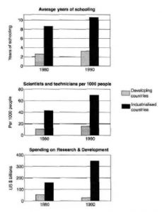
In the example below, you have to compare changes in three fields (average length of schooling, numbers of scientists and technicians, and spending on research and development) in developed and developing countries between 1980 and 1990.
Each bar chart focuses on a separate data field so you will only make some indirect comparisons between the charts, unlike in the pie chart example above.
Do not try to compare them too closely because they are not closely related. Instead, put them in separate paragraphs with separate general overviews.
3. Mixed Charts – Pie Chart vs Table
Task 1 questions with more than one kind of chart are quite common.
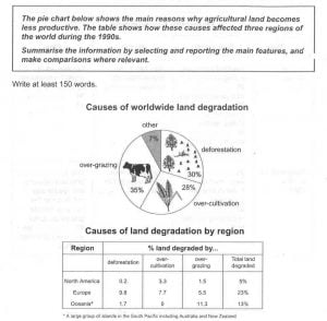
In the example below, you have to describe the main causes of global land degradation and compare changes in three regions during the 1990s.
Each bar chart focuses on a separate data field so you will only make some indirect comparisons between the charts.
Do not try to compare them too closely because they are not closely related. Instead, put them in separate paragraphs with separate general overviews.
4. Mixed Charts – Bar Chart vs Line Graph
In the example below, you have to describe changes to the number of overseas Japanese tourists between 1985 and 1995, and the percentage of those going to Australia between 1984 and 1994.
Each bar chart focuses on a separate data field so you will only make some indirect comparisons between the charts.
Do not try to compare them too closely because they are not closely related. Instead, put them in separate paragraphs with separate general overviews.
Study Tips for Multiple Charts
Multiple charts are becoming more and more common so you need to make sure you understand them and have practised them for your writing exam.
As you can see from the examples above, sometimes the charts are the same type and sometimes not.
Sometimes you can make direct comparisons, and at other times it is a more indirect relationship.
Remember, you still have only 20 mins, but there is probably more data to analyse, so you may have to be even more selective about what you describe.
Now it’s your turn! Put your answers in the comments.
Do you think Task 1 questions with multiple charts are difficult?
A lot of my students seem surprised by Task 1 writing because it wasn’t what they expected, and to be fair there are quite a few different types of questions!
So here is a breakdown of all the basic info you need.
If you want to read some sample essays that will also give you a leg up on the test! Here is a bar chart, pie chart, table, process, and a map!
The IELTS writing exam is a 60 minute test of your English writing ability and there are two parts – Task 1 and Task 2.
For Task 1 (Academic) you will be given some data in the form of a chart, table, or process.
You have around 20 minutes to write at least a 150 word summary of the data.The data comes in many different formats so you should practise all of them to be ready for your test.
What Does a Task 1 Question Look Like?
The question has three main parts:
1. Task instructions – these are always the same for any academic Task 1
2. A statement that introduces the data.
3. The data itself – presented in a chart, table or diagram.
The Instructions
You can see from the three examples below that the instructions can be found above and below the box, as well as the second sentence inside the box.
Every task 1 is the same. You need to:
– Spend about 20 minutes and write at least 150 words.
– Write a summary of the main trends and key details, and make comparisons if possible.
Example 1
Example 2
Example 3
The First Sentence
Look again at the examples. The introductory statement/first sentence is the first sentence in the box.
It is different for each question because the data is different each time.
It is very useful as it gives you the following information:
1. The type of data – chart, table, map, process etc.
2. Other key information e.g. where, when, what
You should read this sentence carefully as you will need to paraphrase this information when you write an introduction to your task 1 essay.
The Data – 6 Task Types
The data is the information you have to describe in your task 1 essay. It will be presented in a chart, table or diagram.
There are six basic types. Let’s take a look:
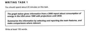
1. Line graphs – e.g. describe changes to six different kinds of fuel consumption over a period of fifty years in the USA.
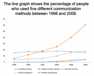
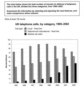
2. Bar graphs or charts – e.g. describe changes to three different kinds of phone use over a period of eight years in the UK.
3. Pie charts – e.g. describe changes to the age of the population over a period of fifty years in Italy and Yemen.
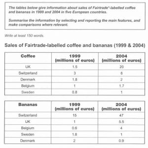
4. Tables – e.g. describe and compare sales of two different products in five countries over five years.
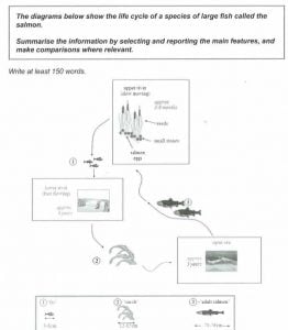
5. Process diagrams – e.g. describe the life cycle of a salmon.
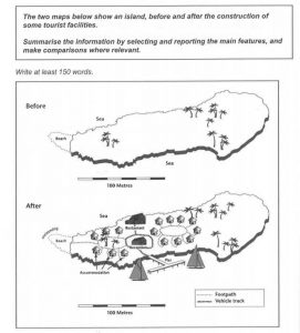
6. Maps – e.g. describe and compare two maps of an island before and after a development.
How Different are the Different Types of IELTS Task 1s?
In some ways every task 1 is the same – they all have the same amount of time, same word length, and in general ask you to do the same thing.
In other ways, they are very different – each task type requires different vocabulary and a different focus.
So you should study and practise each task type separately, so that whichever one you get on your test day, you’ll be able to complete it successfully.
How is Task 1 scored?
Your essay is marked by a qualified IELTS examiner.
They will score your writing equally using four criteria:
1. Task Achievement (Answering the the question)
2. Coherence and Cohesion (Clear and well organised)
3. Lexical Resource (Vocabulary and spelling)
4. Grammatical Range and Accuracy (Grammar and punctuation)
For each of the criteria you will get a ‘band score’ of 0-9.
These will be added together and an average will be calculated and the final figure will be rounded down, even if you are close to the next band score.
Finally the two figures are added together and calculated as ⅓ x Task 1 and ⅔ x Task 2.
This is then rounded down again. Sorry – I didn’t write the test!
For example, Donald Trump gets the following scores:
TA
C&C
LR
GR
Average score
Final result
Task 1
5
7
7
6
6.25
6
Task 2
6
6
6
5
5.75
5.5
(Task 1 score x 1/3) + (Task 2 score x 2/3).
5.775
5.5
KEY TIP: Task 2 is worth double the marks so make sure you don’t spend too long on Task 1. If you are a slow writer, do task 2 first!
Also notice that being marked down in one criteria can wreck your chances of getting the score you need.
Therefore it isn’t enough to get close to the score you want, especially as some examiners are very strict.
You must make sure that through repeated practice that you are consistently getting the scores you need so you can be confident on the day.
Check out our marking service to know your scores, get personal corrections and guaranteed improvement.
"The highest quality materials anywhere on the internet! Dave improved my writing and vocabulary so much. Really affordable options you don't want to miss out on!"