This is an IELTS writing task 1 sample answer essay on the topic of a line graph showing proportions of residents living in Australia from different countries from the real IELTS exam.
Please consider supporting my efforts to creative high quality IELTS materials for students around the world by signing up for my Patreon (and so you won’t miss out on any of my exclusive IELTS Ebooks)!
Dave
IELTS Essay Task 1: Australian Residents
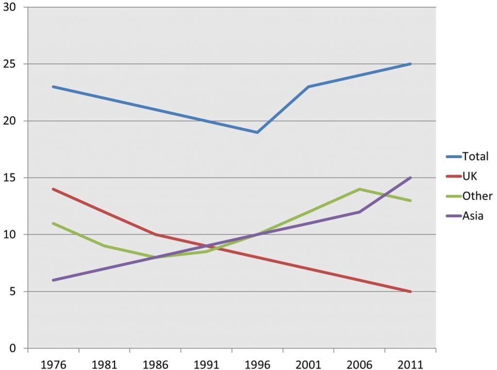
The line chart details the proportion of residents living in Australia in millions from different regions between 1976 and 2011.

The line chart compares figures for millions of residents from the UK, Asia, and other living in Australia from 1976 to 2011. Looking from an overall perspective, it is readily apparent that those from the UK experienced a steep decline, which was compensated for with a rise among others and, in particular, Asians. Total numbers also rose overall.
Individuals from the UK began the period leading all demographics at nearly 14 million before a precipitous fall to 10 million by 1986. In contrast, Asian residents grew steadily from just over 6 million to 9 million by 1991 (overtaking the UK in that year) and continued this upward trajectory to finish with a final surge to 15 million in 2011. The UK had fallen to 5 million in the same year.
Other displayed a more erratic trend with initial figures at 11 million, a moderate decline to 8 million by 1986, a consistent rise to 14 million by 2006, and a slight pullback to 13 million to end the period. Total numbers remained between 19 and 25 million throughout the period with a low point in 1996 and a peak in 2011.
Analysis
1. The line chart compares figures for millions of residents from the UK, Asia, and other living in Australia from 1976 to 2011. 2. Looking from an overall perspective, it is readily apparent that those from the UK experienced a steep decline, which was compensated for with a rise among others and, in particular, Asians. 3. Total numbers also rose overall.
- Paraphrase what the graph shows.
- Write a clear overview summarising the major trends and differences.
- Add an extra sentence to be sure that you have covered everything.
1. Individuals from the UK began the period leading all demographics at nearly 14 million before a precipitous fall to 10 million by 1986. 2. In contrast, Asian residents grew steadily from just over 6 million to 9 million by 1991 (overtaking the UK in that year) and continued this upward trajectory to finish with a final surge to 15 million in 2011. 3. The UK had fallen to 5 million in the same year.
- Begin writing about the differences.
- Compare as much as possible.
- Move on to the next category to describe.
- Try to include all the data you can.
1. Other displayed a more erratic trend with initial figures at 11 million, a moderate decline to 8 million by 1986, a consistent rise to 14 million by 2006, and a slight pullback to 13 million to end the period. 2. Total numbers remained between 19 and 25 million throughout the period with a low point in 1996 and a peak in 2011.
- Write about the rest of the information.
- Make sure you have detailed all the information.
Vocabulary
What do the words in bold below mean? Take some notes on a piece of paper to aid your memory:
The line chart compares figures for millions of residents from the UK, Asia, and other living in Australia from 1976 to 2011. Looking from an overall perspective, it is readily apparent that those from the UK experienced a steep decline, which was compensated for with a rise among others and, in particular, Asians. Total numbers also rose overall.
Individuals from the UK began the period leading all demographics at nearly 14 million before a precipitous fall to 10 million by 1986. In contrast, Asian residents grew steadily from just over 6 million to 9 million by 1991 (overtaking the UK in that year) and continued this upward trajectory to finish with a final surge to 15 million in 2011. The UK had fallen to 5 million in the same year.
Other displayed a more erratic trend with initial figures at 11 million, a moderate decline to 8 million by 1986, a consistent rise to 14 million by 2006, and a slight pullback to 13 million to end the period. Total numbers remained between 19 and 25 million throughout the period with a low point in 1996 and a peak in 2011.
Answers
compares figures shows the differences between numbers
residents people living these
looking from an overall perspective, it is readily apparent that overall
experienced underwent
steep decline fell a lot
compensated for made up for
rise increase
in particular especially
total overall numbers
overall generally
leading above
demographics groups of people
before preceding
precipitous fall big decrease
in contrast in comparison
grew steadily increased at regular intervals
overtaking becoming stronger than
continued kept on
upward trajectory increasing pattern
finish end
final surge last large increase
fallen decreased
displayed showed
erratic trend fluctuated
initial figures starting numbers
moderate decline small decrease
consistent rise steady growth
slight pullback marginal decrease
end the period end of the time surveyed
remained between staying in the middle of
throughout the period the whole time
low point lowest number
peak highest number
Pronunciation
kəmˈpeəz ˈfɪgəz
ˈrɛzɪdənts
ˈlʊkɪŋ frɒm ən ˈəʊvərɔːl pəˈspɛktɪv, ɪt ɪz ˈrɛdɪli əˈpærənt ðæt
ɪksˈpɪərɪənst
stiːp dɪˈklaɪn
ˈkɒmpɛnseɪtɪd fɔː
raɪz
ɪn pəˈtɪkjʊlə
ˈtəʊtl
ˈəʊvərɔːl
ˈliːdɪŋ
ˌdɛməˈgræfɪks
bɪˈfɔː
prɪˈsɪpɪtəs fɔːl
ɪn ˈkɒntrɑːst
gruː ˈstɛdɪli
ˌəʊvəˈteɪkɪŋ
kənˈtɪnju(ː)d
ˈʌpwəd ˈtræʤɪktəri
ˈfɪnɪʃ
ˈfaɪnl sɜːʤ
ˈfɔːlən
dɪsˈpleɪd
ɪˈrætɪk trɛnd
ɪˈnɪʃəl ˈfɪgəz
ˈmɒdərɪt dɪˈklaɪn
kənˈsɪstənt raɪz
slaɪt ˈpʊlbæk
ɛnd ðə ˈpɪərɪəd
rɪˈmeɪnd bɪˈtwiːn
θru(ː)ˈaʊt ðə ˈpɪərɪəd
ləʊ pɔɪnt
piːk
Vocabulary Practice
Remember and fill in the blanks:
The line chart c_________________s for millions of r____________s from the UK, Asia, and other living in Australia from 1976 to 2011. L___________________________________________t those from the UK e_____________d a s_____________e, which was c___________________r with a r_____e among others and, i_________________r, Asians. T_______l numbers also rose o_________l.
Individuals from the UK began the period l_______g all d______________s at nearly 14 million b_________e a p_______________l to 10 million by 1986. I______________t, Asian residents g______________y from just over 6 million to 9 million by 1991 (o_____________g the UK in that year) and c__________d this u_______________y to f_________h with a f_______________e to 15 million in 2011. The UK had f_______n to 5 million in the same year.
Other d__________d a more e_____________d with i_____________s at 11 million, a m_________________e to 8 million by 1986, a c_________________e to 14 million by 2006, and a s_________________k to 13 million to e_______________d. Total numbers r_________________n 19 and 25 million t______________________d with a l_____________t in 1996 and a p_____k in 2011.
Listening Practice
Listen to the related topic below and practice with these activities:
Reading Practice
Read more and use these ideas to practice:
Speaking Practice
Practice with the following related questions from the real IELTS speaking exam:
Travelling
- Do you like travelling?
- What is the most beautiful country you have visited?
- Would you like to have a job that demands travelling to other countries?
- What problems can occur when travelling?
Writing Practice
Practice with the related graph below and then check with my sample answer:


Hello Dave! I have been watching your blog for a while and it has really helped me a lot to improve my knowledge and practice a lot IELTS essays…
I did an essay based on the one you posted here.. I would be greatfull if you could just read it and tell me how it is
-The line graphs gives information about the amount of people in millions how lived in Australia from different countries since 1976 to 2011
Overall, the total of the population underwent a variation of its number, while Asians and others nationalities experienced an upward trend, the residents from the UK decreased constantly in the entire period.
The complete population was below 25 million in 1976, although it experienced an downward trend with below 20 million of people in 1996, this figure grew significantly to get positioned in 25 million of people at the end of the period, the majority of this were Asians, which was the first last with just above 5 million and rose constantly year on year, and ended with the highest number of residents by 2011.
The people from other nations underwent a variation, ending with just below of 15 million, and the exception to this trend in general were the people from the UK, which had the highest figure with nearly 15 million in 1976, but it dropped steeply to get around 5 millions of people, respectively.
It has 179 words so far.
Thank you!
when i read books or other websites about writing task 1 they recommend that I shouldn’t write the trend in such detailed ways as it implies that I do not understand the chart fully
however, since your introduction paragraphs contained all the comparing
informations that needed does that mean you can just write all the data on the charts
. i am really confused about what to do?
Other displayed a more erratic trend with initial figures at 11 million, a moderate decline to 8 million by 1986, a consistent rise to 14 million by 2006, and a slight pullback to 13 million to end the period.
It depends on the graph.
Sometimes you can step back and write a really general overview.
Other times you want to be safe and be sure you have the trend fully described.
It’s tricky and takes a lot of practice.
Later in the essay, try to include as much data as possible but of course highlight the key information.
The amount of british living in australia remained the highest figures
The line chart compares the amount of people from three different countries: uk, asia and other living in australia from 1976 to 2011.
In general, more people from all categories were living in australia over the period with the notable exception of the uk which experienced a steep decline
Individuals from the uk begin the period at nearly 14 million and continue leading all demographics despite a continuous fall until equalling figures for Asians in 1991 at 9 million. This group experienced the biggest overall decrease to only 5 million in 2011. By contrast, Asian residents grew the most, from the smallest population at 6 million to triple that of the UK at the end of the period (15 million).
The rise in other nationalities was more moderate with initial and final figures at 11 million and 13 respectively. More specifically, there was a constant increase in population for this category apart from two dropping trends in the first decade by 3 million and the last 5 years by 1 million.
Total numbers remained between 19 and 25 million throughout the period with a low point in 1996 and a peak in 2011.
Good work!
Careful with some punctuation and you could have a little longer/clearer paragraphs.
Nice accurate writing for the most part!