This is an IELTS writing task 1 sample answer essay on the topic of various energy sources from the real IELTS exam.
Find all the most recent task 1 topics here and my full IELTS Ebooks here and my online courses here.
Dave
IELTS Essay Task 1: Pie Charts Energy
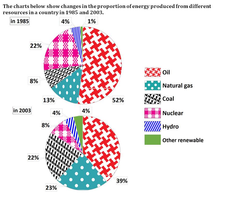
The pie charts display the sources of energy production in 1985 and 2003. Looking from an overall perspective, it is clear that in 1985 the majority of energy came from primarily oil followed by nuclear power, natural gas, and coal with cleaner energy sources rarer. By 2003, renewables became slightly more common or remained level, the use of oil decreased but was still the most used, while both coal and natural gas underwent the largest increases.
In 1985, oil represented 52% of all energy sourced, though this figure had declined to 39% by 2003. Nuclear power, which was the second most pervasive energy source in 1985 at 22%, had the steepest fall to just 8% in 2003. In contrast, natural gas rose from 13% to 23% and coal nearly tripled to 22%.
In terms of the cleaner energy sources, hydro power represented 4% of total usage in both years while other renewables quadrupled from 1% in 1985 to 4% in 2003.
Analysis
1. The pie charts display the sources of energy production in 1985 and 2003. 2. Looking from an overall perspective, it is clear that in 1985 the majority of energy came from primarily oil followed by nuclear power, natural gas, and coal with cleaner energy sources rarer. 3. By 2003, renewables became slightly more common or remained level, the use of oil decreased but was still the most used, while both coal and natural gas underwent the largest increases.
Paraphrase what the bar chart shows.
Write a clear overview summarising the differences.
You might need another sentence for your overview.
1. In 1985, oil represented 52% of all energy sourced, though this figure had declined to 39% by 2003. 2. Nuclear power, which was the second most pervasive energy source in 1985 at 22%, had the steepest fall to just 8% in 2003. 3. In contrast, natural gas rose from 13% to 23% and coal nearly tripled to 22%.
Begin writing about the data for the first categories.
Make sure you compare as much as possible.
Vary long and short sentences.
1. In terms of the cleaner energy sources, hydro power represented 4% of total usage in both years while other renewables quadrupled from 1% in 1985 to 4% in 2003.
Write about the final other parts of the graph – include everything!
Vocabulary
What do the words in bold below mean?Take some notes on a piece of paper to aid your memory:
The pie charts display the sources of energy production in 1985 and 2003. Looking from an overall perspective, it is clear that in 1985 the majority of energy came from primarily oil followed by nuclear power, natural gas, and coal with cleaner energy sources rarer. By 2003, renewables became slightly more common or remained level, the use of oil decreased but was still the most used, while both coal and natural gas underwent the largest increases.
In 1985, oil represented 52% of all energy sourced, though this figure had declined to 39% by 2003. Nuclear power, which was the second most pervasive energy source in 1985 at 22%, had the steepestfall to just 8% in 2003. In contrast, natural gas rose from 13% to 23% and coal nearly tripled to 22%.
In terms of the cleaner energy sources, hydro power represented 4% of total usage in both years while other renewables quadrupled from 1% in 1985 to 4% in 2003.
Answers
Try to write down or think of an antonym/opposite word for further practice:
display show
sources origins
energy production making energy, electricity, etc.
Looking from an overall perspective, it is clear that overall
majority most of
primarily mainly
followed by after that
nuclear power power from nuclear plants and radiation
natural gas a source of heat and power deep in the ground
coal a black rock used for power
cleaner energy sources renewable energies like solar, wind, etc.
Remember and fill in the blanks. Note it on a piece of paper so you can remember better:
The pie charts d_________y the s____________s of e________________n in 1985 and 2003. L______________________________________________t in 1985 the m___________y of energy came from p_________y oil f_____________yn_____________r, n______________s, and c_____l with c____________________s r______r. By 2003, r__________s became s_______________________n or r_______________l, the use of oil decreased but was still the most used, while both coal and natural gas u___________t the largest increases.
In 1985, oil r_____________d 52% of all energy sourced, though this figure had d________d to 39% by 2003. Nuclear power, which was the second most p___________e energy source in 1985 at 22%, had the s_________t fall to just 8% in 2003. I_______________t, natural gas rose from 13% to 23% and coal n___________d to 22%.
I_____________f the cleaner energy sources, hydro power represented 4% of t____________e in both years while other renewables q____________d from 1% in 1985 to 4% in 2003.
Listening Practice
Listen to the related topic below and practice with these activities:
These are the most recent/latest IELTS Writing Task 1 Task topics and questions starting in 2019, 2020, 2021, 2022, 2023, 2024, 2025, and continuing into 2026. ...
The bar charts illustrate how the percentages of the six resources (Oil, Natural gas, Coal, Nuclear, Hydro, and other resources) that produce energy changed in one country in two time periods (1985, and 2003).
Overall, in both years, oil comprised the higher number of all the other resources. Moreover, energy produced from coal, gas, and others rose in 2003, while, nuclear decreased and hydro stayed still.
Proportions of oil had over 50 per cent in 1985, and by 2003, this number had dropped considerably to 39%. However, energy production stillusedoil the most.
In terms of coal and natural gas. They had a significant increase from 8% and 13% in 1985 to 22% and 23 per cent in 2003. Other renewable grew slightly from 1 per cent to four.
In contrast, Nuclear demonstrated a substantial reduction more than half of the percentages of 1985. Furthermore, hydro remain the same in both years (4%).
"The highest quality materials anywhere on the internet! Dave improved my writing and vocabulary so much. Really affordable options you don't want to miss out on!"


your material is very helpful for creak the IELTS exam
You’re welcome, Harpreet!
The bar charts illustrate how the percentages of the six resources (Oil, Natural gas, Coal, Nuclear, Hydro, and other resources) that produce energy changed in one country in two time periods (1985, and 2003).
Overall, in both years, oil comprised the higher number of all the other resources. Moreover, energy produced from coal, gas, and others rose in 2003, while, nuclear decreased and hydro stayed still.
Proportions of oil had over 50 per cent in 1985, and by 2003, this number had dropped considerably to 39%. However, energy production still used oil the most.
In terms of coal and natural gas. They had a significant increase from 8% and 13% in 1985 to 22% and 23 per cent in 2003. Other renewable grew slightly from 1 per cent to four.
In contrast, Nuclear demonstrated a substantial reduction more than half of the percentages of 1985. Furthermore, hydro remain the same in both years (4%).
Good work, Manal!
It could be a little more complex in terms of grammar and vocabulary – good accuracy though!
thanks … It’s very helpful
You’re welcome!
great!!!
Thanks!
Your task 1 is underlength