
This is an IELTS Writing Task 1 Sample Answer from IELTS Cambridge 14 about exports and it is a bar graph (and a table!).
Most students struggle with questions that include two different kinds of graphs. In some ways this can be tricky, especially if the graphs are not really related to each other.
Luckily for these two the graphs are closely related and fairly simple.
It is still a challenge to write a clear over – keep reading to see how I did it!
Take a look here at how to describe multiple charts.
Here are some other IELTS Task 1 Writing Sample Answers that I wrote!
If you want to get my best materials and support me, please sign up for my exclusive IELTS Ebooks here on Patreon.
Dave
IELTS Writing Task 1 Sample Answer: Exports in Various Categories (IELTS Cambridge 14)
The chart below shows the value of one country’s exports in various categories during 2015 and 2016. The table shows the percentage change in
each category of exports in 2016 compared with 2015.
Summarise the information by selecting and reporting the main features, and make comparisons where relevant.
IELTS Cambrdige 14 Bar Chart and Table
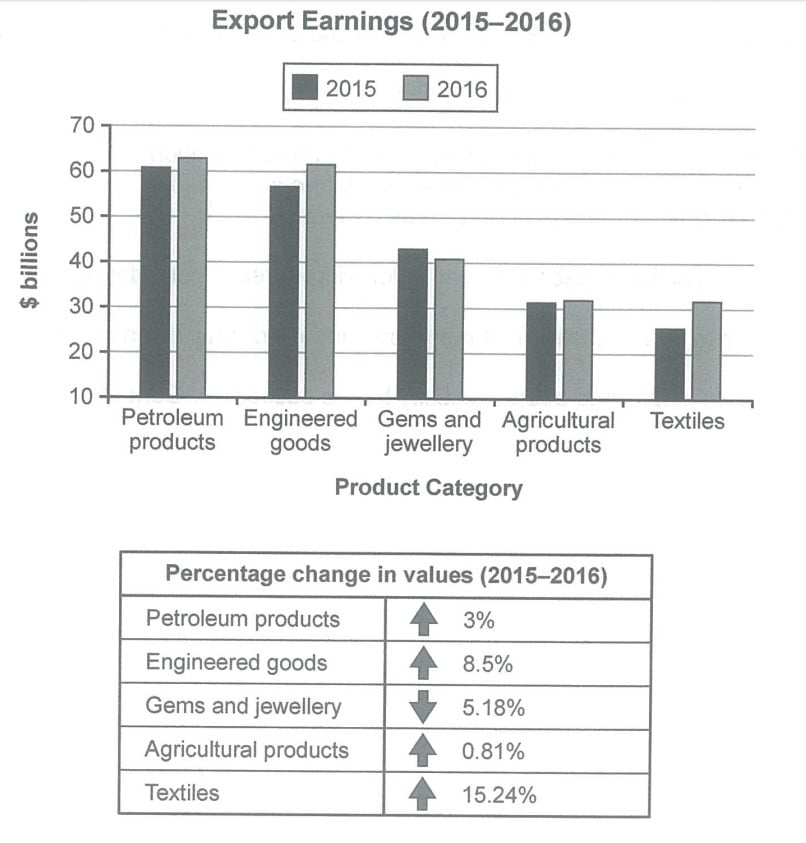
The given graph and table illustrate the changes in export earnings for a country across several industries from 2015 to 2016 measured in billions of dollars. Looking from an overall perspective, it is readily apparent that all earnings experienced rises except for gems and jewellery, which experienced a moderate drop. The majority of earnings came from petroleum and engineered goods, while textiles and engineered goods made the largest percentile jumps.
The two main exports were petroleum products, which went from just over $61 billion in 2015 to around $63 billion by 2016, and engineered goods ($58 billion to $62 billion). That translates to a 3% rise for petroleum and a more sizeable increase of 8.5% for engineered products.
Compared to these two exports, the other products were much lower. Gems and jewellery, the only export to decrease, went down 5.18% from $43 billion to $41 billion. Despite this drop, agricultural goods were lower throughout the period at around $31 and just over $31 billion in 2015 and 2016, respectively. Textiles were the lowest in 2015 at around $26 billion but had pulled approximately level with agriculture by 2016.
IELTS Examiner Sample Answer Analysis
1. The given graph and table illustrate the changes in export earnings for a country across several industries from 2015 to 2016 measured in billions of dollars. 2. Looking from an overall perspective, it is readily apparent that all earnings experienced rises except for gems and jewellery, which experienced a moderate drop. 3. The majority of earnings came from petroleum and engineered goods, while textiles and engineered goods made the largest percentile jumps.
1. The first sentence is just a simple paraphrase of the topic – don’t waste time on this sentence because it has very little impact on your score!
2-3. These sentences have a huge impact on your score! Write your general overview carefully and make sure that you include the trend, the speed and a ranking. Read more about overviews here. Be careful for this mistake that tons of students make with overviews for table.
1. The two main exports were petroleum products, which went from just over $61 billion in 2015 to around $63 billion by 2016, and engineered goods ($58 billion to $62 billion). 2. That translates to a 3% rise for petroleum and a more sizeable increase of 8.5% for engineered products.
1. My first sentence focuses on the two most common areas and includes the data. Make sure that you include the data for every sentence!
2. The second sentence relates that same data to the percentage increases in the table. For these types of two chart questions, there isn’t always a strong relationship between the charts. But for this one there is so I wrote about them in the same paragraph!
1. Compared to these two exports, the other products were much lower. 2. Gems and jewellery, the only export to decrease, went down 5.18% from $43 billion to $41 billion. 3. Despite this drop, agricultural goods were lower throughout the period at around $31 and just over $31 billion in 2015 and 2016, respectively. 4. Textiles were the lowest in 2015 at around $26 billion but had pulled approximately level with agriculture by 2016.
1. My first sentence focuses on the other exports. I grouped them this way just to give my paragraphs some structure and help my cohesion and coherence score.
2. My second sentence focuses on the data for the only export to decrease over the period.
3. The third sentence includes all the data for agricultural goods and compares it to gems and jewellery – always compare!
4. The fourth sentence finishes describing the last area with all the data.
Sample Answer Vocabulary
What do the words in bold mean? If you’re not sure, don’t use a dictionary – try to figure out the meaning from the whole sentence then check your answers below!
The given graph and table illustrate the changes in export earnings for a country across several industries from 2015 to 2016 measured in billions of dollars. Looking from an overall perspective, it is readily apparent that all earnings experienced rises except for gems and jewellery, which experienced a moderate drop. The majority of earnings came from petroleum and engineered goods, while textiles and engineered goods made the largest percentile jumps.
The two main exports were petroleum products, which went from just over $61 billion in 2015 to around $63 billion by 2016, and engineered goods ($58 billion to $62 billion). That translates to a 3% rise for petroleum and a more sizeable increase of 8.5% for engineered products.
Compared to these two exports, the other products were much lower. Gems and jewellery, the only export to decrease, went down 5.18% from $43 billion to $41 billion. Despite this drop, agricultural goods were lower throughout the period at around $31 and just over $31 billion in 2015 and 2016, respectively. Textiles were the lowest in 2015 at around $26 billion but had pulled approximately level with agriculture by 2016.
Answers:
across: through all the areas
overall perspective: in general
readily apparent: clear
moderate drop: small decrease
made the largest percentile jumps: the largest increases (by percentage)
just over: a little bit above
translates: means
more sizeable increase: larger jumps
were much lower: a lot less
despite this drop: even though it decreased
respectively: in turn/for each
pulled approximately level with: was almost equal
Pronunciation
Try to remember and correctly pronounce the vocabulary from above:
ˈəʊvərɔːl pəˈspɛktɪv
ˈrɛdɪli əˈpærənt
ˈmɒdərɪt drɒp
meɪd ðə ˈlɑːʤɪst percentile ʤʌmps
ʤʌst ˈəʊvə
trænsˈleɪts
mɔː ˈsaɪzəbl ˈɪnkriːs
wɜː mʌʧ ˈləʊə
dɪsˈpaɪt ðɪs drɒp
rɪsˈpɛktɪvli
pʊld əˈprɒksɪmɪtli ˈlɛvl wɪð
Vocabulary Practice
Remember and fill in the blanks:
The given graph and table illustrate the changes in export earnings for a country ______________ several industries from 2015 to 2016 measured in billions of dollars. Looking from an ______________, it is ______________ that all earnings experienced rises except for gems and jewellery, which experienced a ______________. The majority of earnings came from petroleum and engineered goods, while textiles and engineered goods ______________.
The two main exports were petroleum products, which went from ______________ $61 billion in 2015 to around $63 billion by 2016, and engineered goods ($58 billion to $62 billion). That ______________ to a 3% rise for petroleum and a ______________ of 8.5% for engineered products.
Compared to these two exports, the other products ______________. Gems and jewellery, the only export to decrease, went down 5.18% from $43 billion to $41 billion. ______________, agricultural goods were lower throughout the period at around $31 and just over $31 billion in 2015 and 2016, ______________. Textiles were the lowest in 2015 at around $26 billion but had ______________ agriculture by 2016.
Comment below –
What are the chief exports from your country?


Great sample.I went over this graph yesterday, I literally spent more than one hour figured out how to describe it. I became frustrated. Since many others IELTS gurus suggest to separate the description of each graph into different paragraphs, would this be effective in this model? I mean, since the graphs are related. Can we write in BP1 just about 2 main feature and their rises and downs, and then turn to the table and write about the difference in percentage changes?
That would be possible but because the relationship between the graphs is so direct it doesn’t make much sense. The way you suggest would be fine as long as you mention the data for all areas!
The chart illustrates a country’s worth of exports in numerous categories in billion dollars during the year 2015 and 2016. Displaying the percentage change in each category of exports in 2016 vs. 2015 is the table below.
From an overall perspective, it is readily apparent that the country spent the most on petroleum products and least on Textiles on both years. It also spent the least on Agricultural products in 2016. Apart from that, all the categories had an increasing trend in percentage change except for gems and jewelry which had a decreasing pattern. Among them, the most striking change was visible to Textiles whereas others remained below 10%.
The most striking change was visible to textiles followed by Engineered goods. Initially, the export earnings for textiles were approximately $26 billion which surged up to $31 billion creating the highest change (15.24%).
Similarly, engineered goods reached the height of $61 billion in the final year with the change of 8.5%.
Percentage change for petroleum products, gems and jewelry and agricultural products remained below 6%. Initially, the export earnings were $60 billion which peaked $62 billion in the final year creating a slight change of 3%. Likewise, there was a slight increase of agricultural products by 0.81%. On the contrary, gems and jewelry decreased to just over $40 billion by the change of 5.18%.
Great overview but be careful not to add to much detail (and never include any data in the overview).
Really good descript of the data, Sasha.
Careful with articles, singular/plural, prepositions and your word choice.
Thankyou for the feedback Dave!
You’re very welcome!
The bar chart delineates the country’s exports earnings and the table shows the percentage changes in various catergories during 2015 and 2016. The values are measured in billions dollars. Looking at the overall perspective, it is readily apparent that there is huge surge in engineered goods and textiles whereas gems and jewellery fell steeplyand no major change was seen in the agricultural products.
Looking first of all at the highest earnings, Engineered goods which was approximately $58 billion in 2015 and peaked up to $$61 billion in 2016 with an increase of 8.5% then petroleum products went up to just over from $61 billion in 2015 to $63 billion in 2016 with 3% increase. Next increase in the category being textiles from $25 billion in 2015 to $32 billion in 2016 with a surge of 15.24%%. Agricultural products grew marginally from $31 billion to $32 with 0.81% increase.
Looking at the downward trend gems and jewellery saw a fall from approximately $43 billion in 2015 to $40 billion in 2016 with a fall of 5.18%.
Nice writing, Rashmi!
Some good academic langauge in there – careful with your articles and punctuation especially.
Continue working hard!
The chart gives information about a certain country’s export output according to types of the products between 2015 and 2016. The table however, reveals how the export products varied in terms of percentages in 2016 since 2015. The earnings are reported billion dollars.
It appears petroleum-based and engineered products constituted major portions of the export, whereas other types took up less significant amount. In terms of the changes in the given period, textile and engineering industries most increased their export values which contrasted with the dropped earnings of gems and jewellery.
First, the highest growth was observed in textiles, which was 15%. Similarly, engineered goods, which comprised the second most valuable products, also experienced high growth at 8%.
However, both petroleum products which was the most top export product valued at 60 billion dollars and agricultural products which were worth about 31 billion by 2015 earned 3% and 0.8% increase in the revenue in the following year. Finally, gems and jewelerries went down in value from 43 to 41 billion dollars, and the depreciation was 5%.
Highly appreciated
You’re welcome Maaz!
The graph details the export value for different items for a special country in 2015 and 2016. the table illustrates the percentage changes for each item over this period.
In general, the graph clearly shows that the mentioned country’s biggest export revenue relates to petroleum products followed by engineered goods. moreover, the value of exports rose slightly for all items except Gems and jewelry in 2016 compared to 2015. the maximum growth rate belonged to textiles and in contrast, agricultural products had the least amount of growth by the end of the Period.
In 2015 the country exported petroleum products valued at almost 61 billion dollars. this figure increased slightly in the next year and picked at 63 billion dollars (the maximum value for all export items over the mentioned period) and showed 3% growth in 2016 compared to the previous year. engineered products stood second in the ranking and the country earned close to 56 and 62 billion dollars in 2015 and 2016 respectively. this increment accounted for an 8.5% growth rate which put it as the second biggest growth.
Gems and jewelry, agricultural products, and textiles ranked 3rd, 4th, and 5th and their export values were close to 42, 32, and 21 billion dollars in 2015 and approximately to 40, 31, and 30 billion dollars in 2015 respectively. textiles value rose 15.24% (the maximum amount of growth) and this percentage is 0.81% for agricultural products (the minimum growth rate). the only item that had the opposite trend is gems and jewelry because their value abated in 2016 equal to 5.8% of their value in 2015.